Why We Buy
20.10.2025
Managing Director Madeleine Lindner on the question: How are purchasing decisions made?
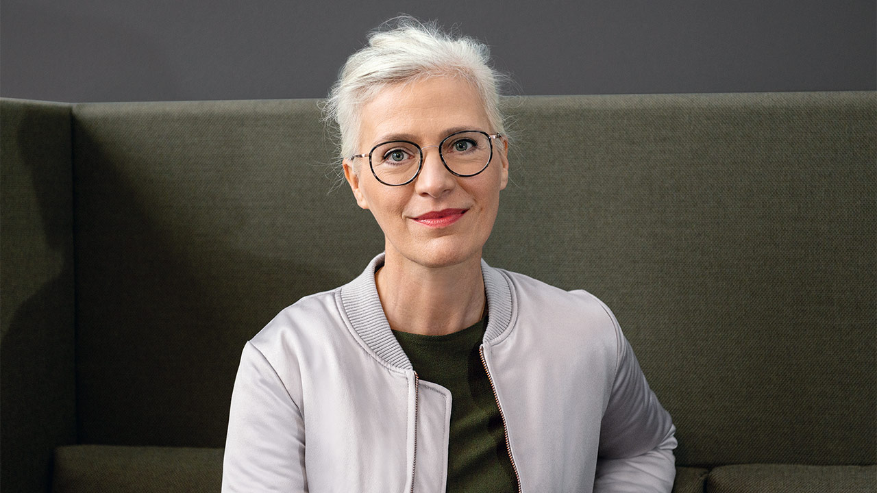
Why do consumers buy what they buy? Managing & Creative Director Madeleine Lindner explores this question and explains the important role psychology plays in packaging design.
Whether a package is a hit or a miss is decided in seconds. Why is this?
Most purchasing decisions are spontaneous and made directly at the shelf – often in less than three seconds. In this decisive moment, the packaging is a silent salesperson: It has to immediately convey the product’s promise and its relevance. Our brain evaluates colours, shapes and textures subconsciously and emotionally – long before we start thinking about them rationally. This is precisely where good design plays its part. It appeals to the senses and triggers a positive feeling.
What interests you personally about the psychology of packaging?
I find it fascinating just how much stimuli at a subconscious level control our behaviour. A single colour, a change in shape or a different kind of surface can have a decisive effect. As designers, our job is to create beautiful, coherent packaging that positively influences purchasing decisions.
What role does colour psychology play here?
Colours influence our perception and arouse emotions even before we've read a single word. At HAJOK Design, we place great importance on precisely analysing which colour codes predominate in a particular category and which colour strategy has the greatest impact. By specifically aligning colour design with the emotions you want to evoke, brands can effectively harness the power of colour to achieve their goals.
Red is one of the most popular brand colours in the FMCG sector. It has been proven to evoke physical reactions and stimulate spontaneous purchasing decisions. Brands like Melitta and Coca-Cola contribute to strengthening this positive image of red by conveying qualities such as emotional attachment, joie de vivre and energy.
Blue, on the other hand, represents trust, having a calming and relaxing effect on a psychological level. This is beneficial when treating yourself to small moments of pleasure in everyday life. Green tones, symbolize naturalness and are increasingly being used to show case sustainability in a credible way. Balance is crucial: colours always have to be seen in context – together with packaging materials, typography and the target audience. It’s only in this way that an authentic, brand-typical overall image can be created.
How can packaging design help brands connect emotionally with consumers?
We can create a deeper connection to the brand when we integrate storytelling elements and tactile stimuli. Stories activate emotions, making them more memorable. And multi-sensory packaging – with embossing or special surfaces for example – appeal to multiple senses at once, which enhances the whole brand experience.
Download press release
More articles
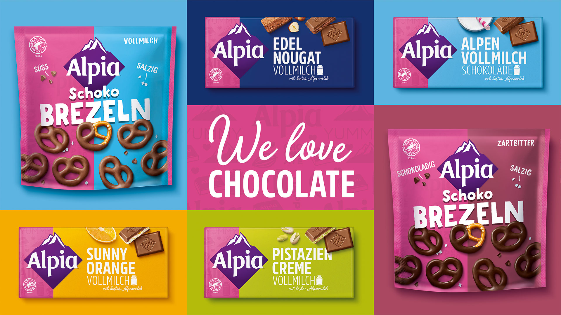
Alpia Gets a Colorful Relaunch
The Alpia brand by Stollwerck now presents itself in a colourful and modern packaging design.
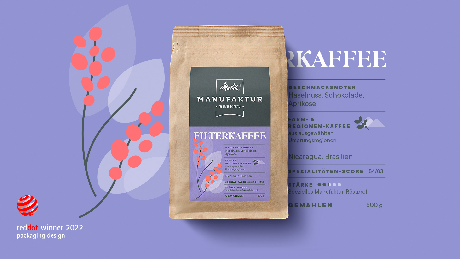
Award Winning Design
HAJOK Design wins a Red Dot award for the design of Melitta® Manufaktur coffee.
From Pick-Me-Up to Cult Drink
How to successfully appeal to the right target group with an expressive design.
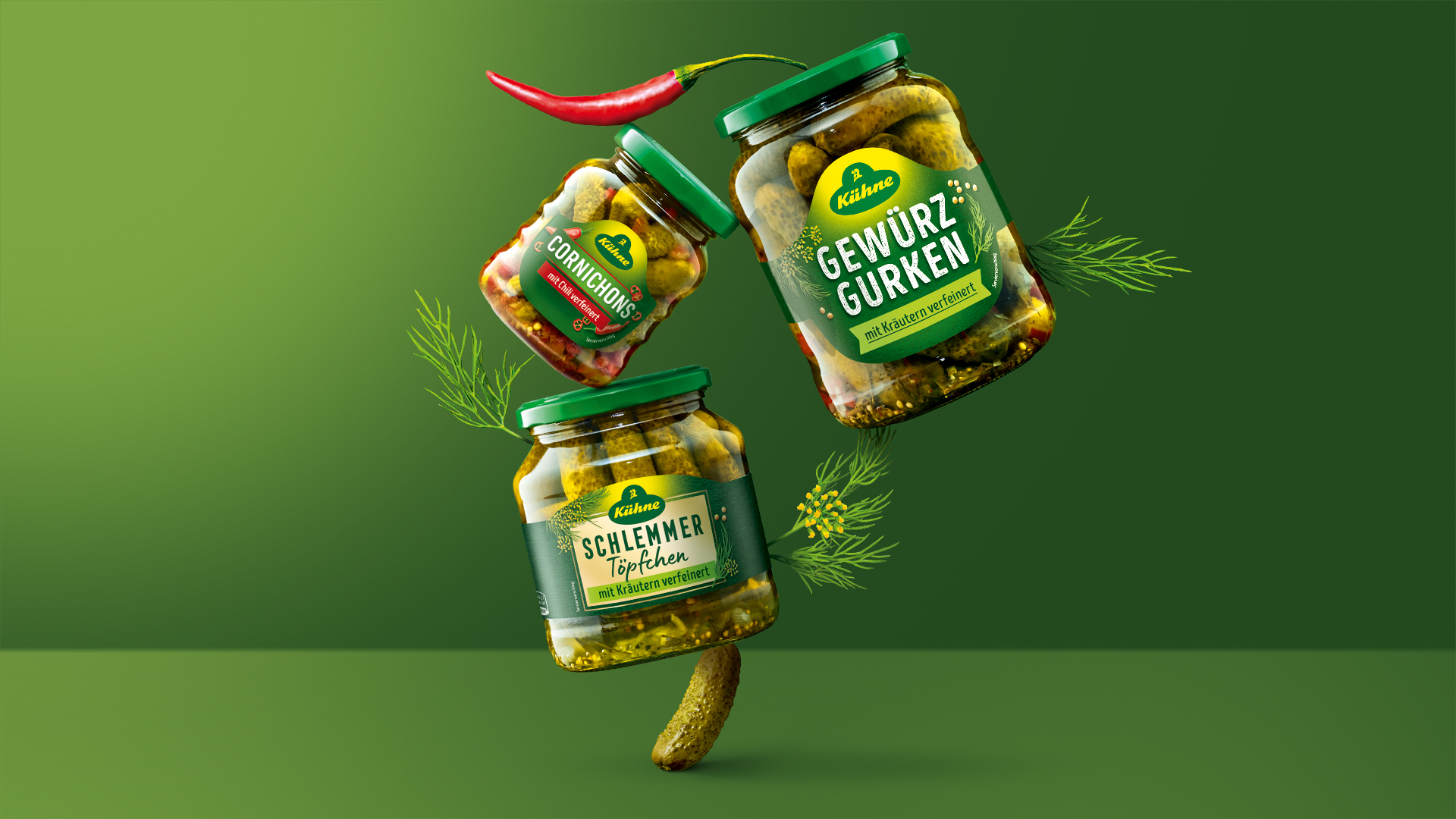
Modern Look
Contemporary, distinctive and characteristic - the new design of the Kühne gherkin range.