New Identity
Social changes of our times can be clearly identified from current food trends. The more the necessities of life and consumers' demands change, the greater the change in products from the food industry. New work, health, sustainability and connectivity are just a few of the aspects playing a role in the development of food trends right now. As one of the largest food brands in the world, Knorr had to position itself in a more progressive and diverse way for the future. In 2018 it laid the foundation for the most important relaunch in the company's 180-year history. A new visual identity was created: natural, transparent and authentic.
Great challenge
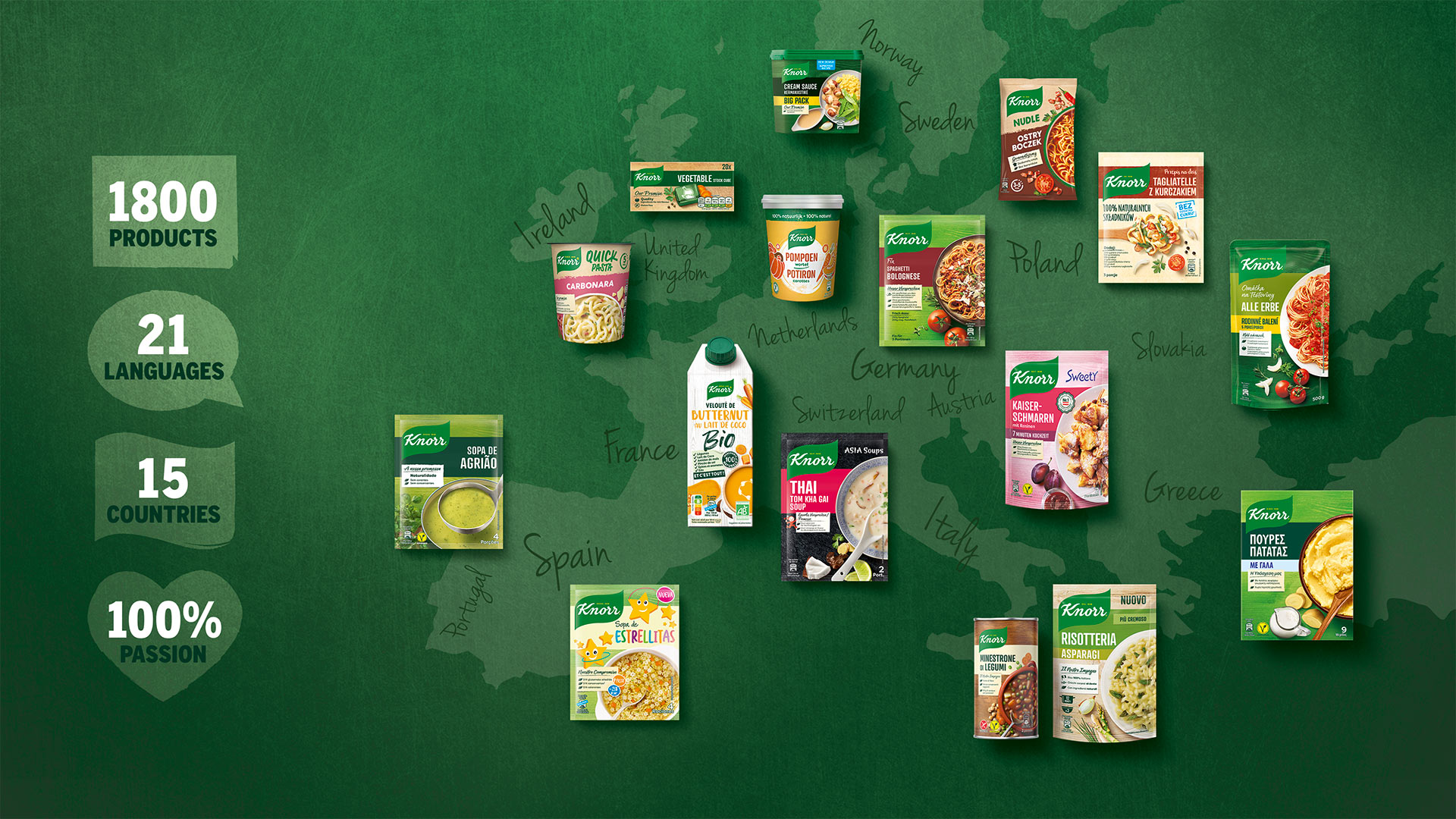
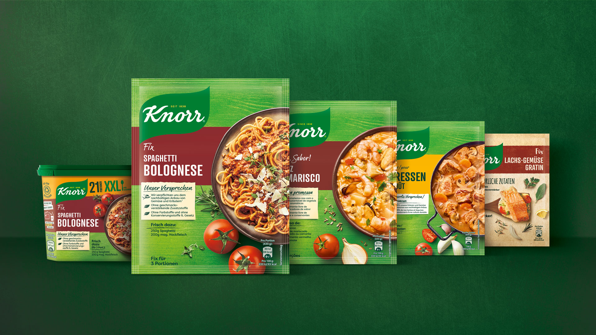
For the European market, HAJOK Design is responsible for the development of strategic food master designs and the entire roll-out. More than 1,800 SKUs, numerous technical specifications, complex, country-specific requirements and a wide variety of packaging formats – there could hardly be a more challenging packaging design project! Since we had already realised two European relaunches for Knorr in the past, our team was able to draw on a wealth of experience and took on this challenge with a great deal of know-how and enormous passion.
One language
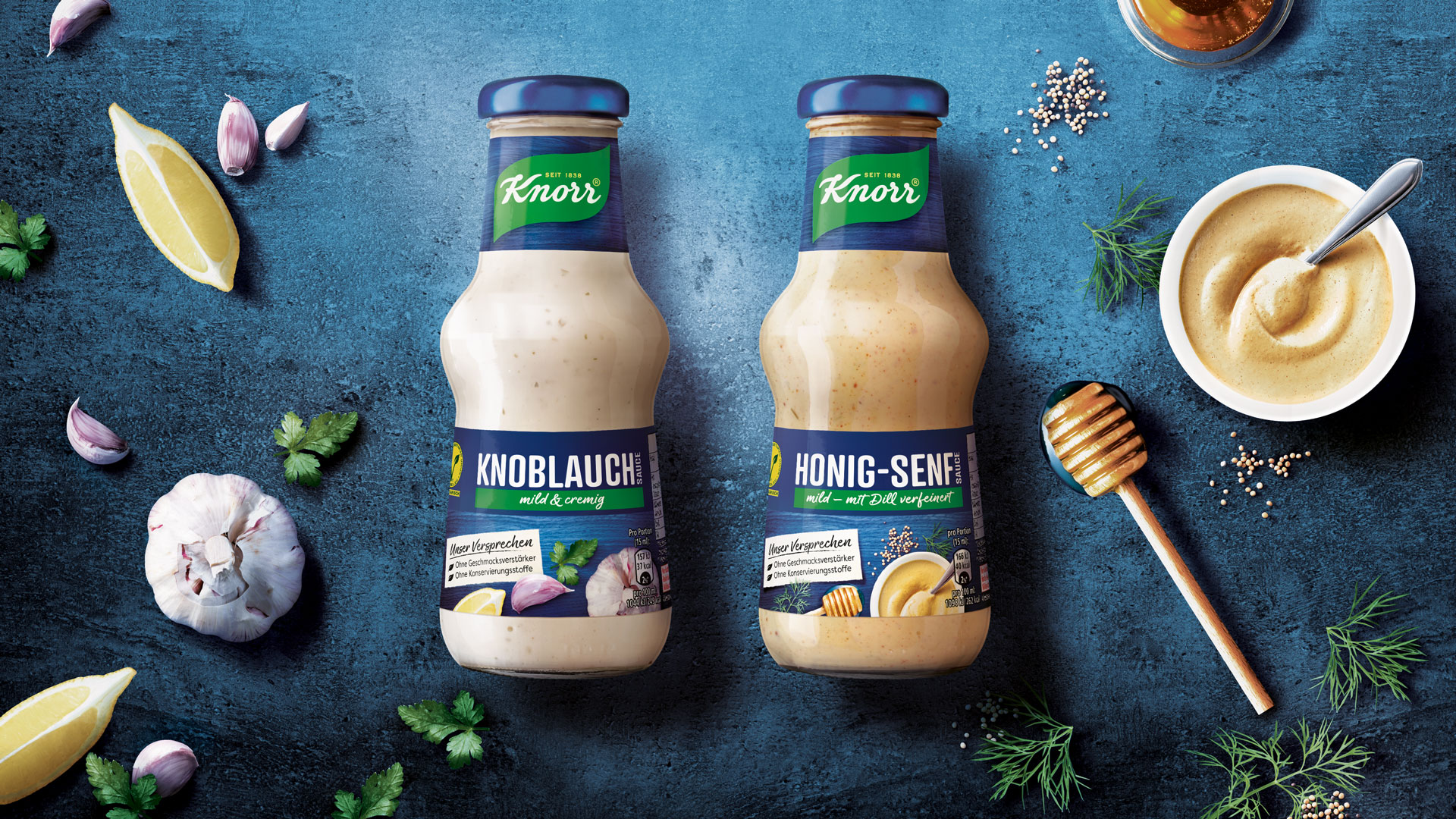
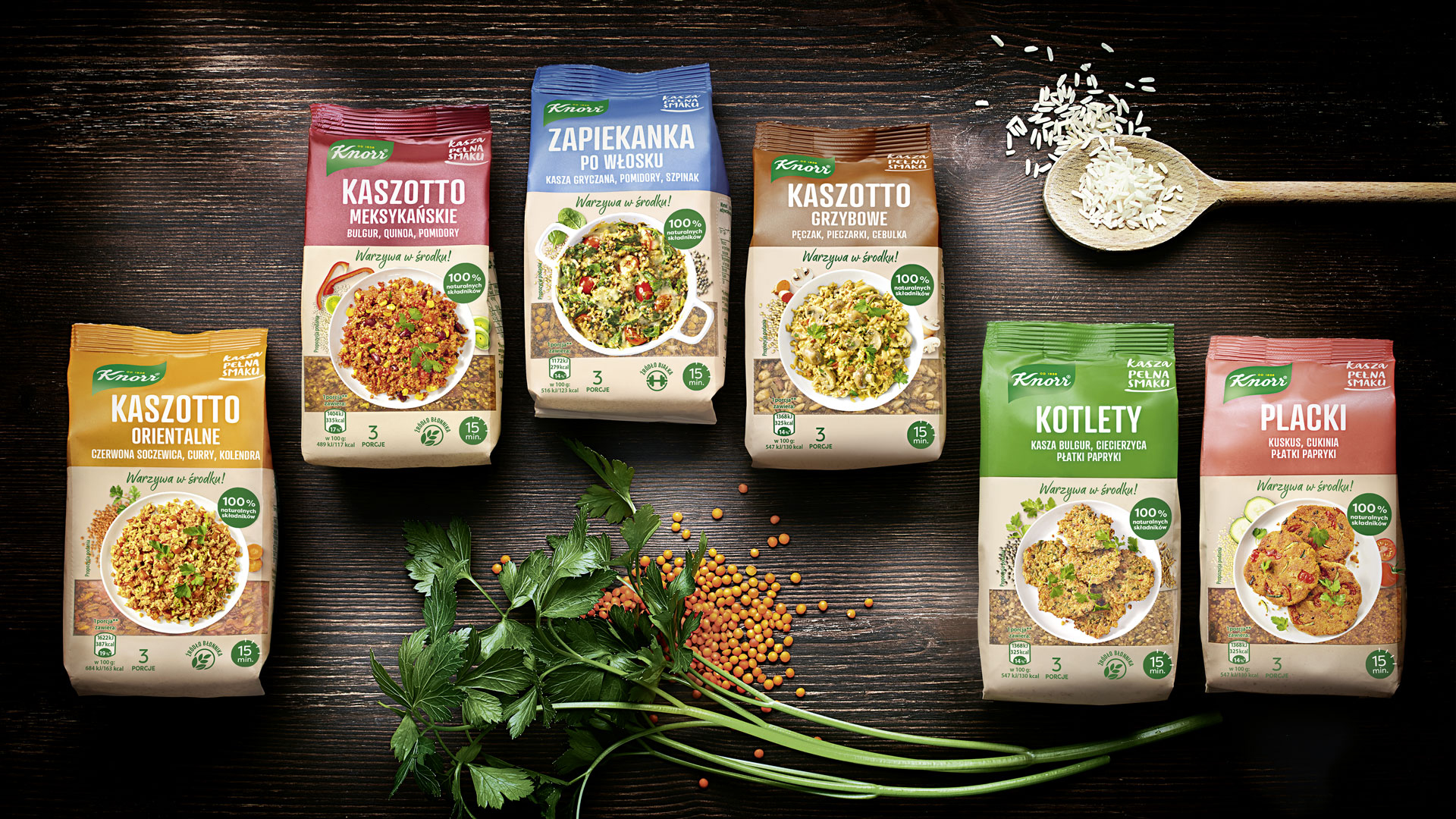
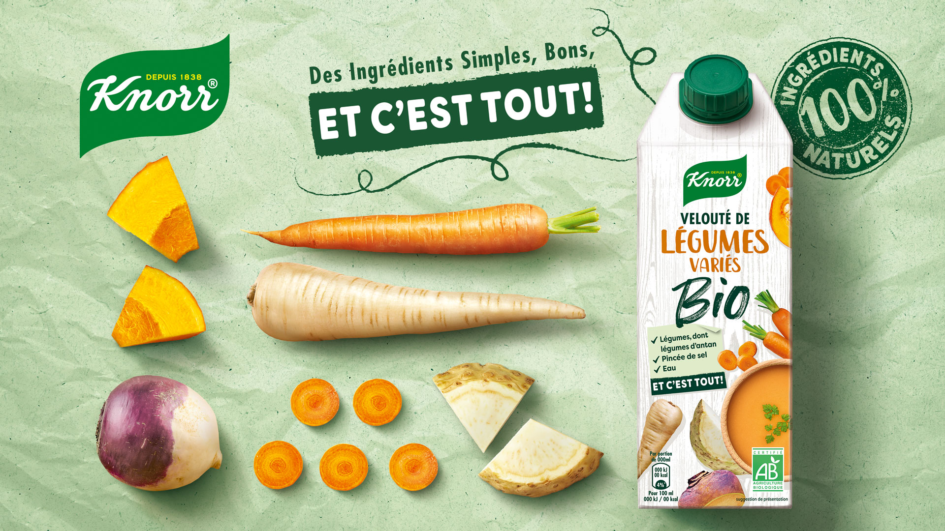
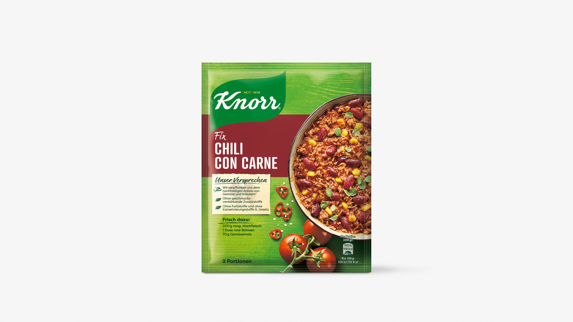
Our task was to bring together the different categories and regional distinctions of the various countries under the new global Knorr master brand. Despite design differences necessary in the broad-based and extensive range of products, the key brand visual should always be immediately recognisable. In addition, the design had to be brought up to date while communicating how natural and delicious the food products are. A homogeneous design language across all categories and in all countries was to be realised.
NEW
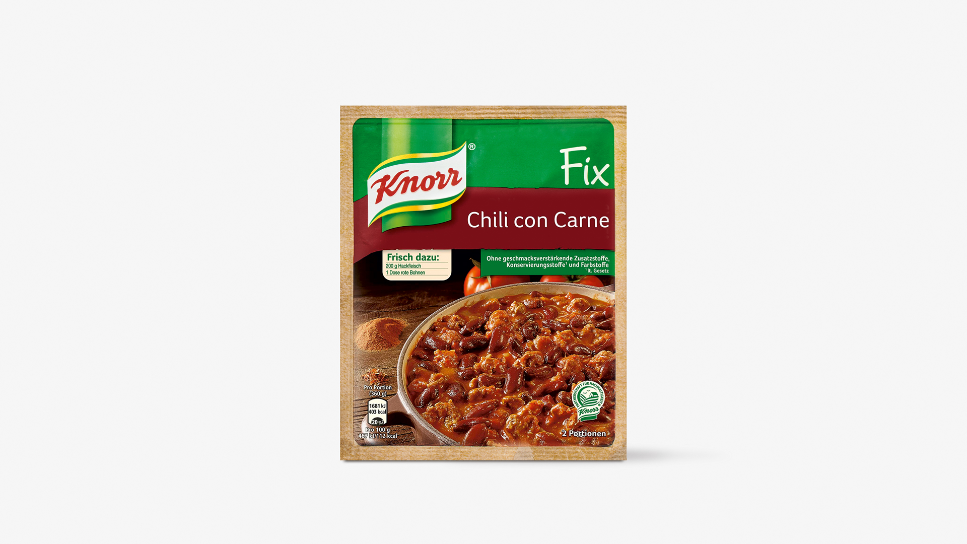
OLD
On site
Our preparation for this complex project included creating new jobs at the agency: for example a consultant working on-site in Rotterdam as the direct contact person for the Knorr Marketing Team. In Hamburg, an experienced managing designer developed and coordinated the design processes for the creation of a consistent overall brand image for the European market. Our expert for print technologies made sure that the food packaging design works with all print-specific specifications.
Total overview
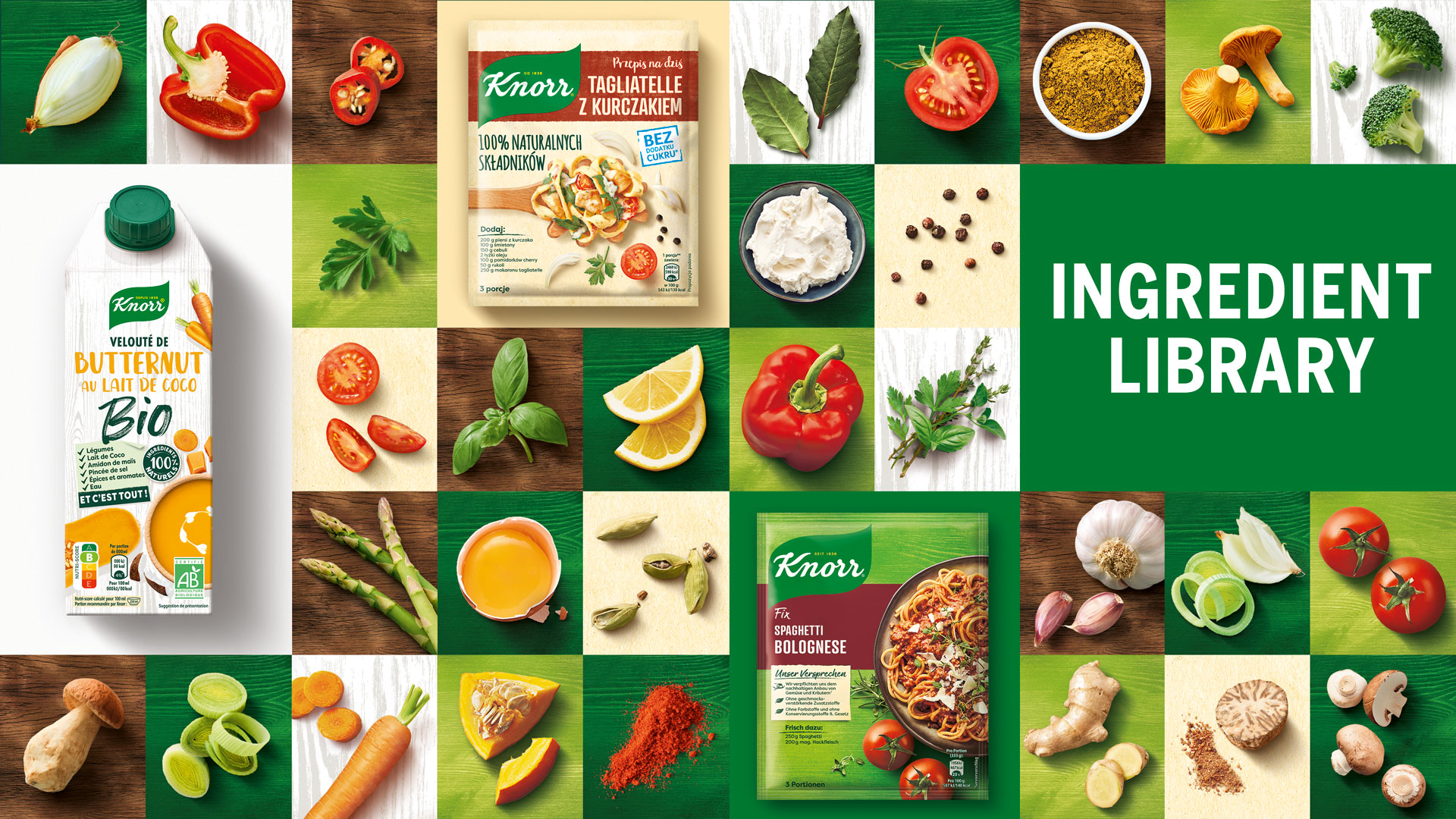
An overarching brand consistency was realised with the implementation of the design management together with the development of guidelines and checklists. For the visual language in particular, it was important to take into account the image perception in the respective countries for the use of new and existing photographs. Existing images were preferred for reasons of time and money, if they were a good fit to the modern and country-specific context of the new designs. This extensive food project has shown that we are experts at meeting the demands of a broad European market, coordinating a large number of SKUs while always maintaining an overview of all areas. From consultancy and design, photography and image processing right up to the final artwork and checking printability – the HAJOK team provides all of these services under one roof.
Facts & Figures
-
Relaunch of the European Knorr portfolio
-
More than 1,800 products
-
Design management
-
Brand guardian
-
Packaging design food
-
Photo shoot
-
Illustration
-
Key visuals
-
Ingredient photo library
-
Design catalogue
-
Tray design
-
Image processing
-
Final artwork
-
Prepress
You are looking for a competent full service packaging design agency?
We’d love to work for you!