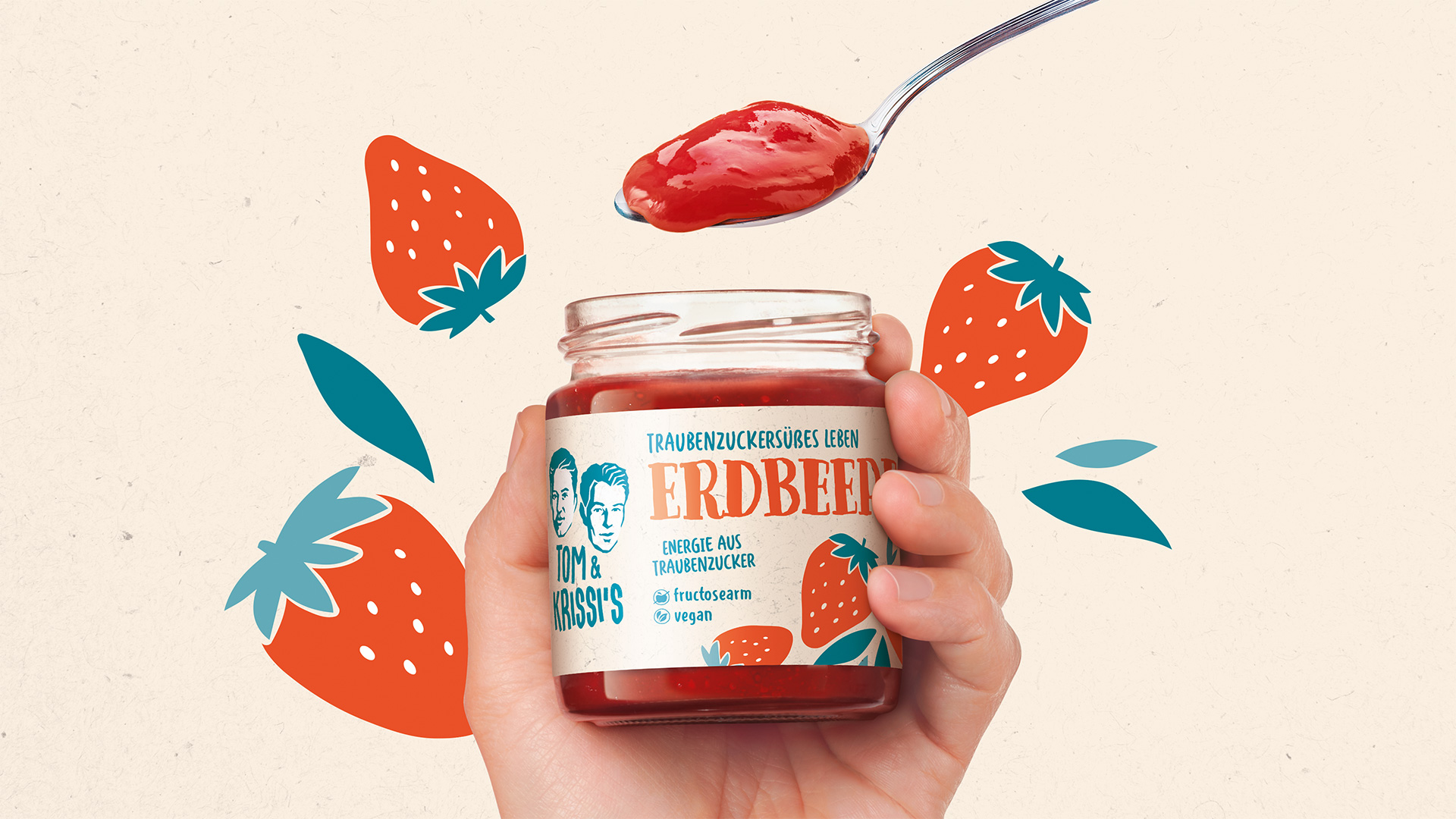
Gold in Glas
Even the ancient Romans seasoned their dishes with mustard seeds. This makes mustard one of the oldest convenience products in the world. At Kühne, mustard has had a long tradition, yet recently its on-shelf appearance had been rather reserved. Since every variant contains a wealth of brand expertise and passion, it was crucial that these very strengths should in future be expressed visually on each jar.
Family feeling
Our task was to give the mustard range the place it deserves within the Kühne family: making it modern, confident and clearly recognizable as part of the brand. Over the years, it had lost some of its on-shelf impact. The redesign was intended to give Kühne mustard a more distinctive look and confidently embody the brand identity with clear communication.
NEW
OLD
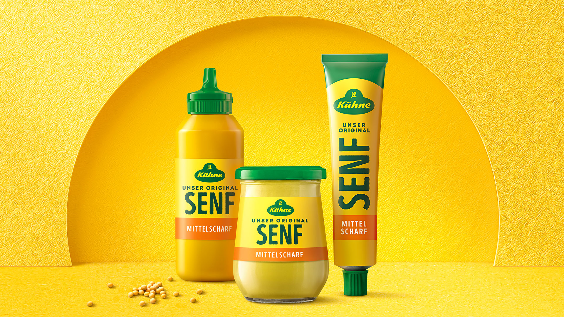
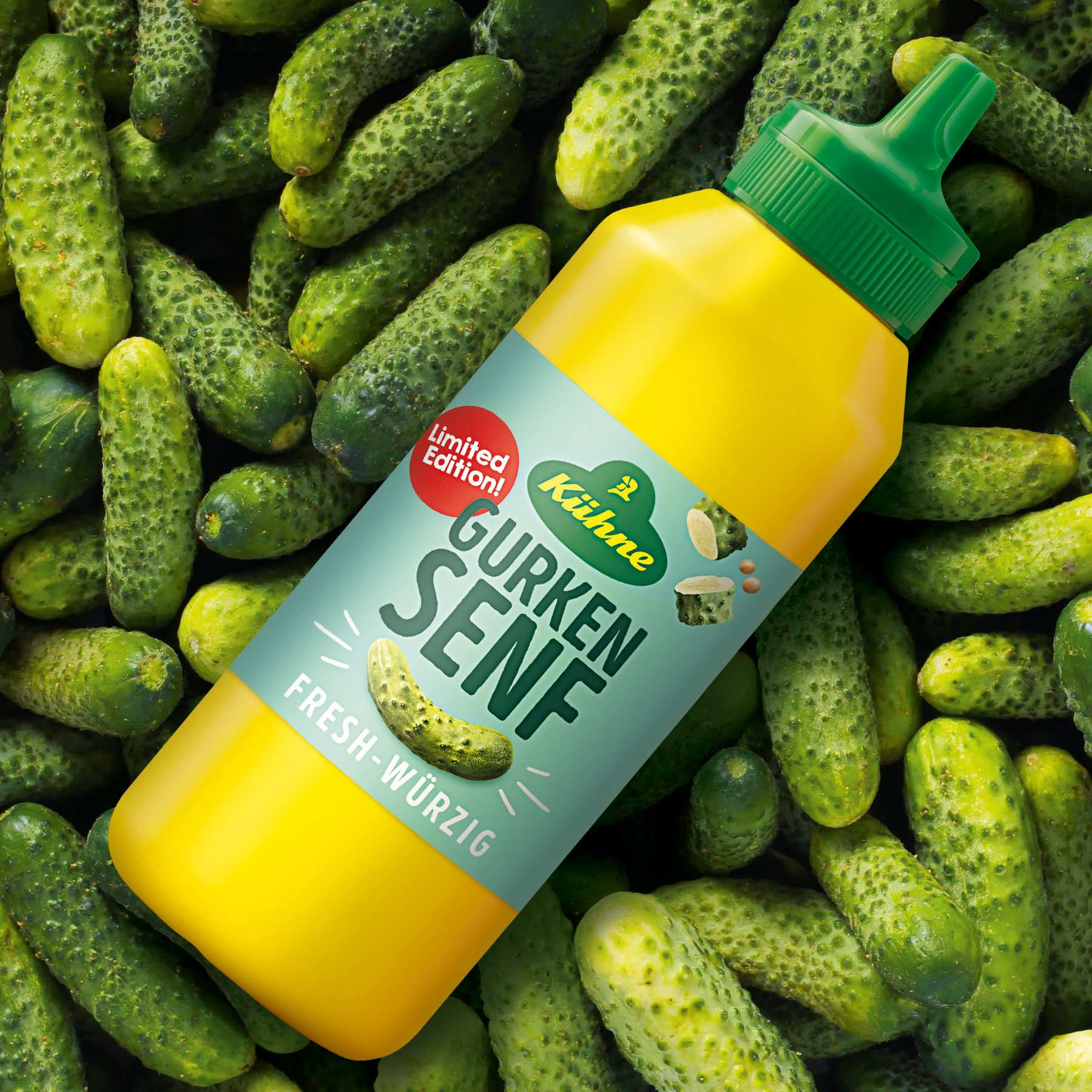
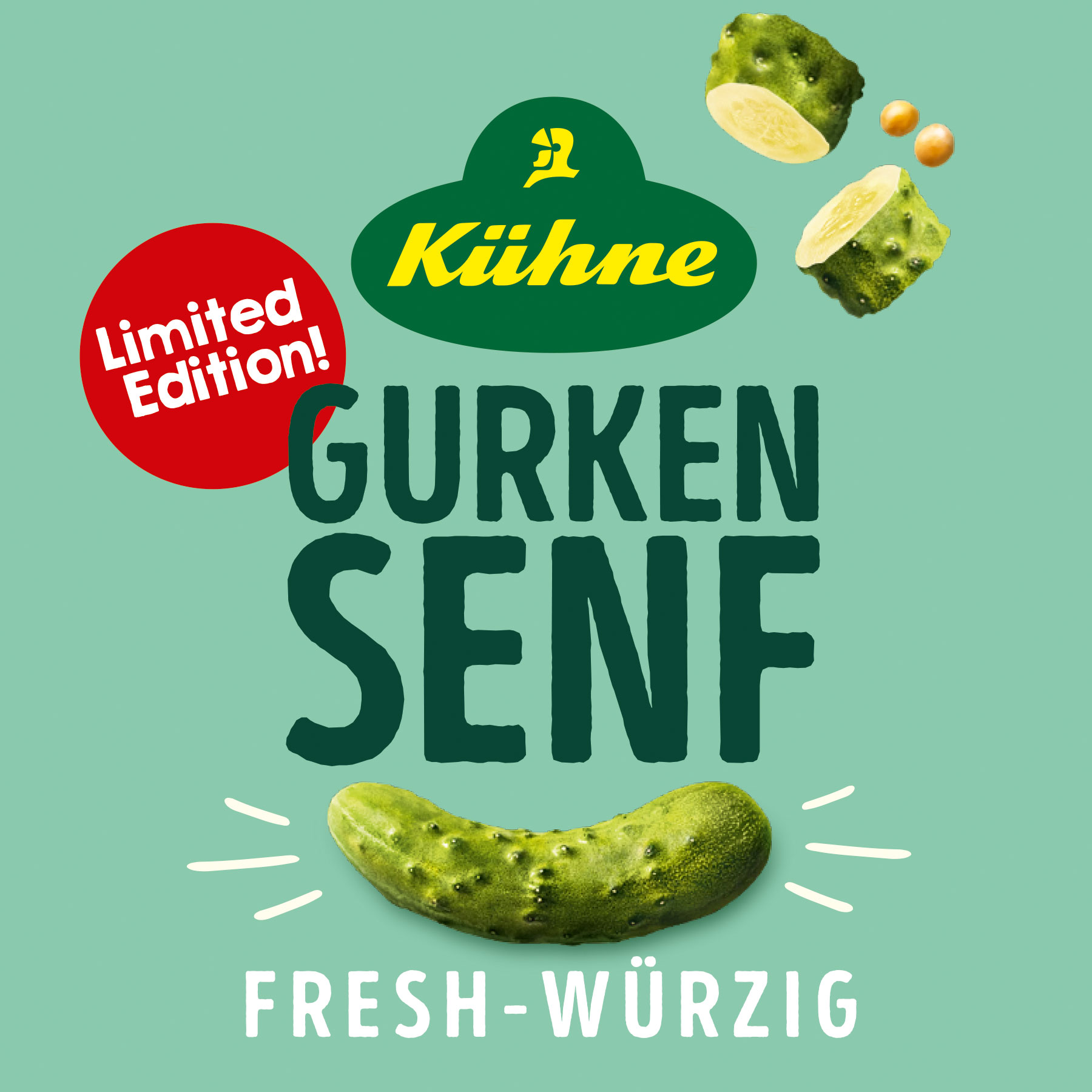
Clear lines
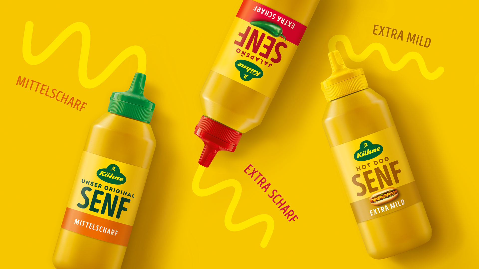
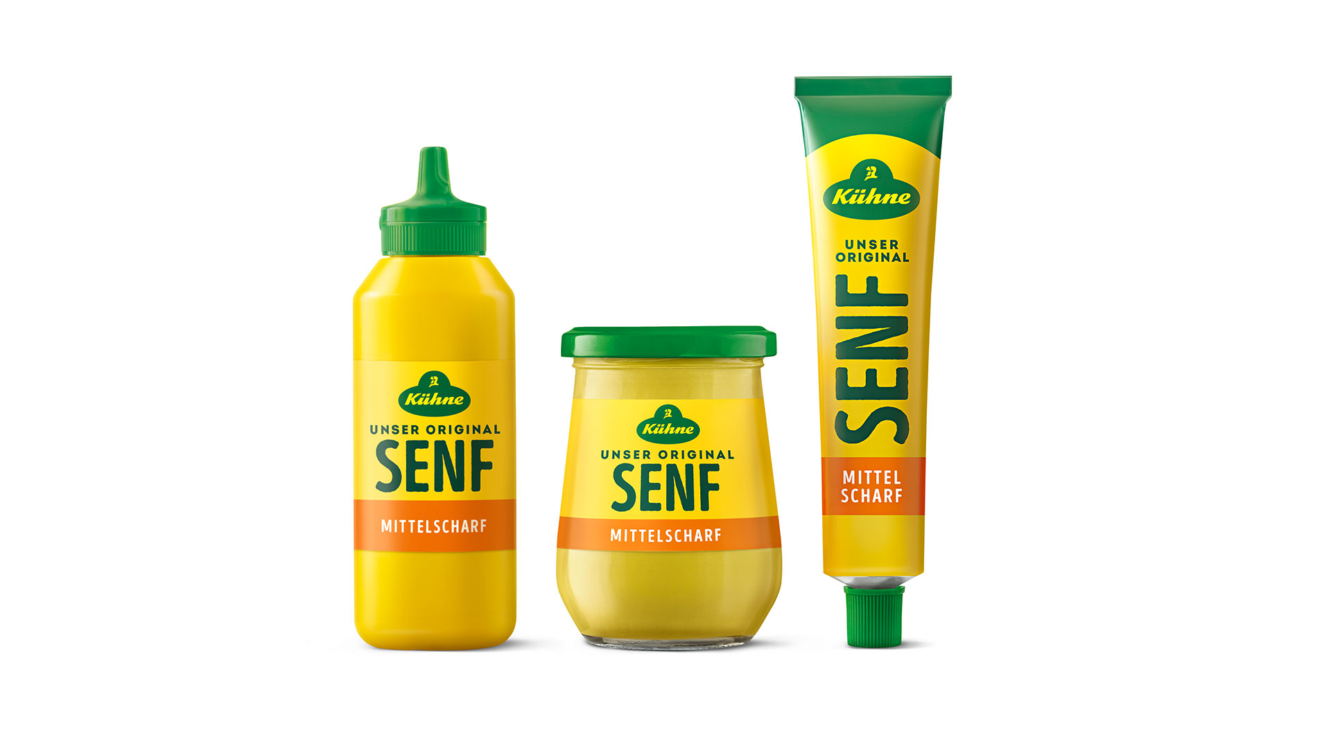
Our design team has successfully applied the Kühne DNA to the range, by standardising the variants, integrating the squeeze bottles into the core portfolio. The team deployed concise, straightforward typography to create a sense of authority and consistency. The striking colour scheme in bright mustard yellow ensures maximum on-shelf visibility. The range is now quickly identifiable thanks to its strong presence. This is how Kühne mustard presents itself today as what it is: a straightforward, high-quality companion for cooking, BBQs and enjoyment, and a true member of the Kühne family.
Are you interested in our services?
Please feel free to contact us!