Finely ground
Aurora has a very wide range of products which can quickly overwhelm an increasingly younger target group with little baking experience. A clearly understandable navigation of the flour range at POS should provide a better overview while at the same time achieving more focus on quality.
NEW
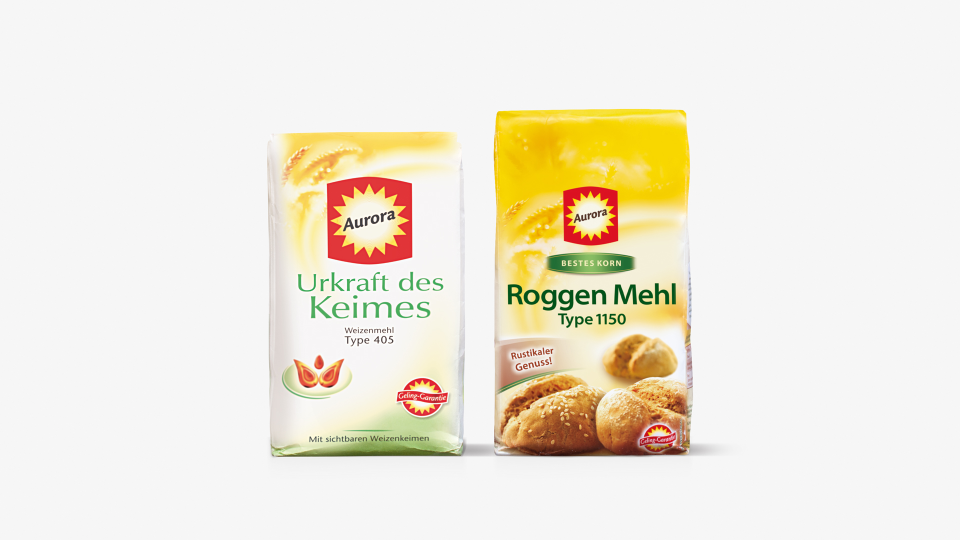
OLD
Absolutely clear
Communication at POS should be as simple and as quick as possible. Thus the integration of a differentiated colour coded system seemed the obvious approach. In dialogue with Aurora and assisted by consumer tests, we were able to clearly understand how to make the products more accessible.


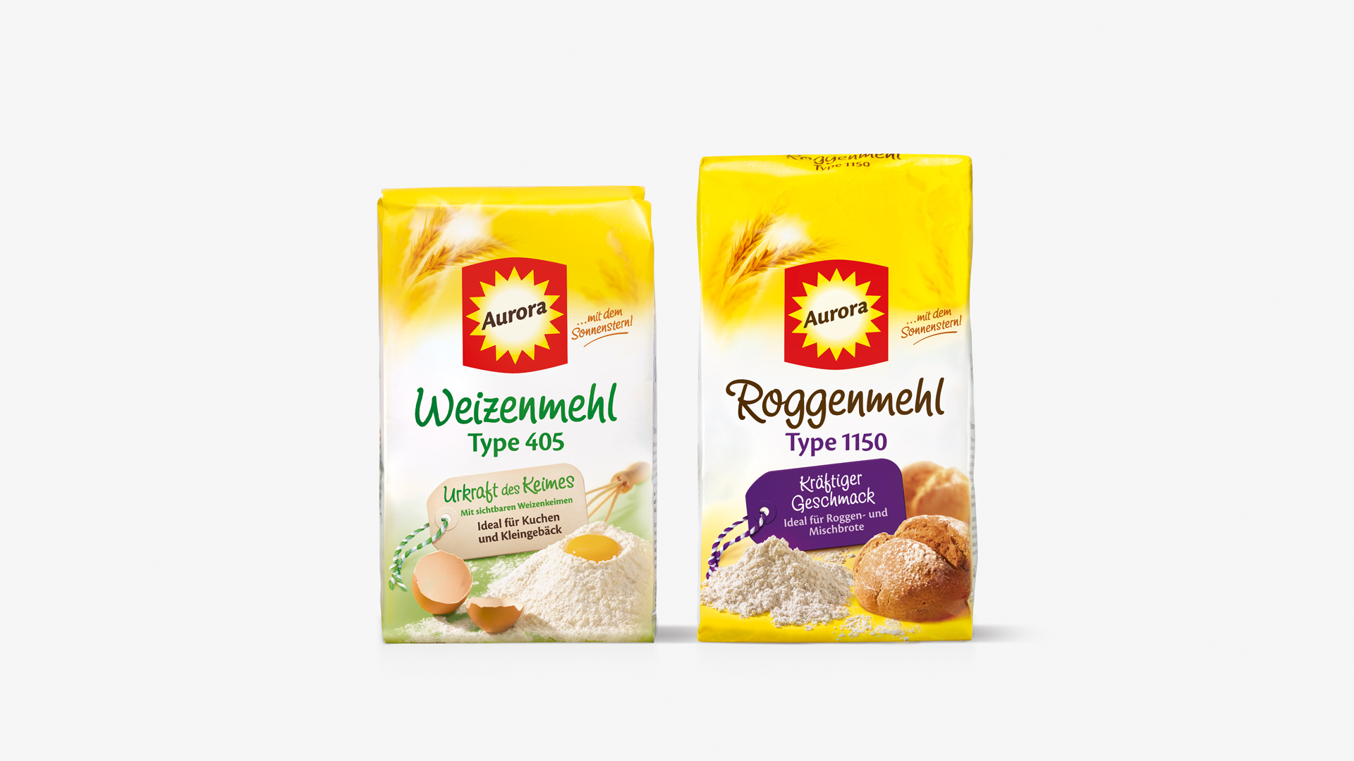
Well labelled
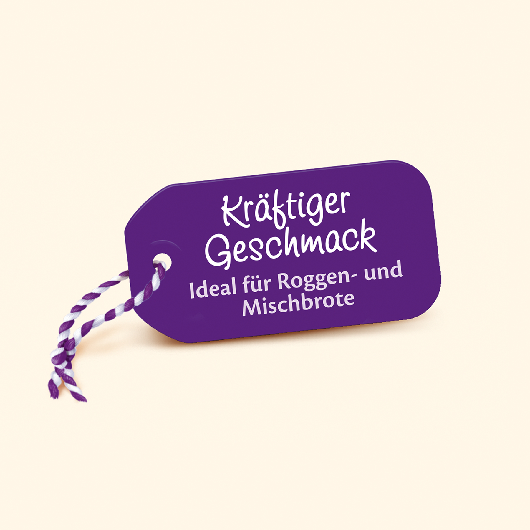
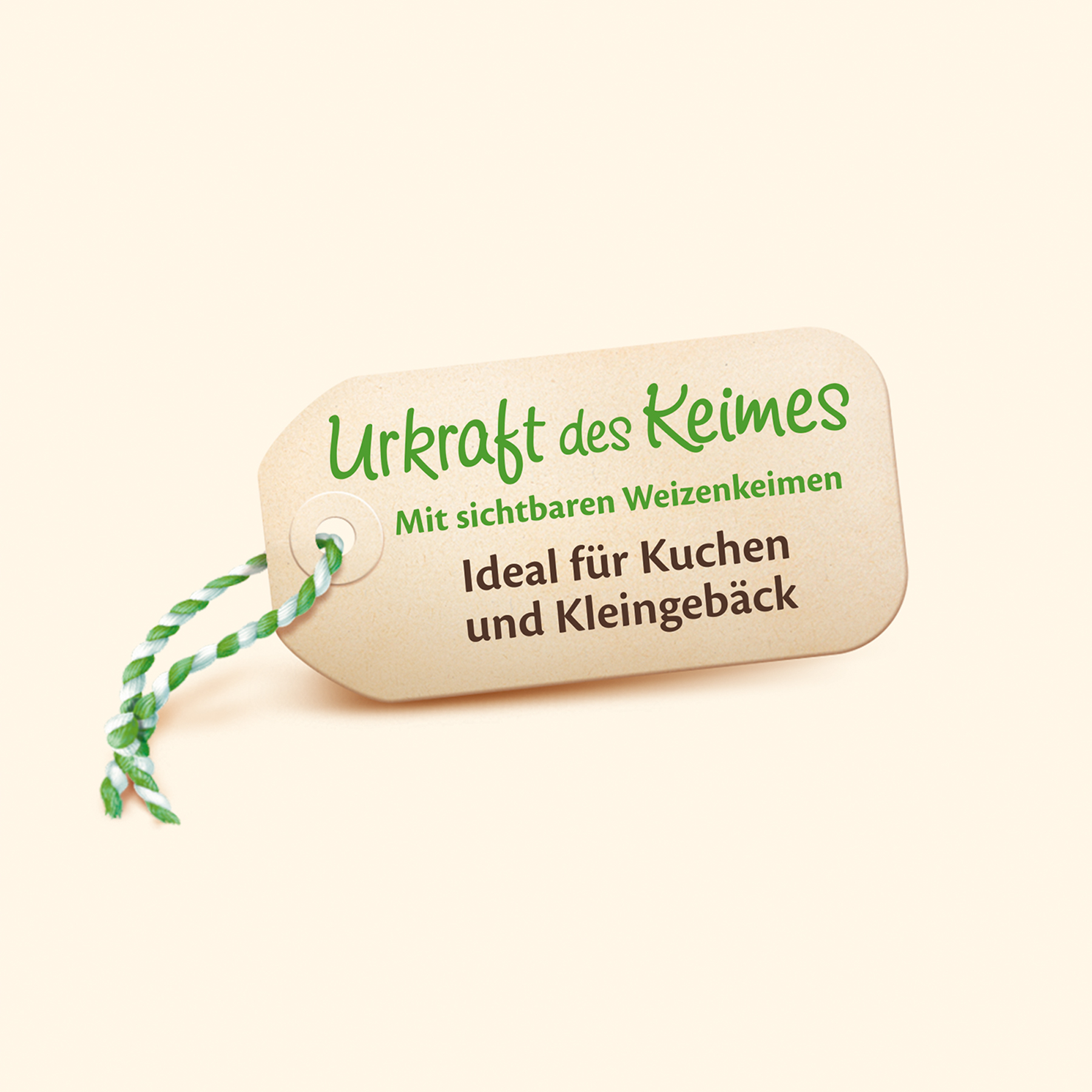
The central element is the colour coded tag: important information can thus be conveyed at a glance, easy to understand and clearly communicated. The hand-written variant information and the increased percentage of yellow on-pack give the design a sense of authority, warmth and quality.
Are you interested in our services?
We’d love to get to know you!