A Higher Level
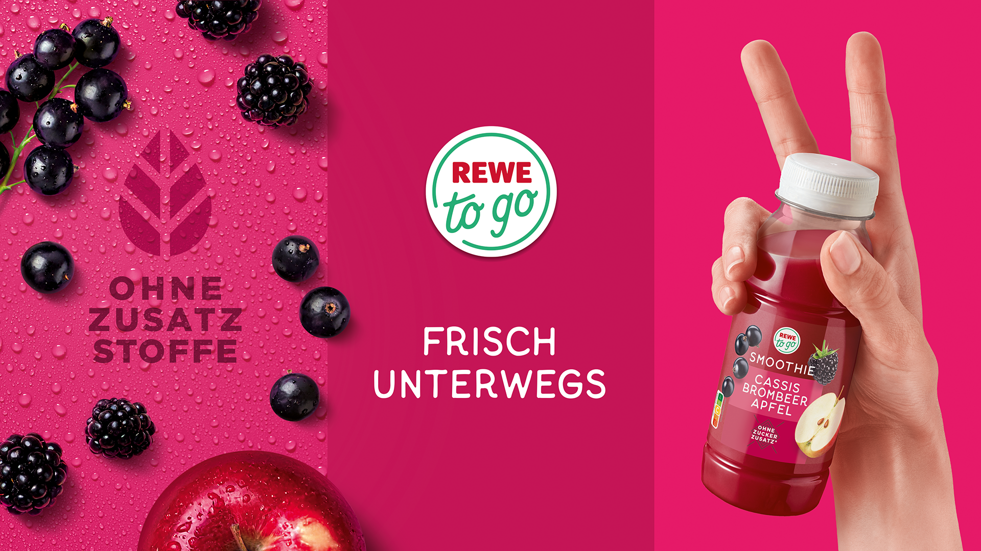
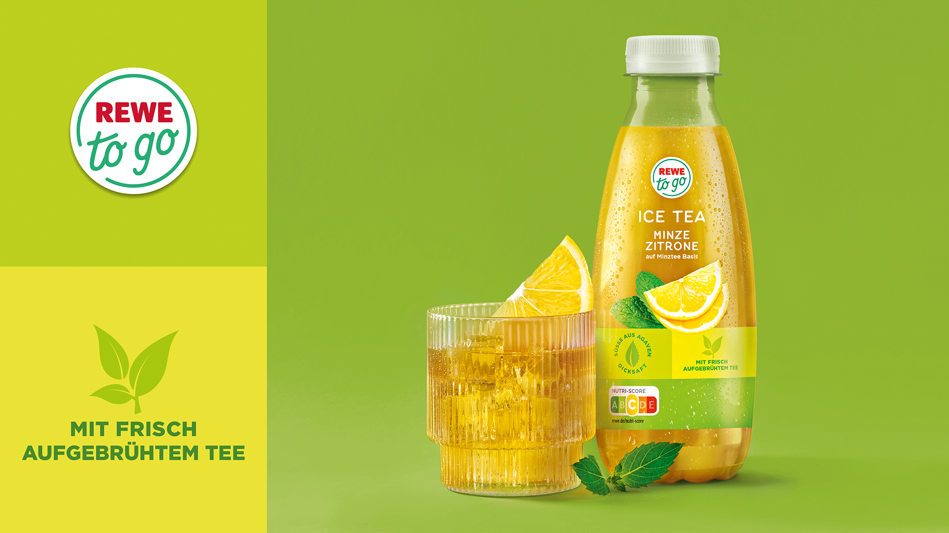
REWE to go stands for fresh, yummy and innovative products for on-the-go and at home. The high standard of product quality, trendiness and, above all, maximum freshness were all attributes that had to be reflected in the new packaging design.
HAJOK Design developed the brand in 2016 and has continued to expand the line-up into one of the best-known convenience brands in German food retail. The goal now was to enhance REWE to go with both strong, confident communication of the brand platform as well as personalised communication of the individual products.
Fast & Fresh
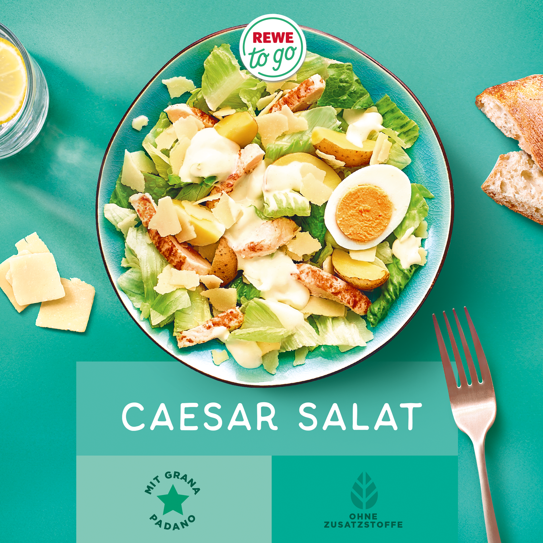
When you choose REWE to go, you buy ultra-fresh and delicious products, free from artificial flavours and flavour enhancers. Whether small snacks on-the-go, something for a protein-rich break, or vegan ready-meals when you're in a hurry, REWE to go combines freshness, product quality and enjoyment. Our design team has created a modern, distinctive look that clearly conveys this philosophy.
Facts & Figures
-
Relaunch of the REWE to go brand
-
Visual brand identity
-
Logo development
-
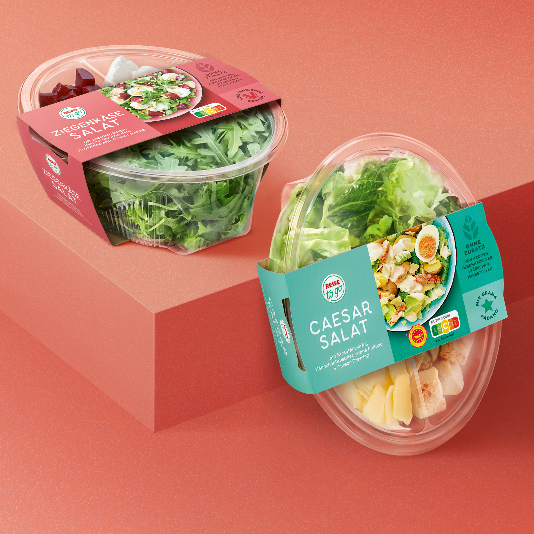
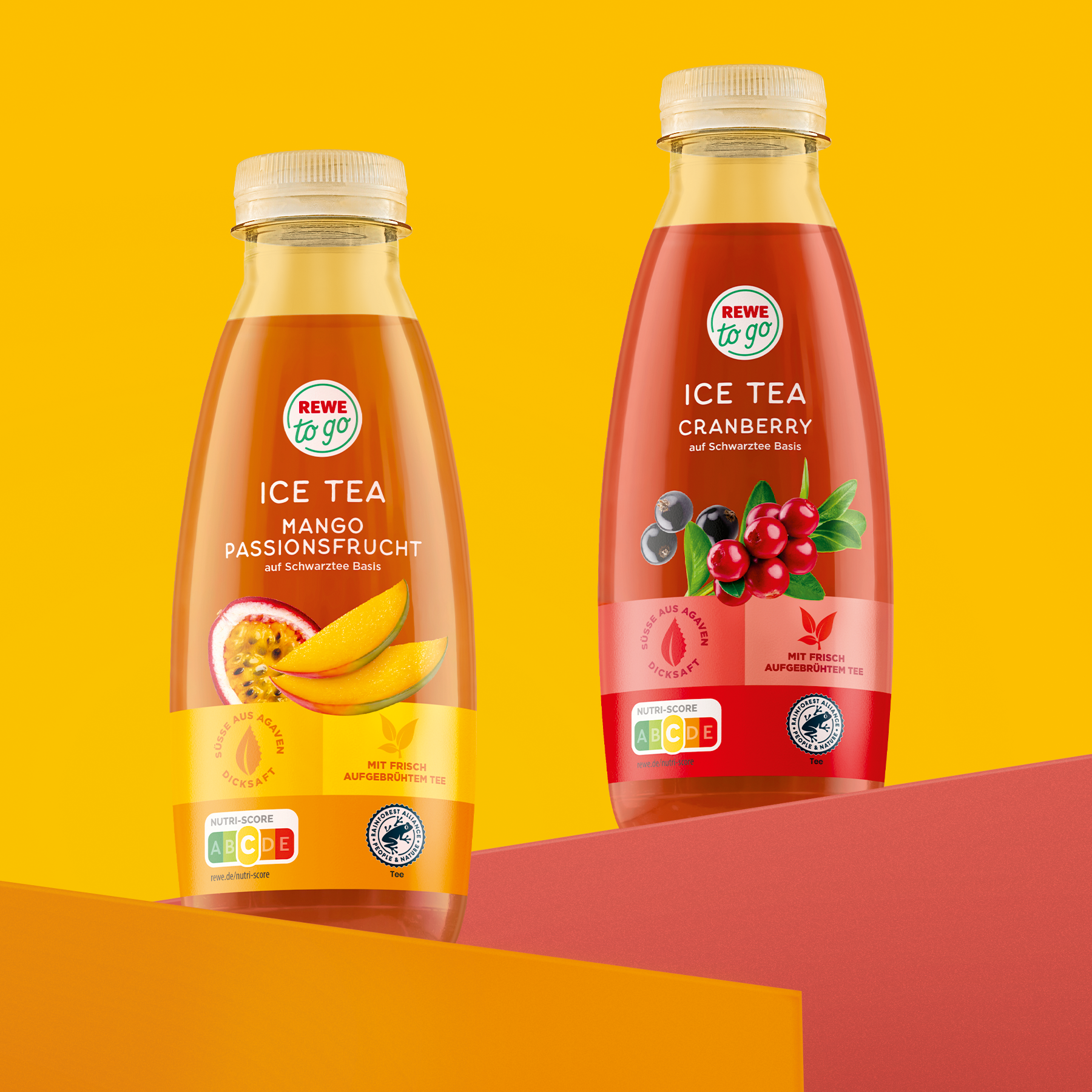
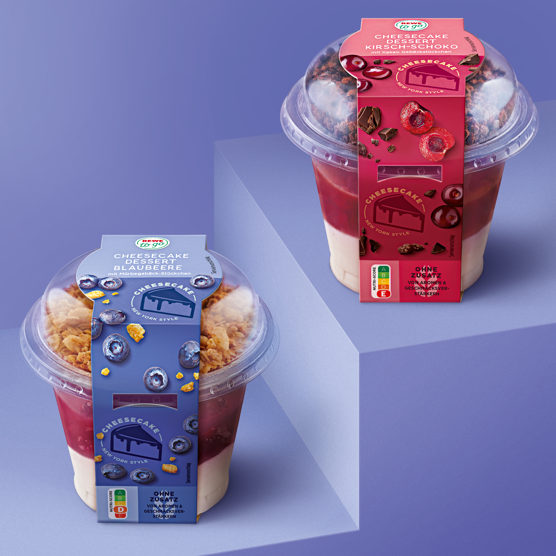
Packaging design food & beverages
-
Over 90 products
-
Fotoshootings
-
Illustrations
-
Image retouching & composing
-
Final Artwork
Great Benefits
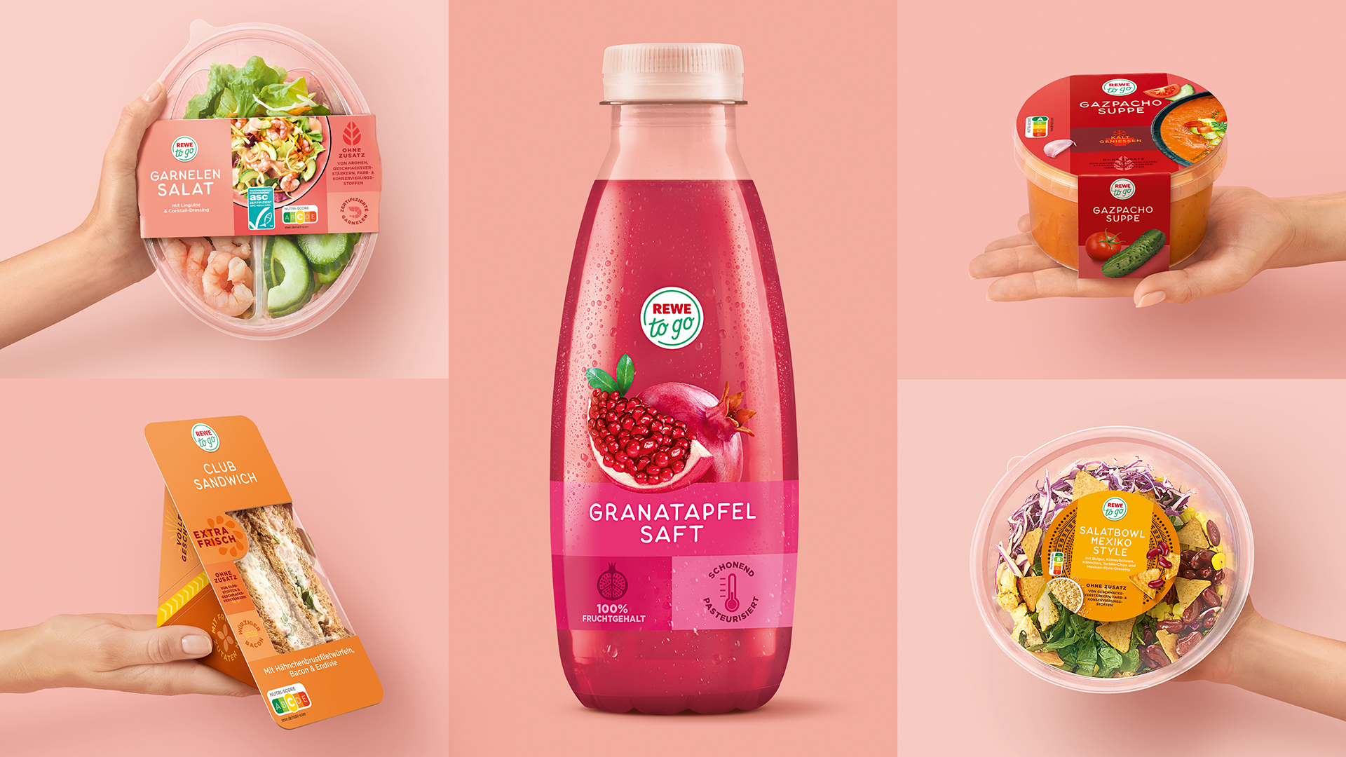
The commitment to product freshness is at the core of the brand. The centrally positioned logo serves as a guarantee of quality. The aesthetic, on-pack presentation of the food particularly ensures appetite appeal. The combination of individual benefit icons and product highlights help create a Rewe to go lifestyle range that inspires customers to try something new!
New Identity
The new design is modular, clearly structured and extremely versatile. Soft, modern colours set the stage for the brand, benefits and the food shots. The flexible system works for over 90 products and provides a distinctive presence for both large ranges and seasonal individual products. With the new confident design, REWE to go succeeds in bringing a strong sense of freshness to the refrigerated shelves.
NEW
OLD
Would you like to find out more about our work?
We look forward to the exchange!