Swiss Care
Founded in 1890, the Basel-based company Coop is one of the largest cooperative companies in Switzerland. It operates some 930 supermarkets, which alongside branded products, also sell Coop own brands, such as the well cosmetic line. In 2020, HAJOK Design won the pitch for an extensive relaunch of the packaging design and the brand logo for around 200 products.
Fresh line
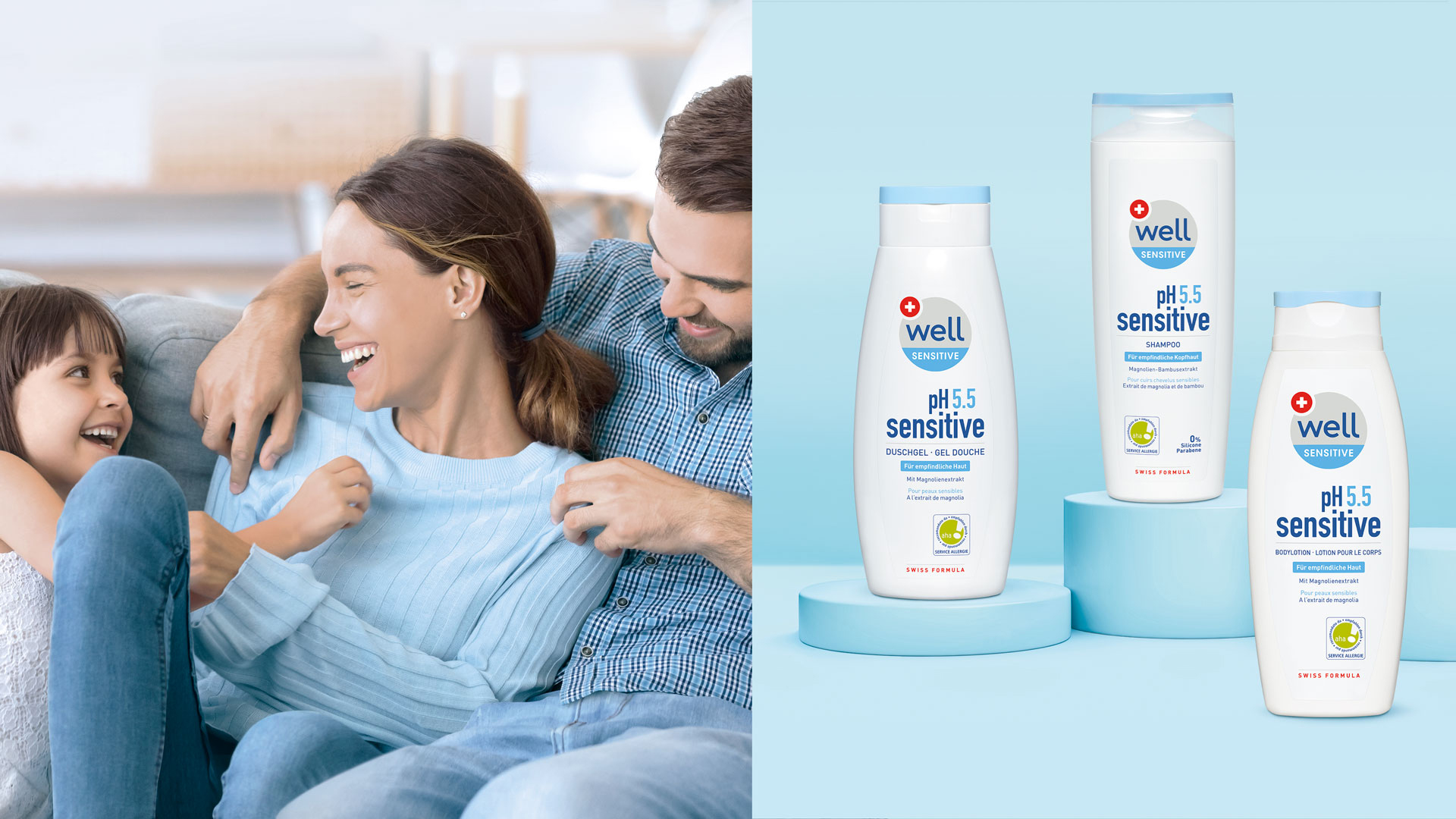
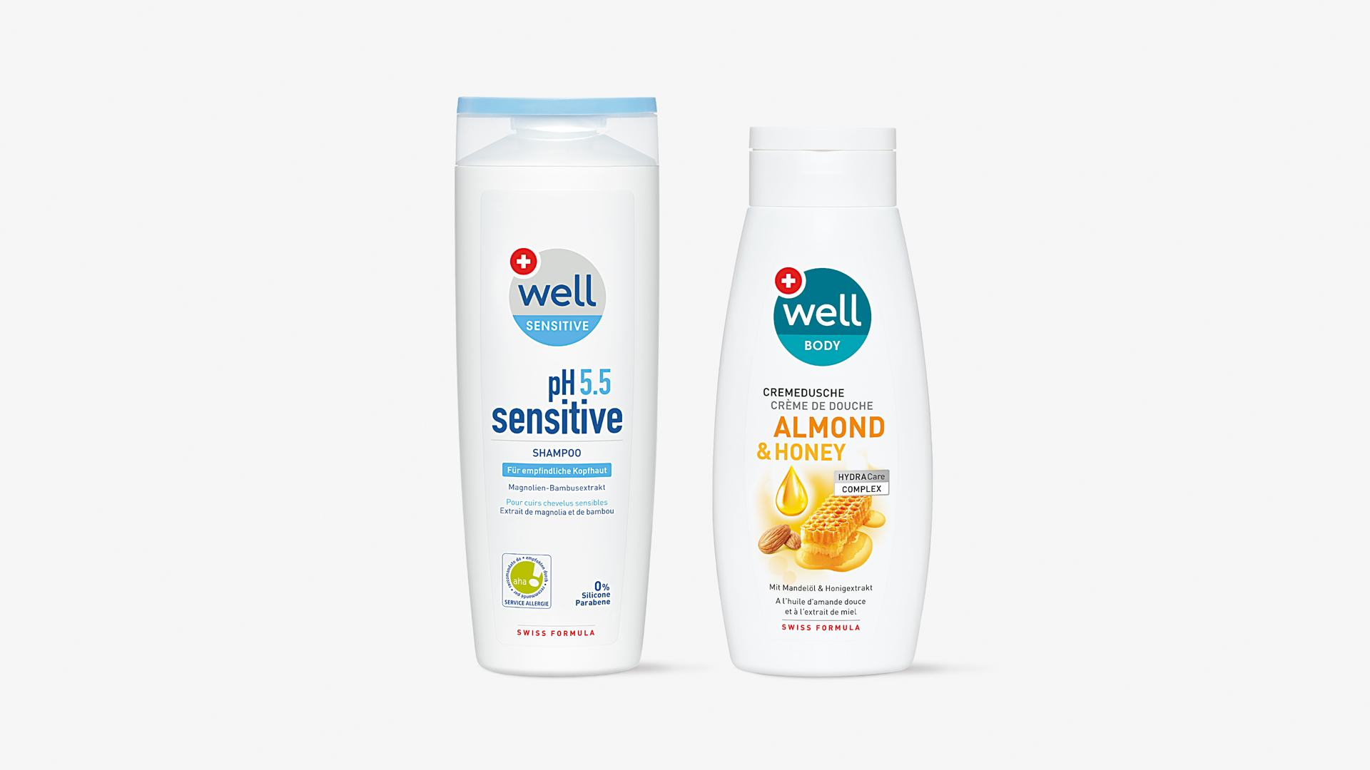
The goal was to raise the emotional impact of the well range with an experience world for the whole family and to be visually competitive with branded products. Coop also wanted greater harmonisation across the different cosmetic categories. The Swiss origin had to be integrated on-pack as a symbol for successful cosmetic expertise.
Category Codes
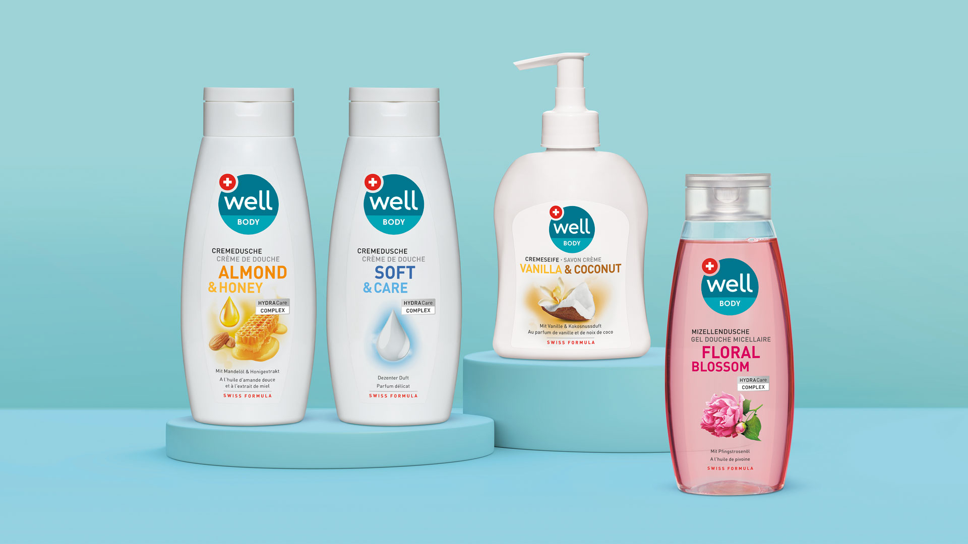
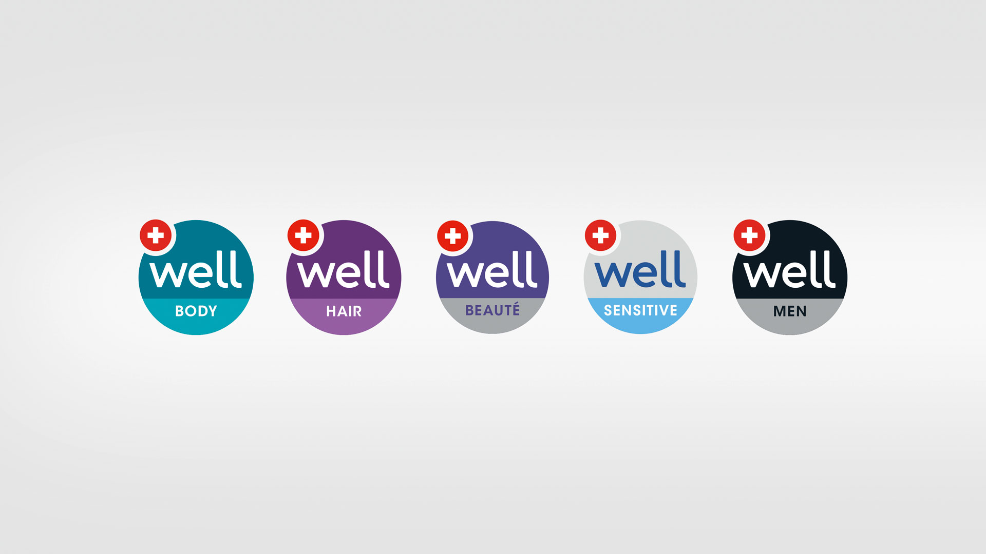
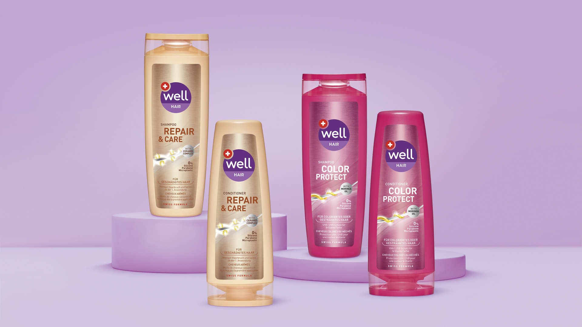
The new logo creates a visual link across the entire product portfolio. The different colour codes symbolise colourful and lively everyday family life and serve to differentiate the product ranges from each other.
NEW
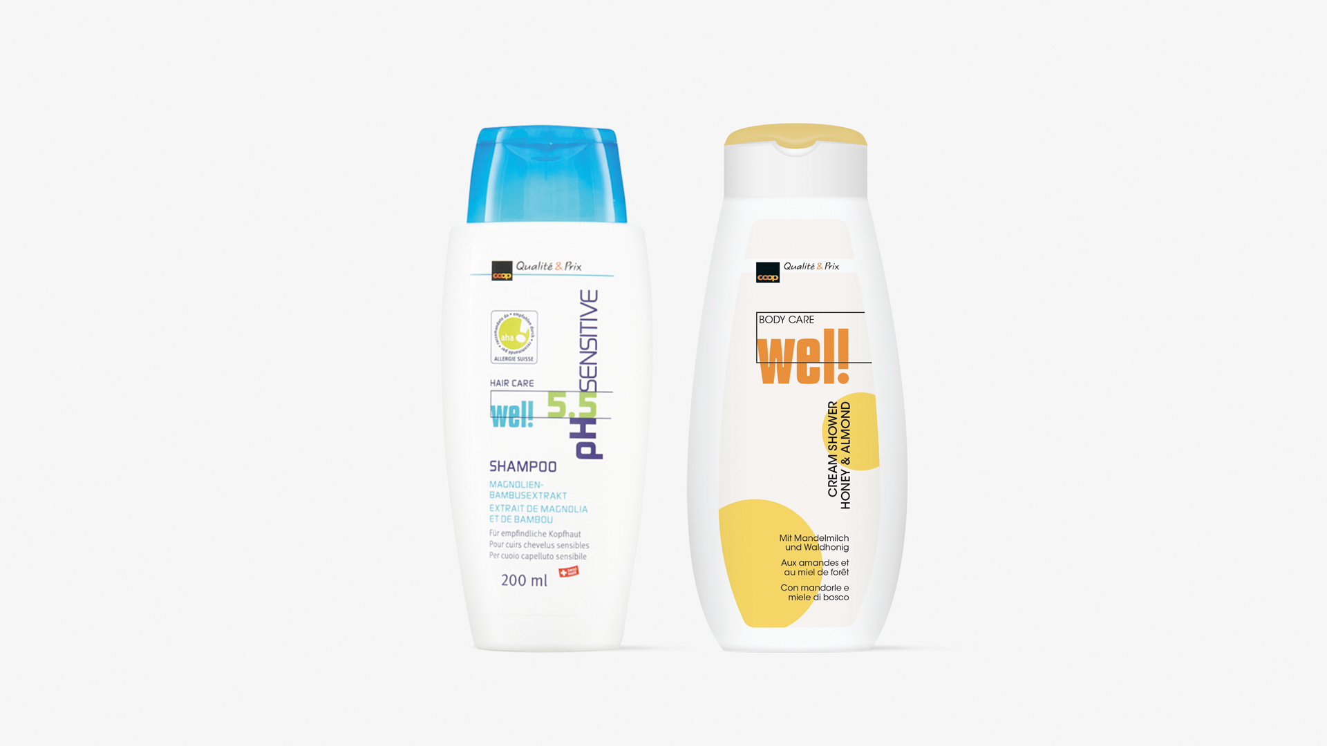
OLD
Family friend
While well appeared somewhat technical and cool before the relaunch, the new cosmetics packaging design presents itself with contemporary illustrations and a consistent look. The Swiss origin appears as part of the logo. True to the “enjoy life” motto of the pitch, the cosmetics brand well is now approachable and trustworthy as a personable companion for every sphere of life and for the whole family.
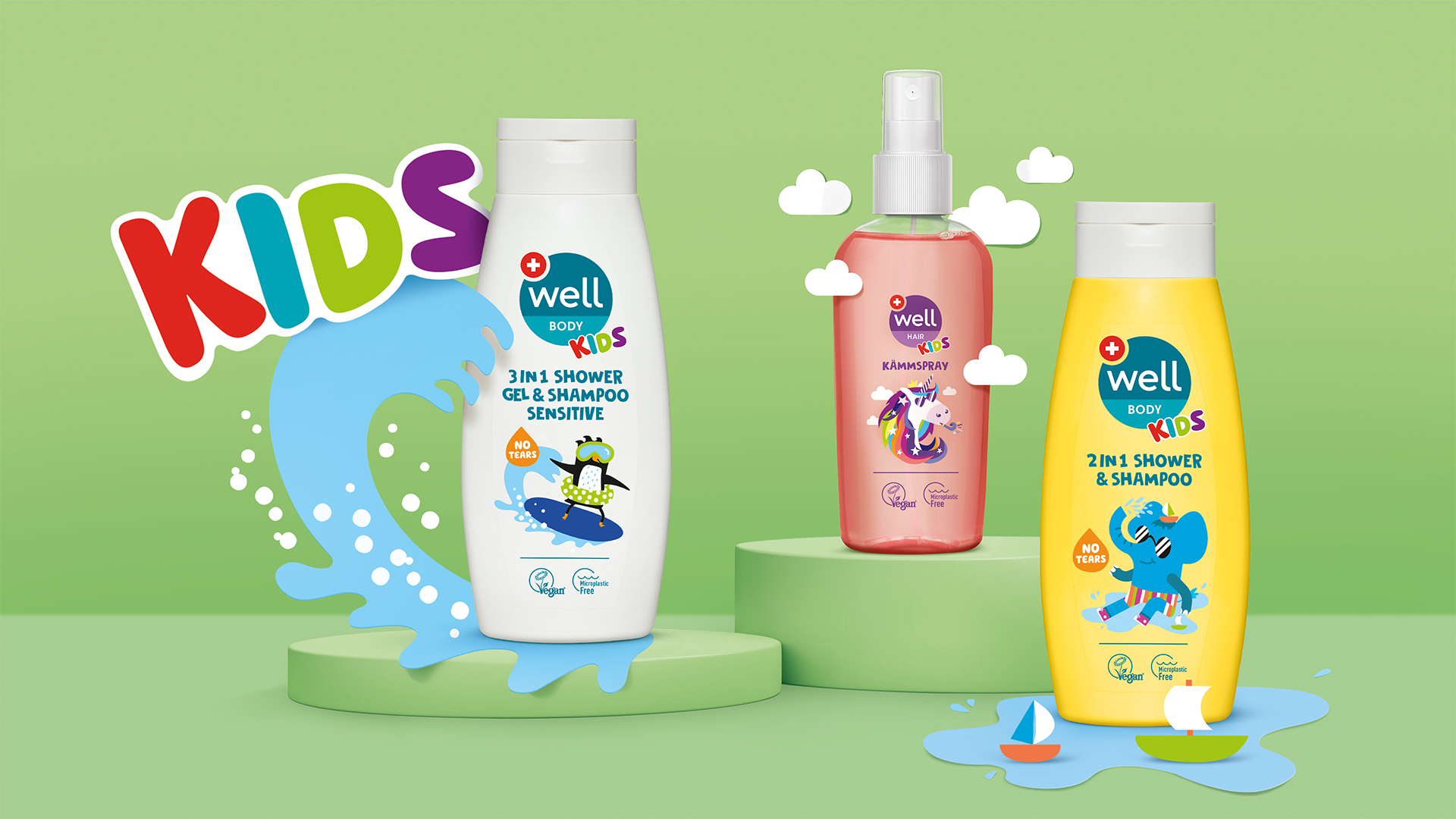
ABUZZ WITH COLOUR
Children's eyes will light up when they see the unique characters we have created for the Coop well kids range! Our colourful illustrations sparkle with a zest for life - full of personality, they transform each product into a little journey. The vibrant, fun colours provide on-shelf wow moments while still being in-line with the familiar well world. This is how to create really fun packaging design!
Are you looking for a competent partner in cosmetic packaging design?
Please feel free to contact us!