With heart & crown
Since 1959, the German van Well brand has stood for value-for-money, long-lasting porcelain and stoneware tableware. Our design team was commissioned to develop the design for 2 tableware sets, plus a logo relaunch and create a design manual for future packaging.
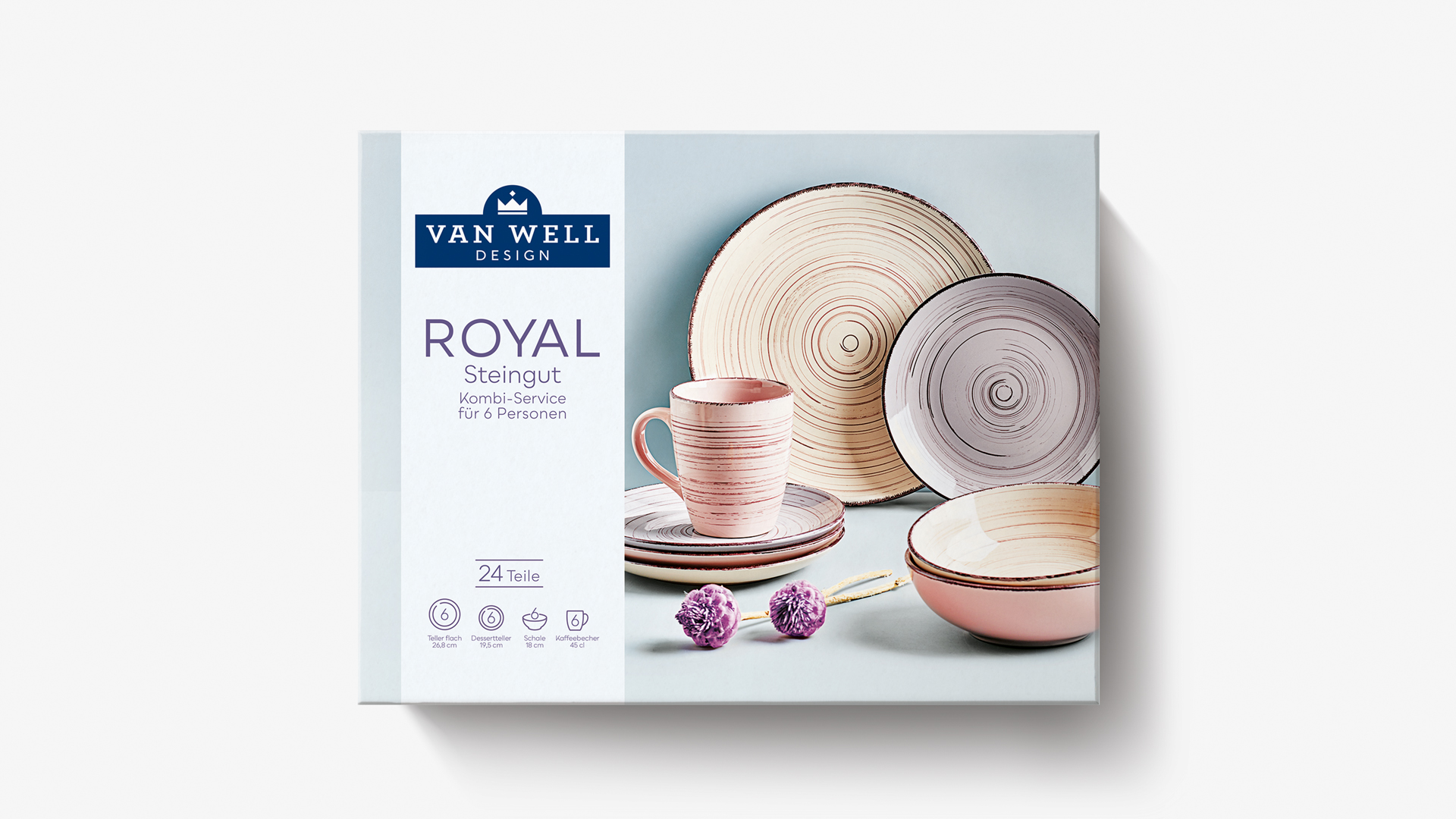
NEW
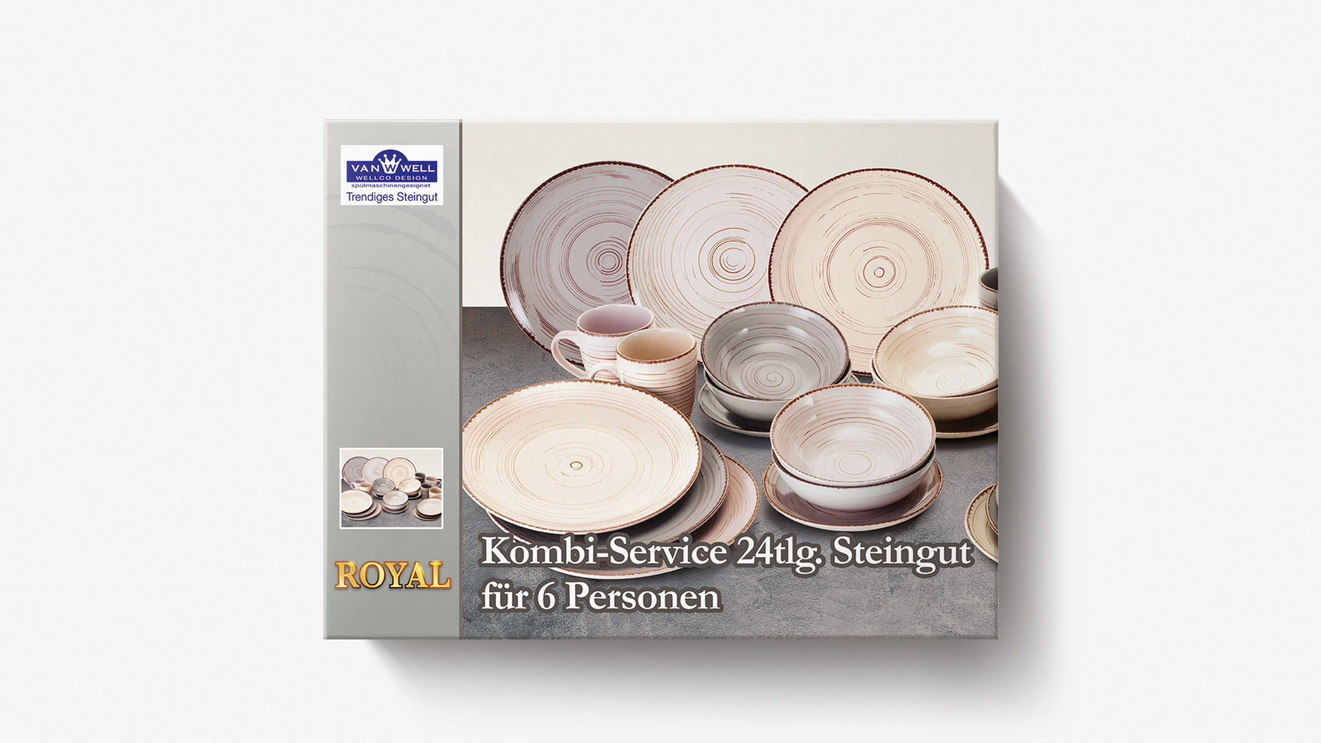
OLD
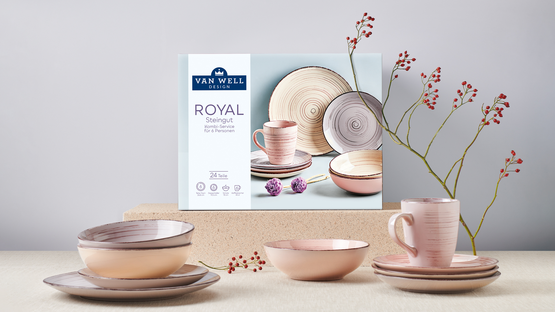
Stand-out new look
The old packaging design lacked emotion and the brand also needed to be highlighted more. With an elaborate photo-shoot at our in-house studio, we have created a completely new look with more aesthetics and spatial depth. The logo has been brought up to date with modern typography, more elegant colours and a new staging of the crown. The information band now looks harmonious with a clear, tidy structure. This has turned a rather inconspicuous packaging design into a real sales pitch!
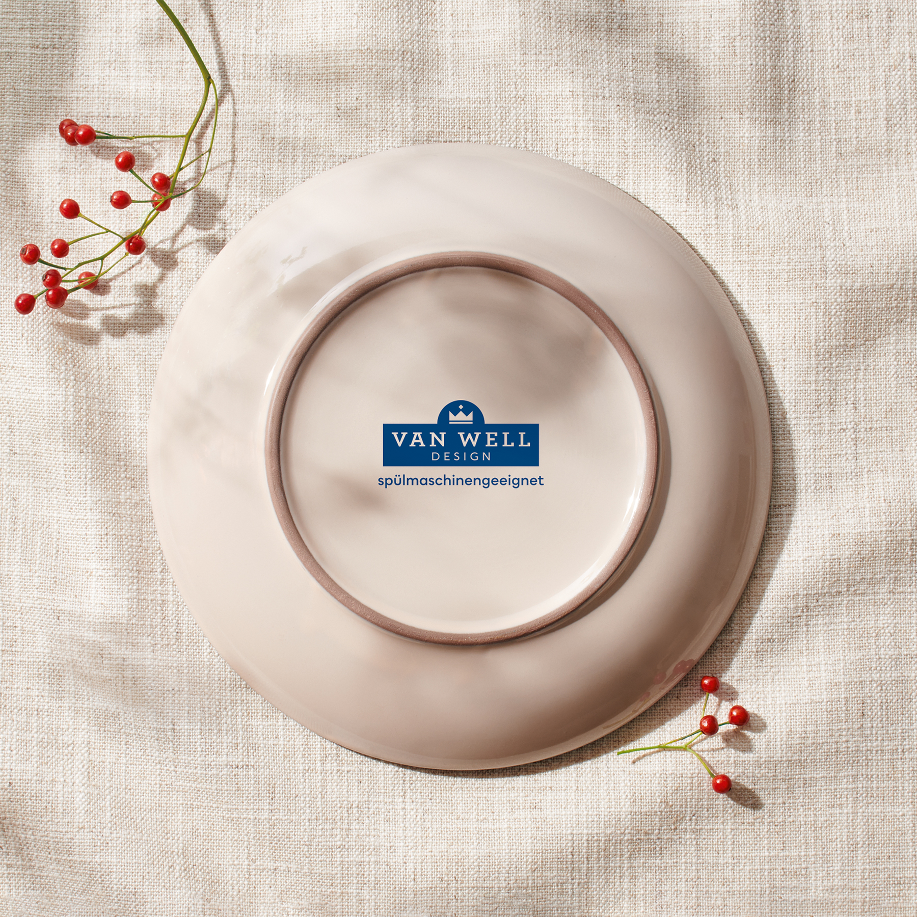
360° DESIGN
Our design team reinterpreted the crown with a less-is-more, contemporary look. The blue-grey colourway gives the new van Well logo an elegant character. The modern tableware is visible on all sides of the packs for more shelf-impact, regardless of where the sets are presented in-store.
NEW
OLD
We are experts in launches and relaunches.
Contact us to find out more!