Simply Kühne
The subtle yet distinctive taste, decades of experience and a wide range – three good reasons that have established Kühne’s pickled gherkins as the market leader. The family business was founded almost 300 years ago and the company’s gherkins have been a permanent fixture of German households since 1903. However, it was time to bestow the packaging design with a younger look and feel while still ensuring brand recognition. HAJOK came up with fresh ideas and a convincing concept that subsequent market research also confirmed as a winner.
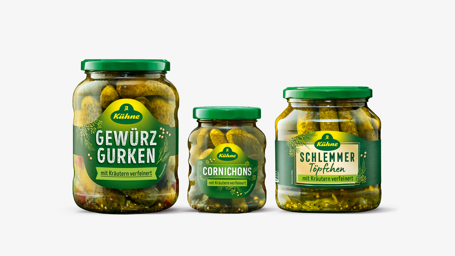
NEW
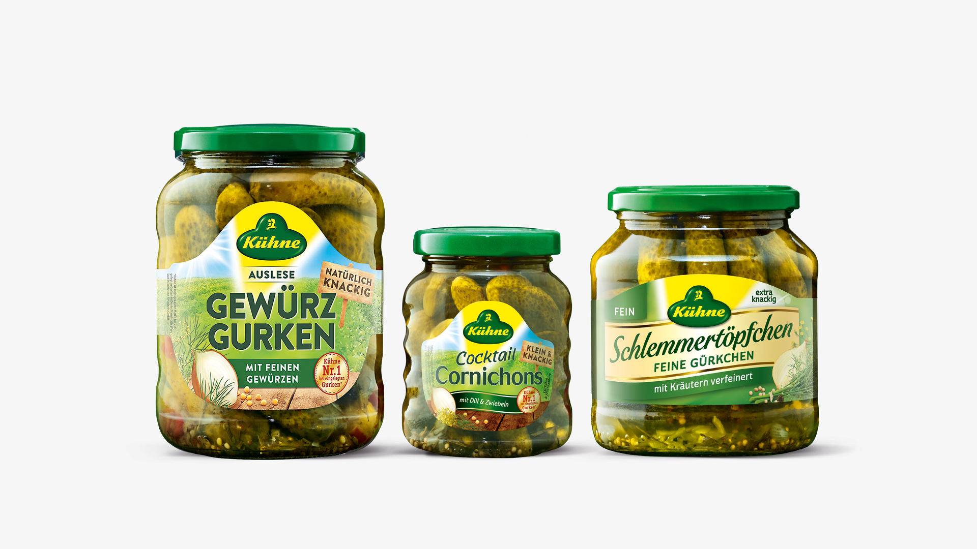
OLD
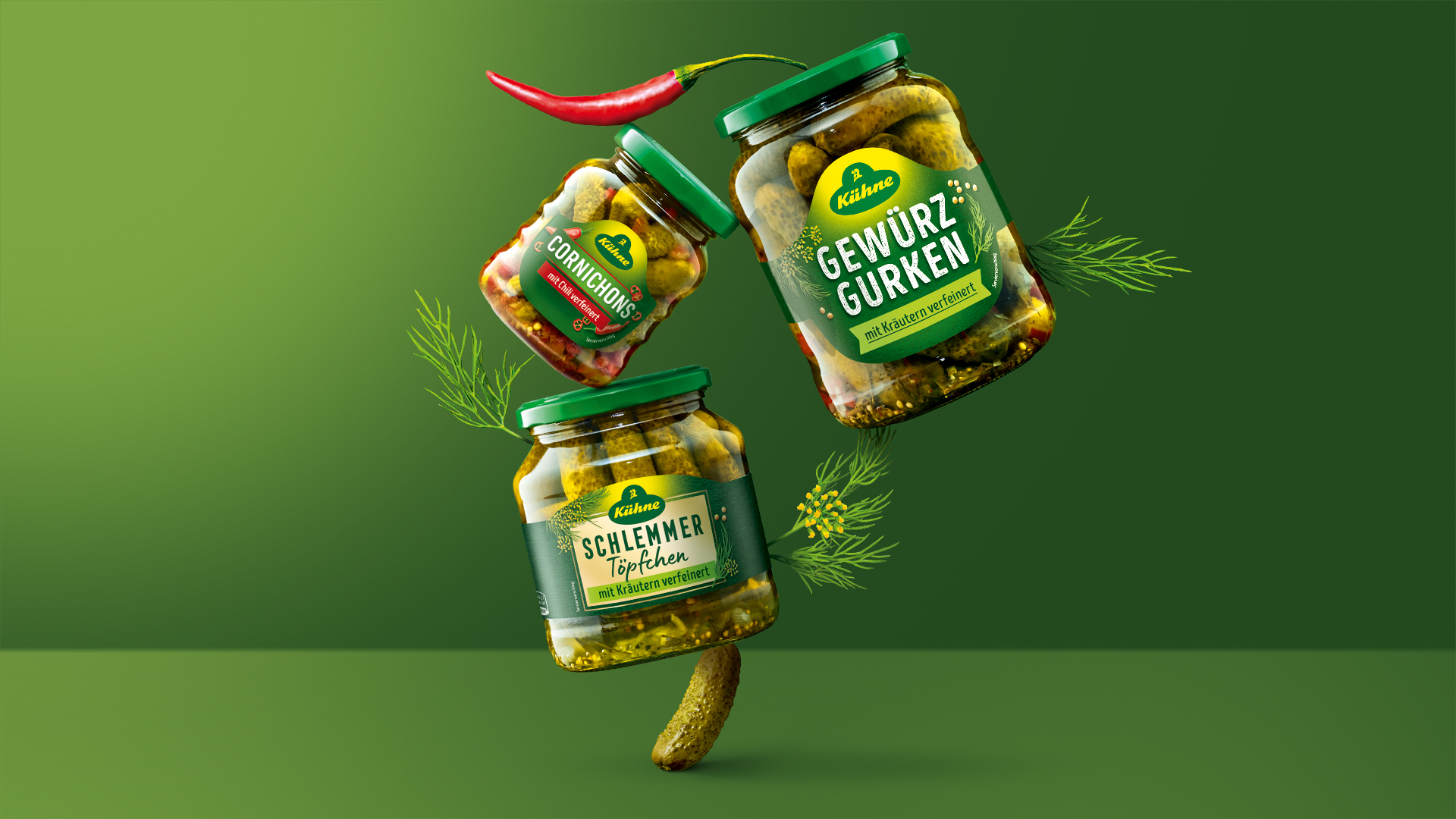
Unity in diversity
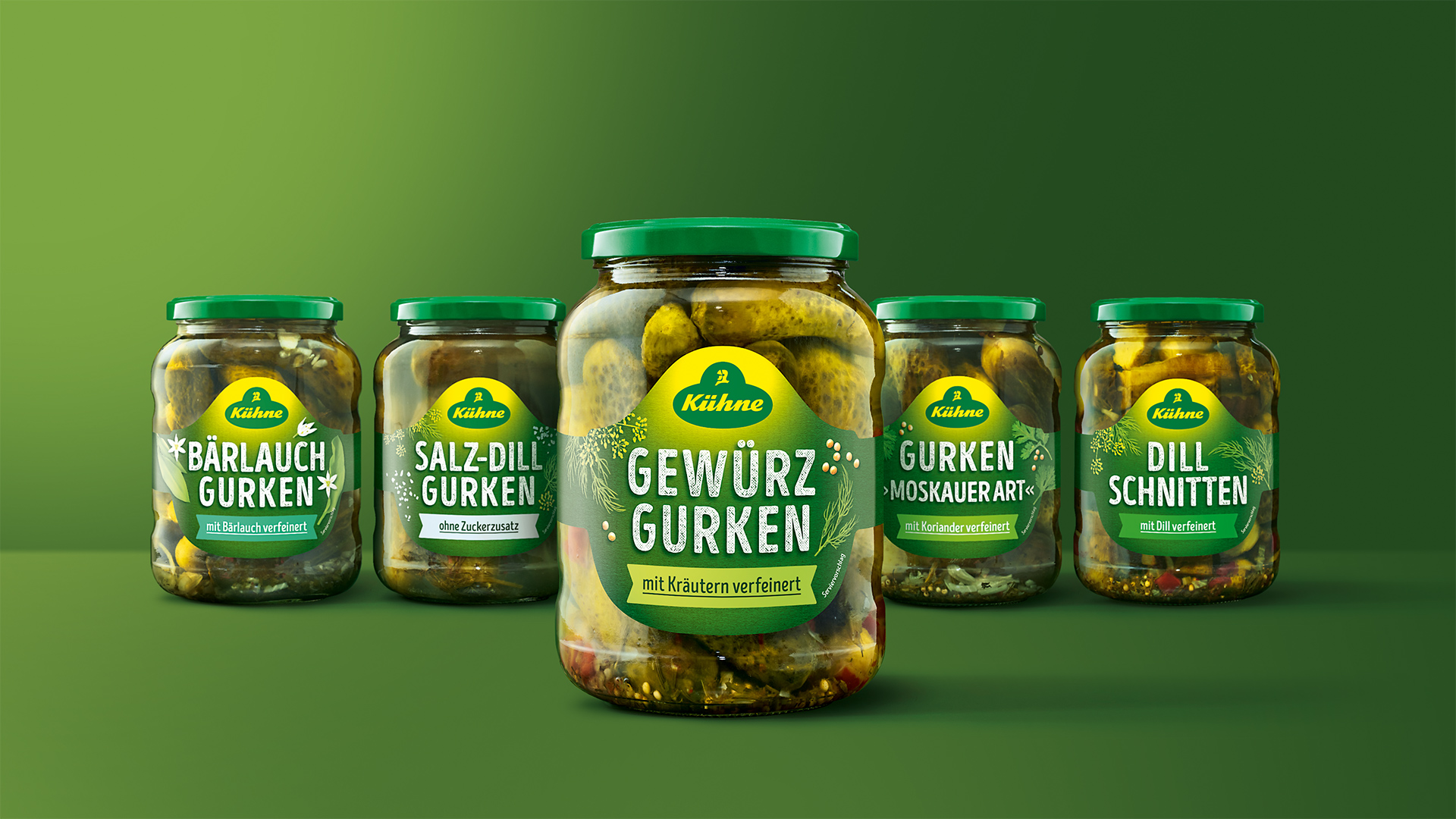
Looking at the entire range, the old design lacked harmony and there was no uniform visual brand element – a must-have for increased shelf impact. It was therefore our task to give the 31 different gherkin variants a clearer portfolio structure that enables consumers to quickly identify their product. The new look also had to be contemporary and approachable to appeal to younger buyers and convince them of the high quality of the pickled gherkins. Active involvement in consumer connect market research enabled the agency to gain valuable insights and establish a sound understanding of the target group.
In Focus
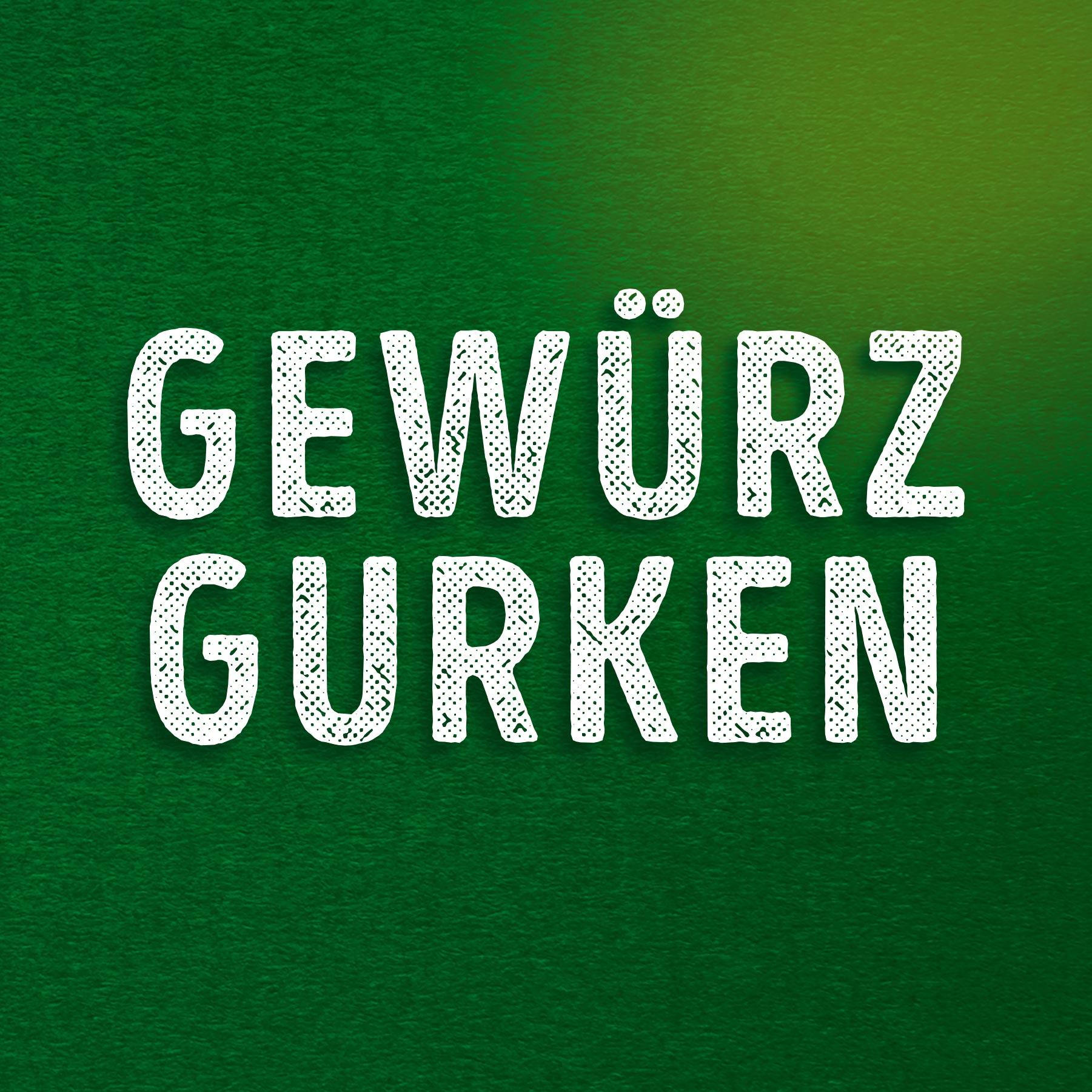
We have changed the on-jar information hierarchy for clear and compelling visual guidance – crucial for purchase decisions. The key focus across all varieties is now on the product name displayed in a striking, modern font; below which clear colour coding highlights each variant. Naturally presented herbs and spices surround the typography in a supporting role. The yellow triangle of the previous design has now given way to a soft glow that gently accentuates the Kühne logo. This reduced approach to the packaging design ensures quick on-shelf navigation enabling consumers to find their favourite Kühne products with ease.
We are experts in launches and relaunches.
Feel free to contact us!