Goed voor het hart
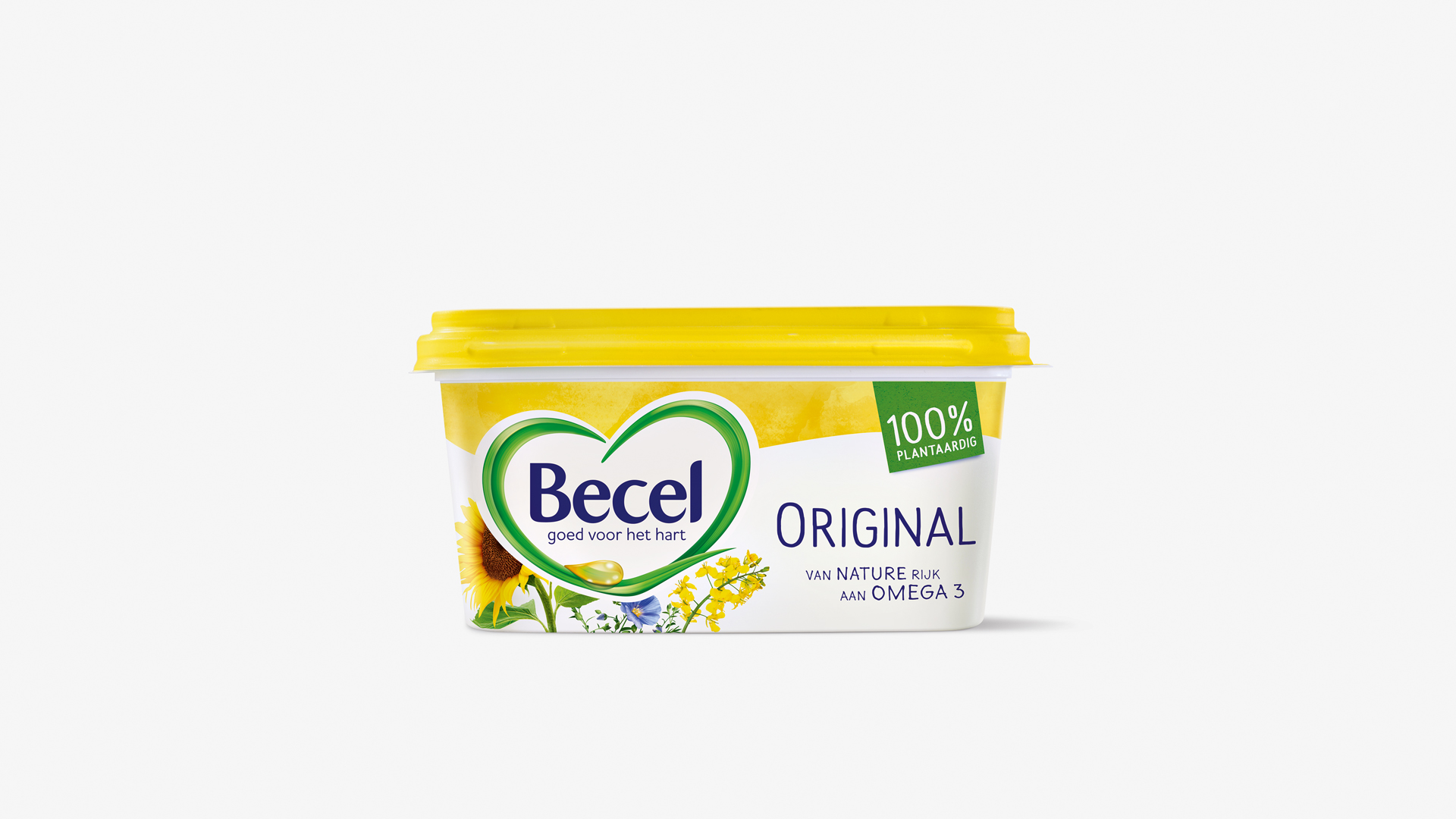
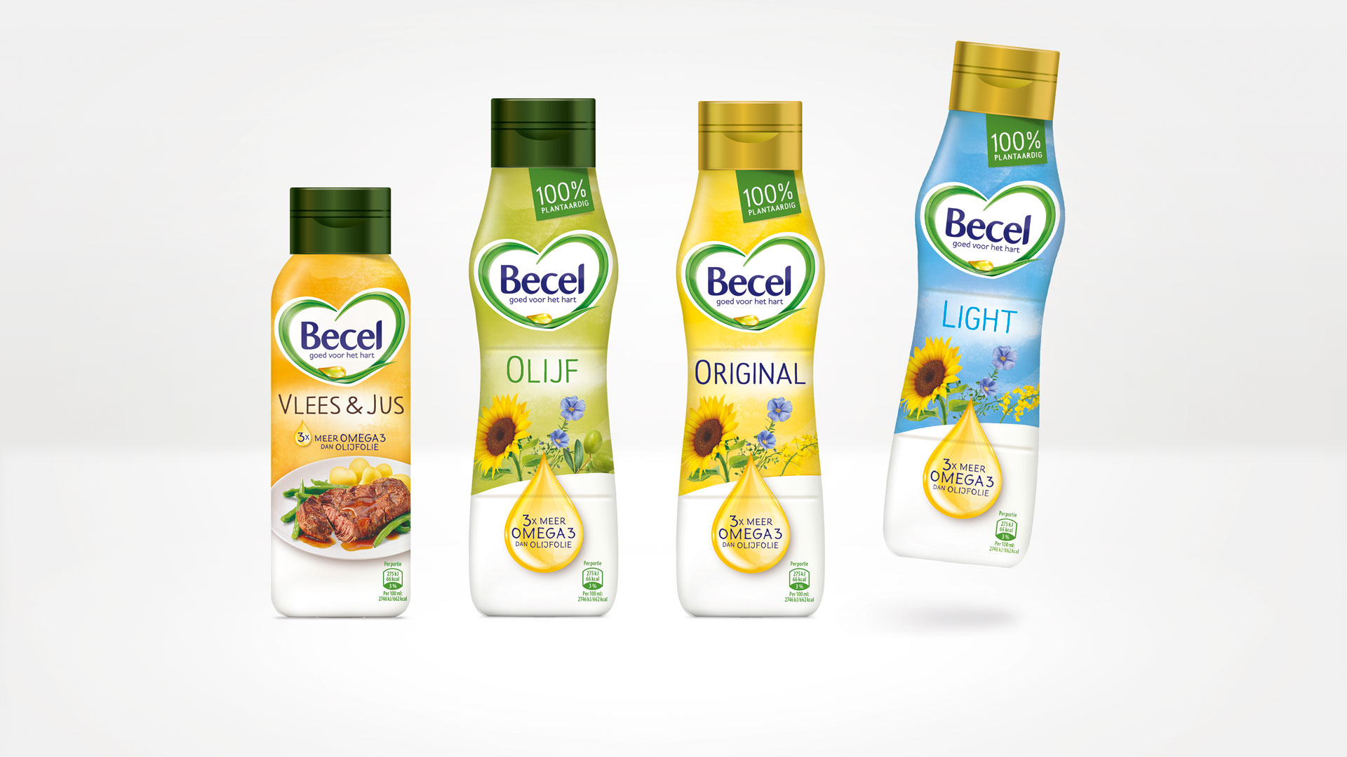
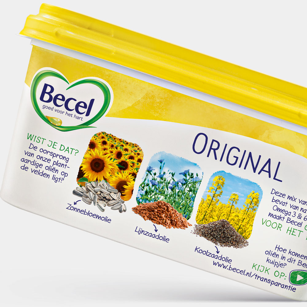
Becel, the healthy heart brand needed a new design to adapt to today’s consumer demands. Our task as the European lead agency for Becel was to redesign the entire Dutch product range for a more modern, more natural look that goes right to the heart.
Natural & approachable
Good for people and the environment – with the help of new positioning, the Dutch Becel range should more clearly communicate its benefits of naturalness and sustainability compared to diary products. During an intensive workshop with product and packaging developers, brand-managers and production managers, it soon became clear that the benefit of being 100% vegetarian should not just be visualised with a new logo but also with a complete new packaging design.
Design with heart
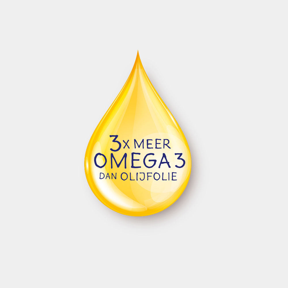
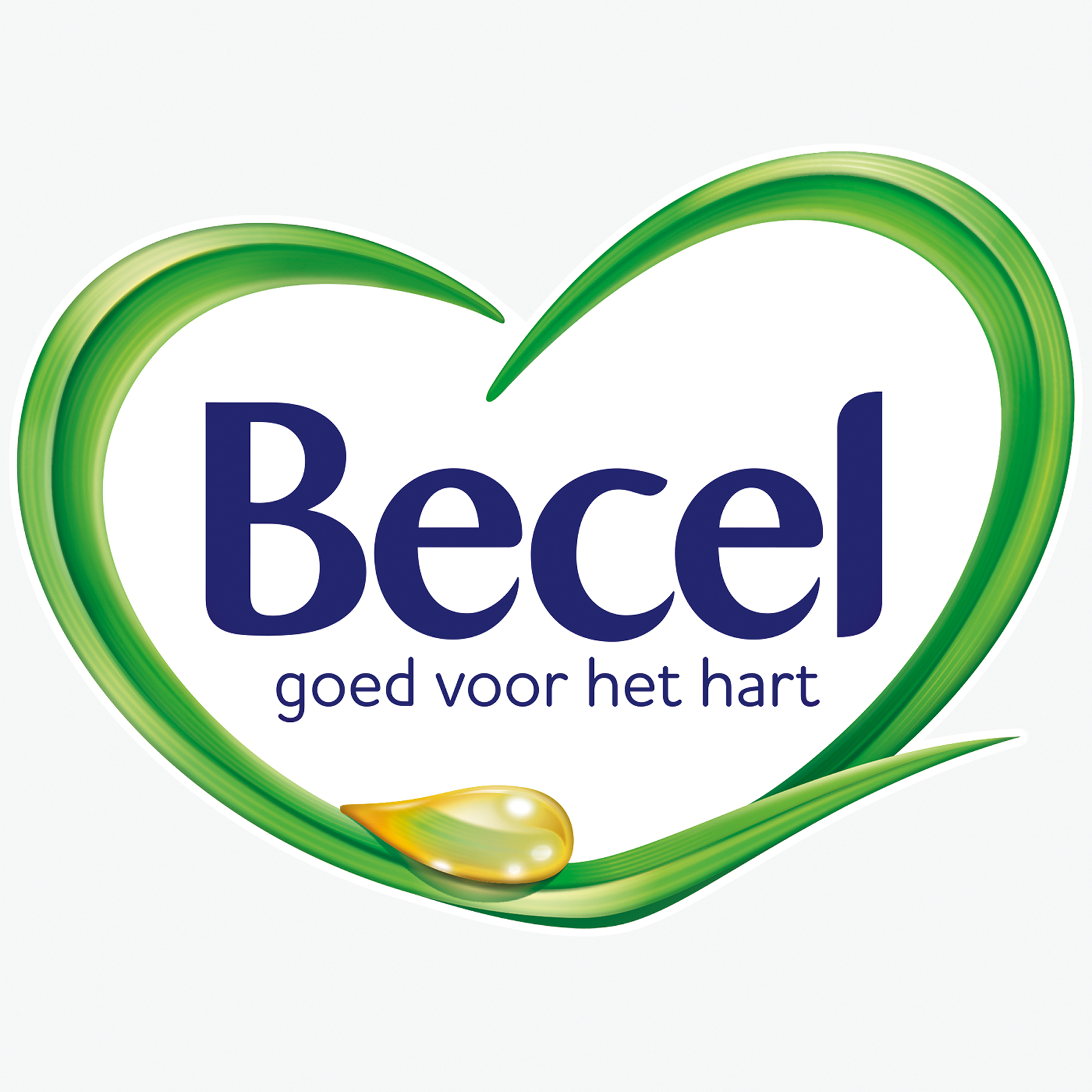
The redesigned logo, created from blades of grass and a drop of oil embedded in a meadow of flowers along with the water-coloured variety coding stand for naturalness. The claim “Goed voor het hart“ (“Good for the heart”) is integrated in the heart-shaped logo for the first time and is thus directly linked to the brand.
Facts & Figures
-
Relaunch of the whole Becel range for the Netherlands
-
Participation at a design workshop
-
Brand strategy
-
Design strategy
-
Logo development
-
Packaging Design

We are experts in launches and relaunches.
Contact us to find out more!

