THE BREAD EXPERTS
Starting as a small bakery called “Glockenbäckerei” (Bell bakery), Glockenbrot has grown to become one of the most important bread producers in the Rhine-Main region of Germany in the last forty years. Glockenbrot, combining tradition, technology and attitude was now ready for its next big step.
Our task was a corporate relaunch that respects the company's heritage while making its future clearly visible. As a first milestone, we recommended a unified company name: Glockenbrot.
Facts & Figures
-
Positioning workshop
-
Corporate design
-
Logo development
-
Icon development
-
Brandbook
-
Digital design
-
Shooting supervision
-
Lorry branding
-
Promotion articles
-
Interior branding
-
Guidance system
PROFESSIONALS AT WORK
The goal of the relaunch was to strengthen Glockenbrot as a B2B brand within the REWE Group and to bring the company, both visually and in terms of content, to where it stands today: as a modern, responsible employer and high-performing business partner.
As one of the biggest challenges for any trade is finding and retaining employees, employer branding became a core element of the project. While Glockenbrot had long since established itself as an attractive employer in the region, its previous branding still seemed like a relic from the 1980s: outdated, distant and out of touch. In an intensive positioning workshop with the client we redefined the brand essence – which serves as a strategic foundation for a branding strategy that resonates with B2B partners, job applicants and employees alike.
AS CLEAR AS A BELL
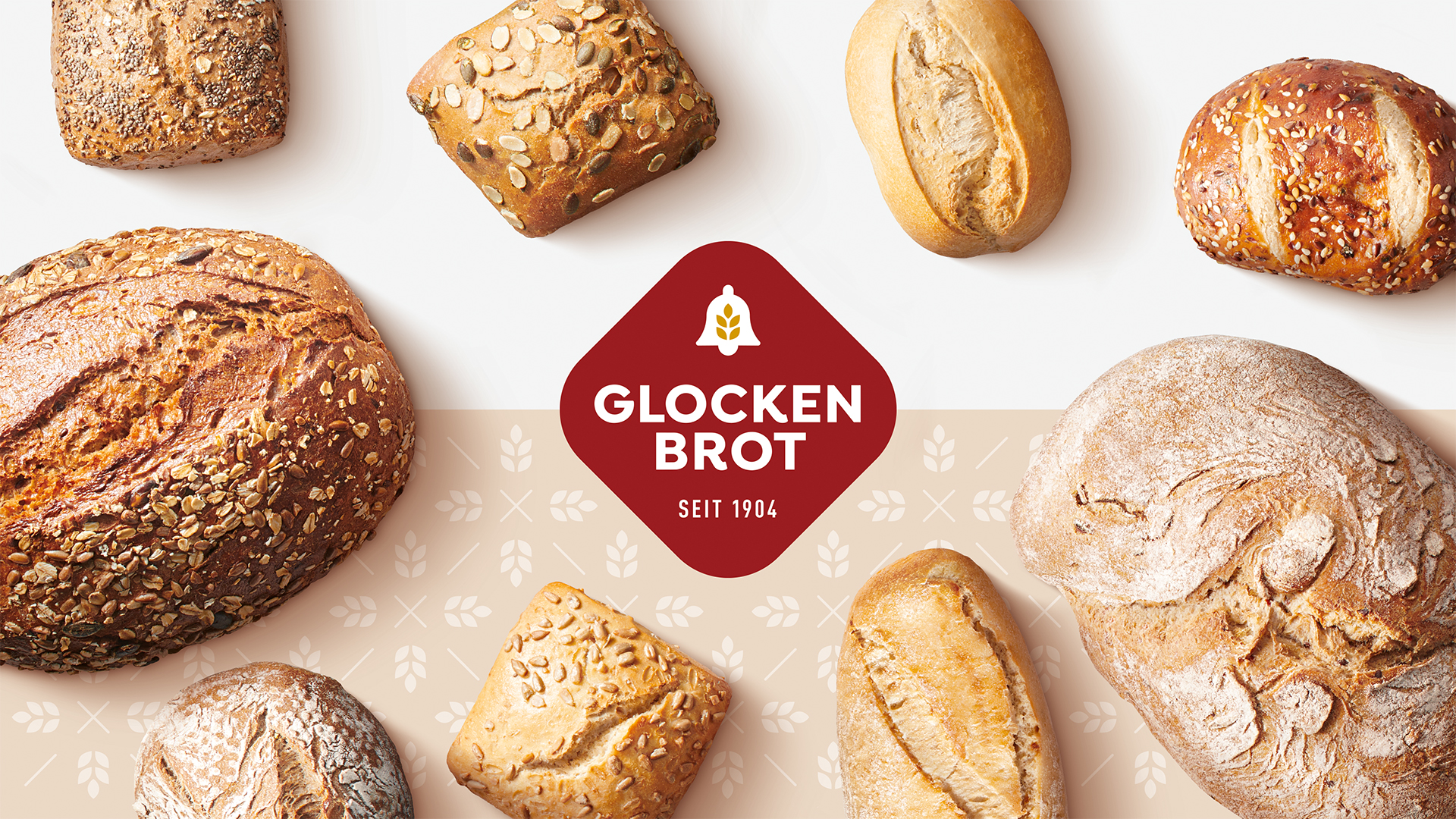
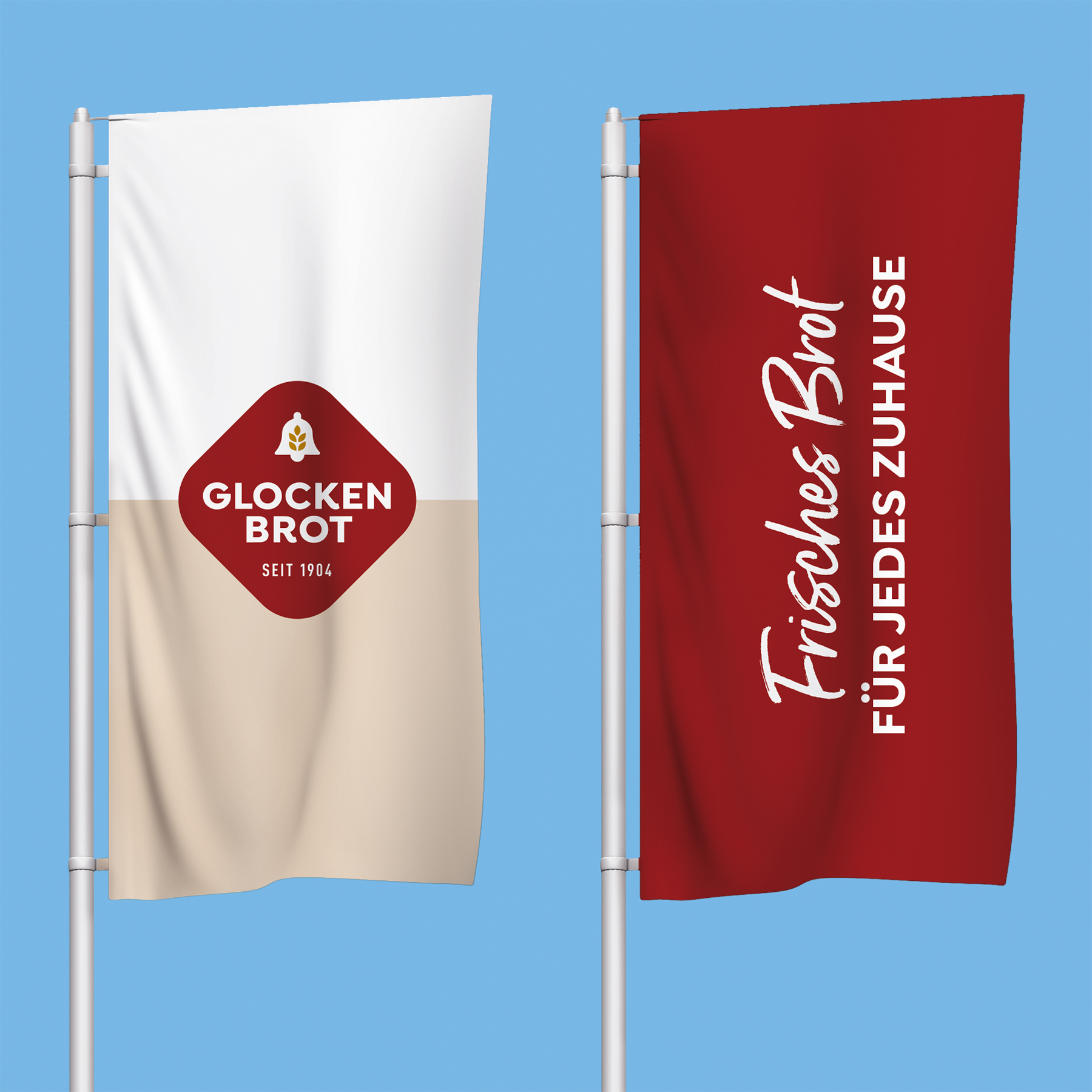
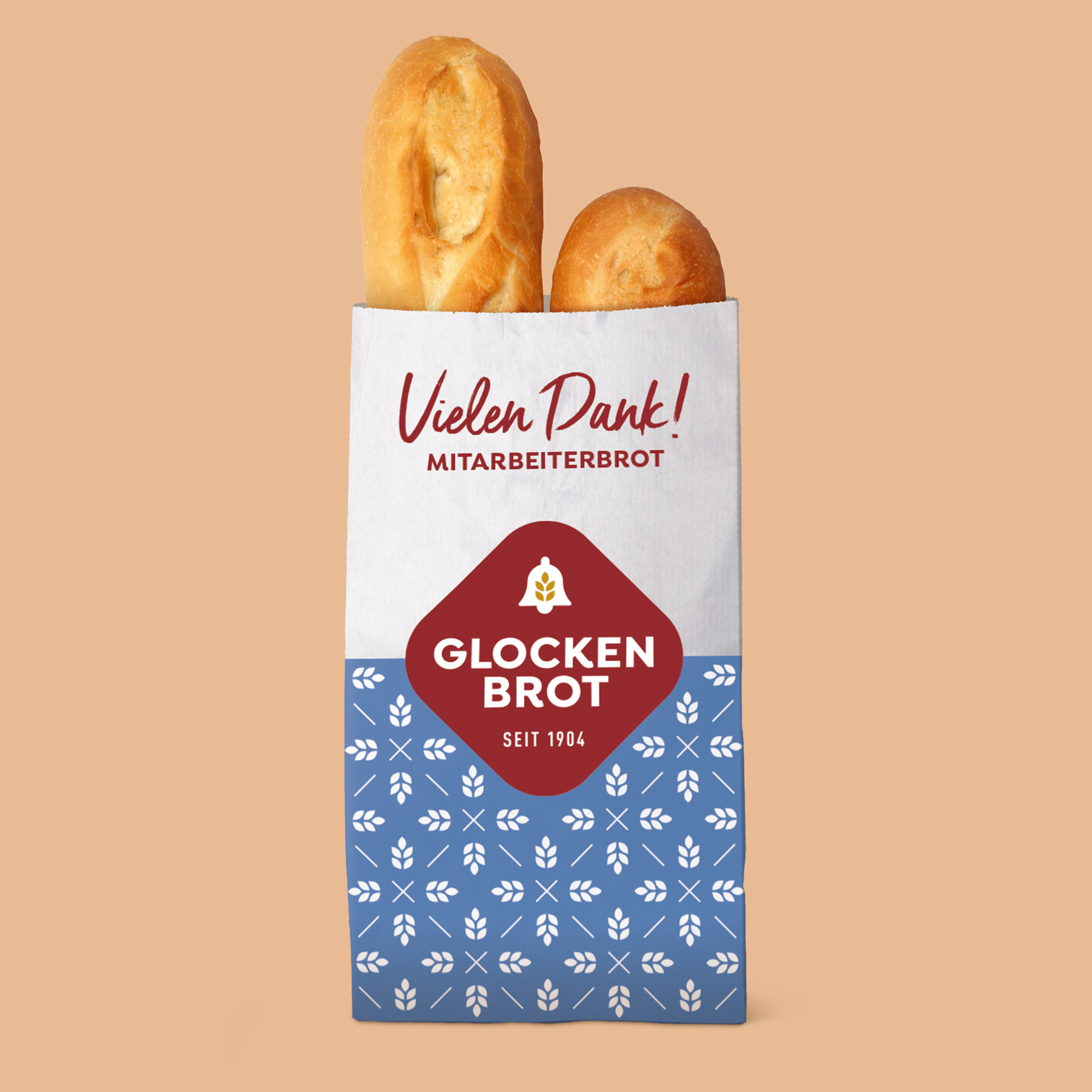
The new corporate identity combines the best of both worlds: the strength of skilled craftsmanship and the precision of modern production. The bell and the signature red hue remain as brand anchors. These visual elements are complemented by a modular design system of natural colours, comprising clear typography and unambiguous icons. The result is a brand presence that appears professional yet approachable, authentic and confident.

HARMONY
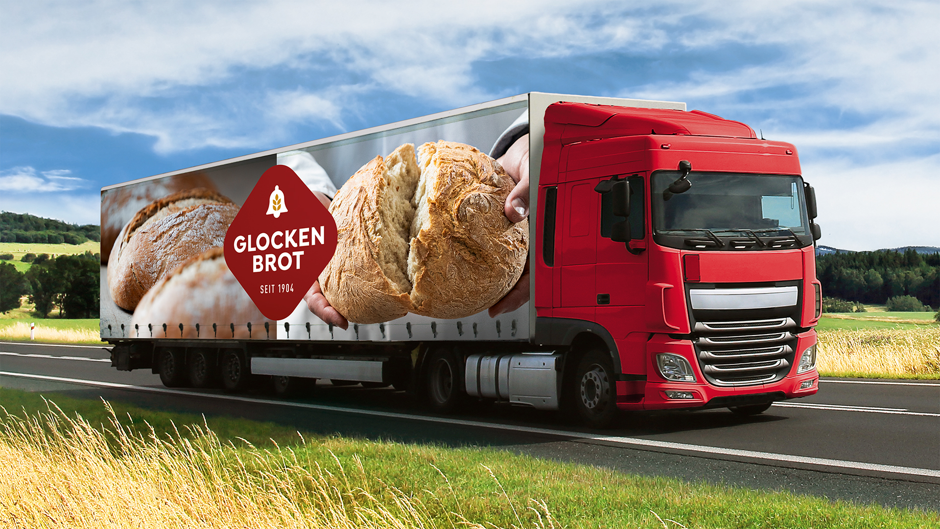
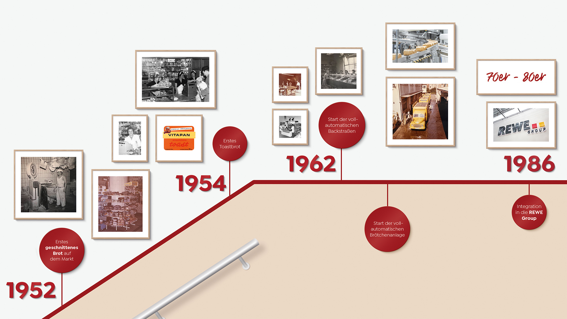
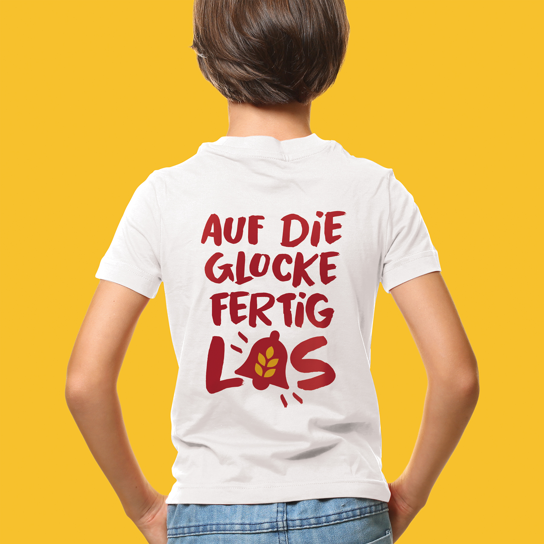
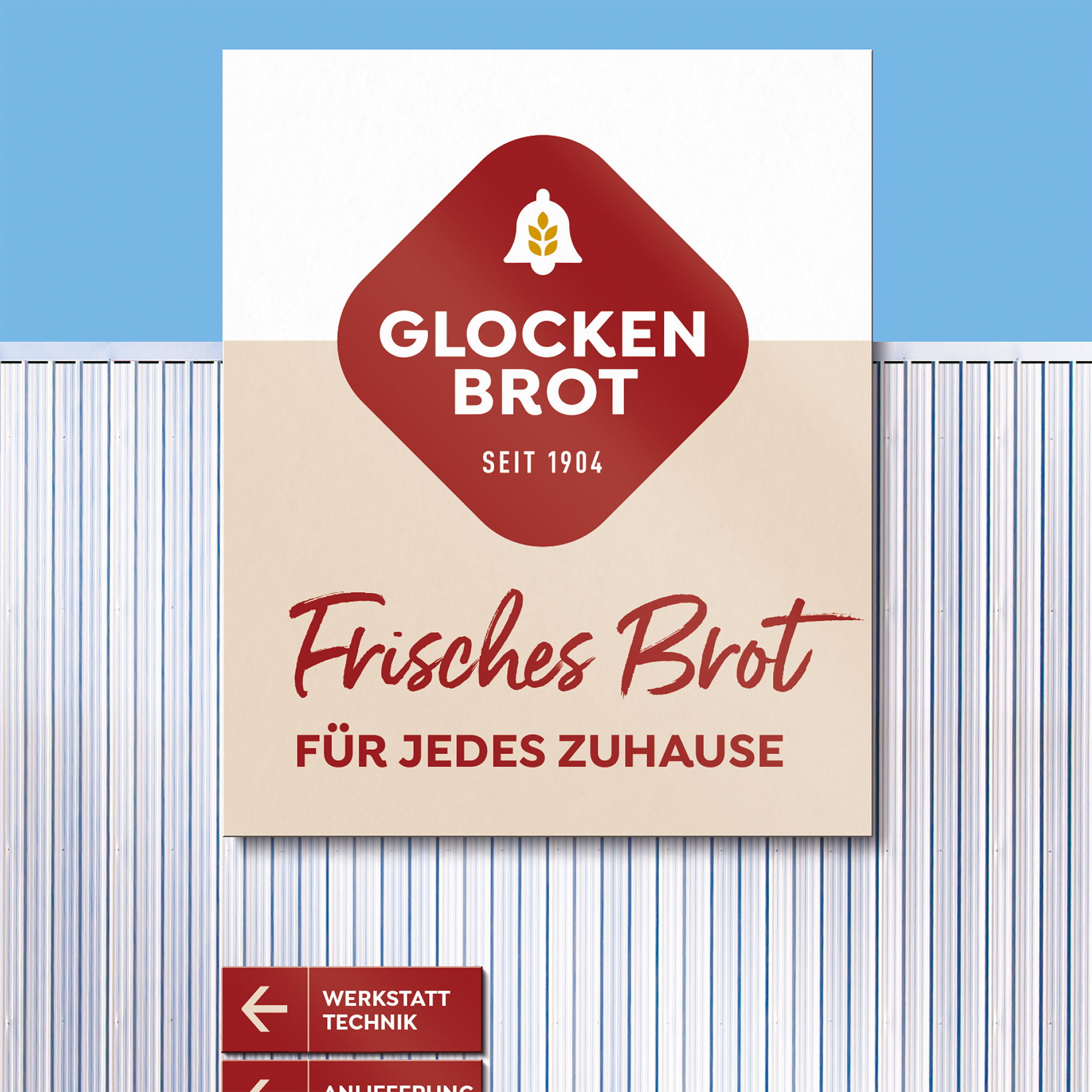
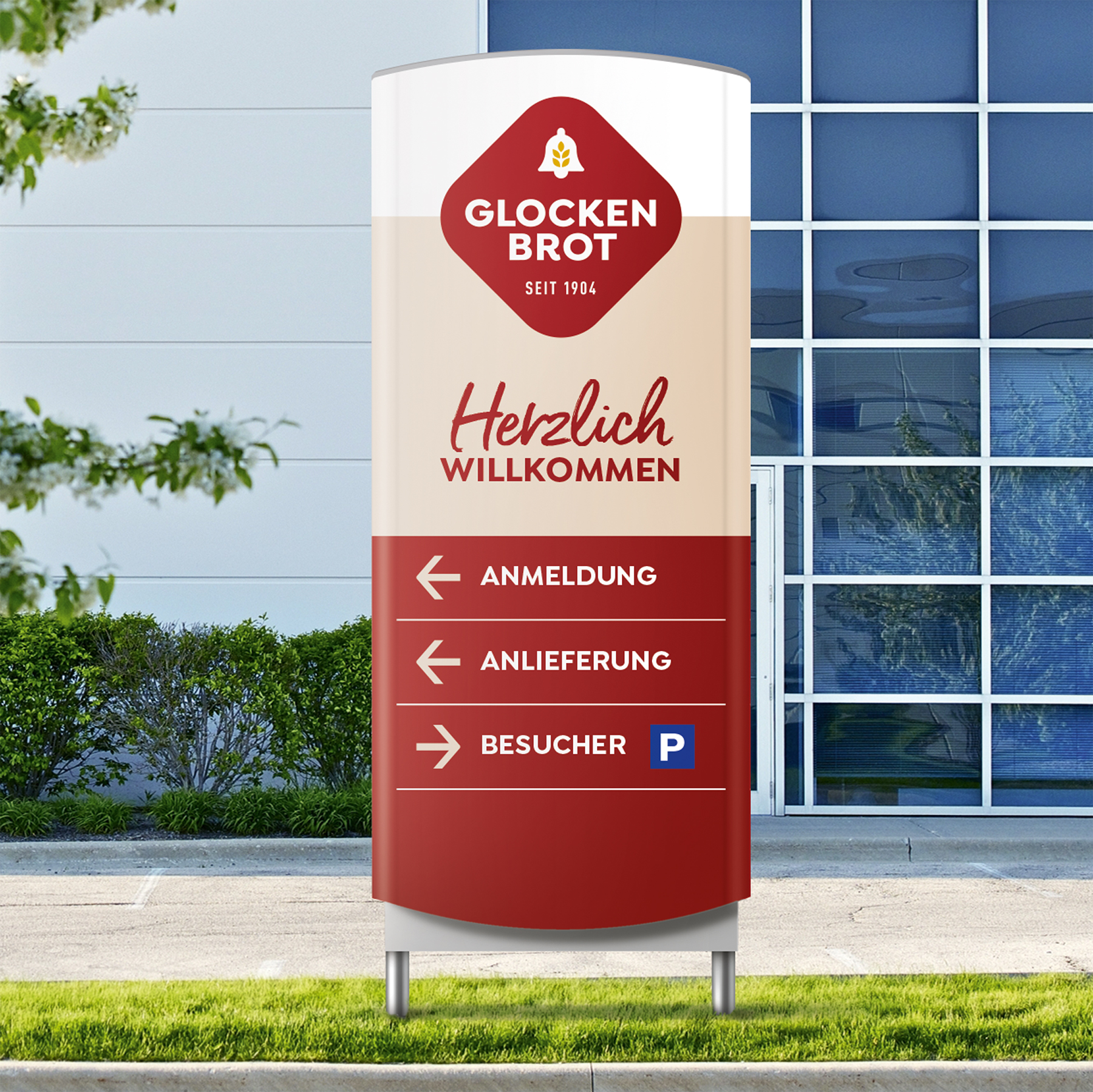
Two locations, many touchpoints – one look. We redesigned reception areas, hallways, the cafeteria, conference rooms and the complete on-site signage system. Employees experience the relaunch every day: from T-shirts and historical photos in the stairwell to bread bags. The new identity is also reflected off-site: on trucks, at trade fairs and on all communication materials. Instead of using stock photos, we focused on real people. We were responsible for conceiving the photo shoots, selecting photographers and staging staff in their everyday work environments. The result is honest, authentic and contributes to a sense of identity for the whole company.
OVEN-FRESH NARRATIVE
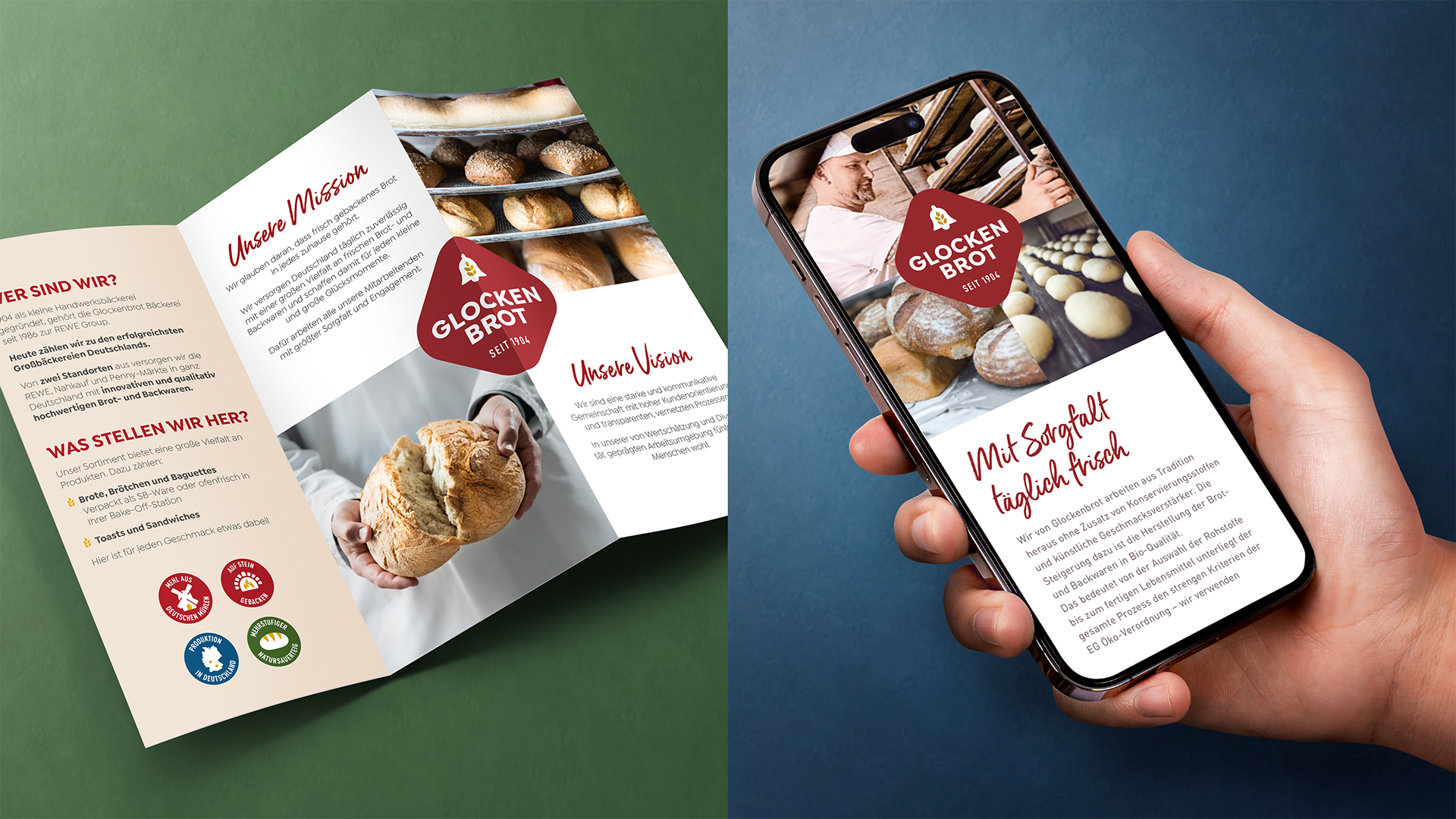
The website and brochures convey the new bright, clear and informative look both in print and digitally. The modular corporate identity creates space for what makes Glockenbrot special – the quality of its products, the origin of its raw materials and the people who make it all possible. The new look demonstrates that Glockenbrot is more than just a producer. It's a company that values teamwork and makes its employees visible. Ultimately, they are who make Glockenbrot what it is, day in and day out.
