The right choice
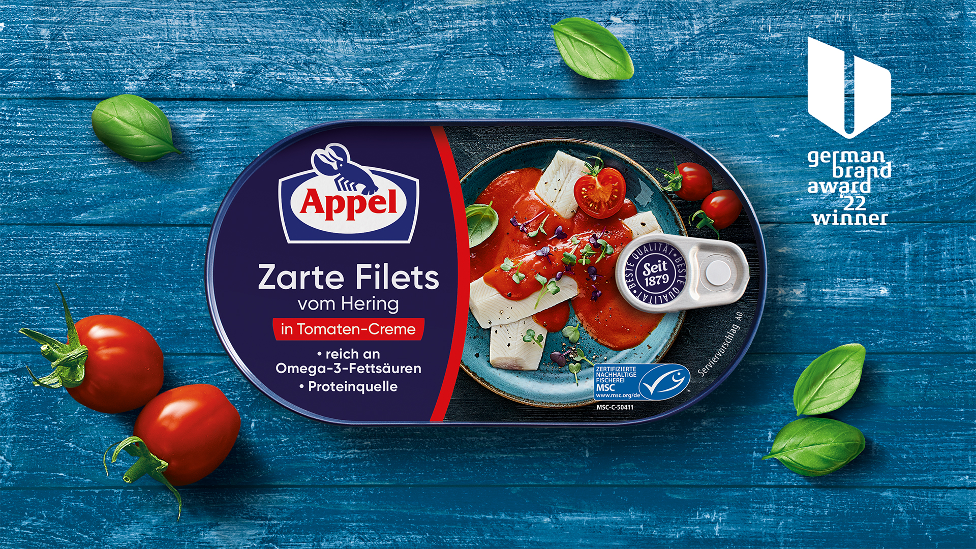
More than 140 years ago, Heinrich Wilhelm Appel sold the first pickled herring fillets in his grocery store in Hanover, northern Germany. Today, Appel, with its headquarters in the coastal town of Cuxhaven, is one of the most traditional fish and delicatessen brands in Germany. The eye-catching logo and the striking blue colour guarantee brand recognition. However, the time had come to modernise pack appearance and bring it up to date with the changing needs of the target group. Appel commissioned us as a packaging design agency with the relaunch of over 50 products.
Award-winning

Honoured with the German Brand Award for ‘Excellence in Brand Strategy and Creation’
Facts & Figures
-
Design relaunch of more than 50 products
-
Competitor- & design analysis
-
Category codes analysis
-
Concept development
-
Packaging design food
-
Logo adjustmen
-
Tray design
-
Advertisement design
-
Photo shooting
-
Image editing
-
Final artwork
More Indulgence
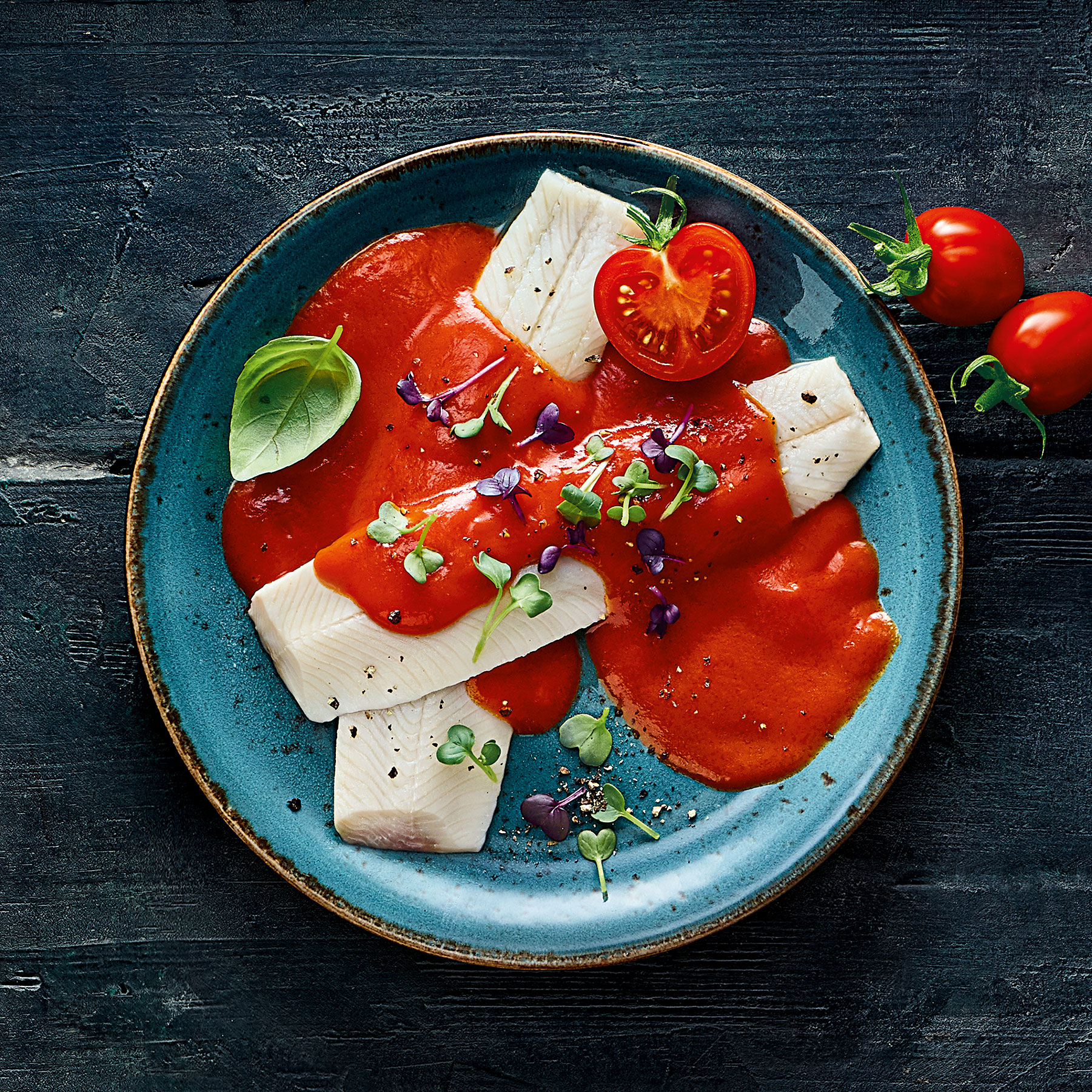
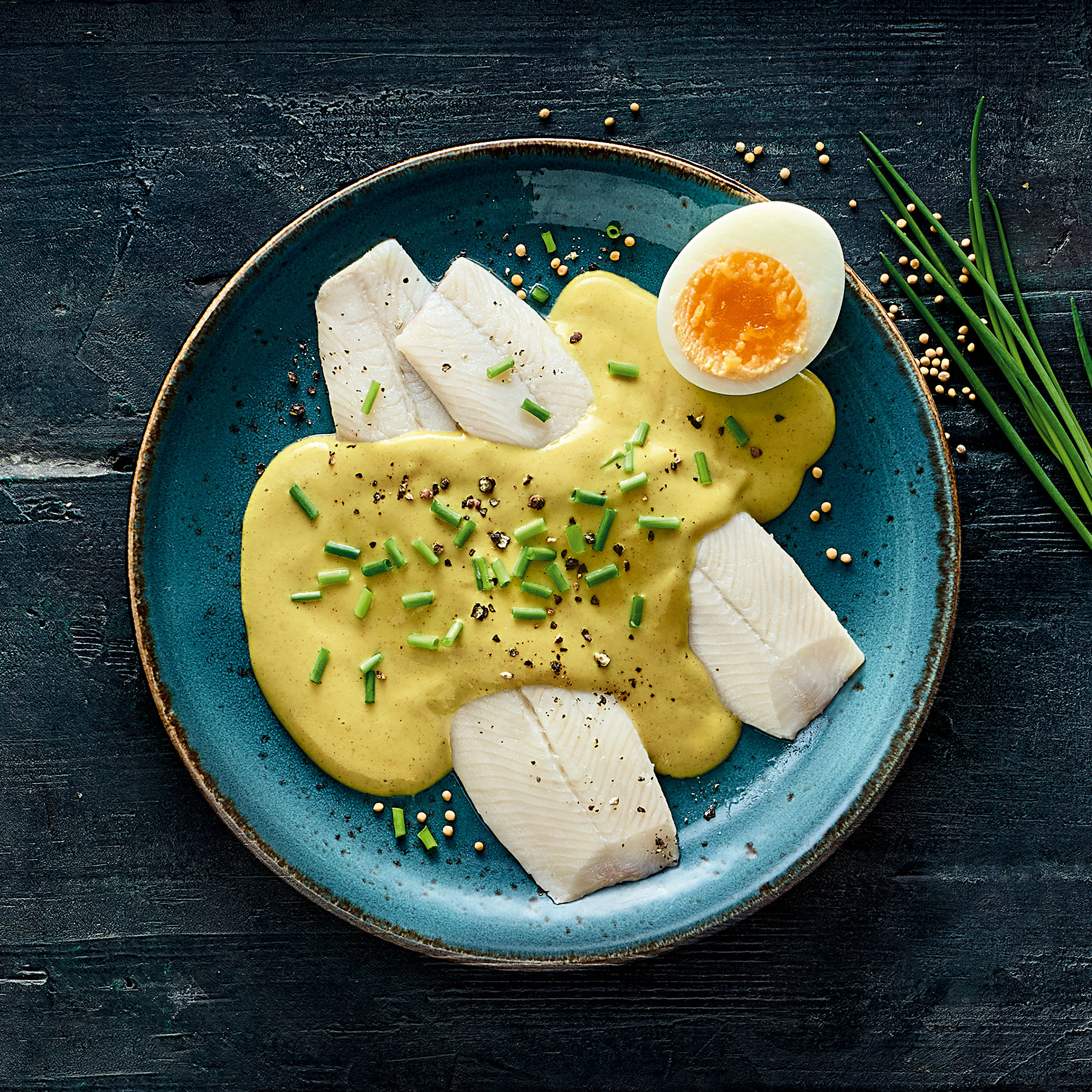
The high quality of the Appel food brand was barely visible and the product presentation no longer generated any contemporary appetite appeal. We recommended more clarity, more authenticity and more enjoyment! To rejuvenate the brand and strengthen shelf impact, we made use of modern typography, high-contrast colours and naturally staged food images.
Well done
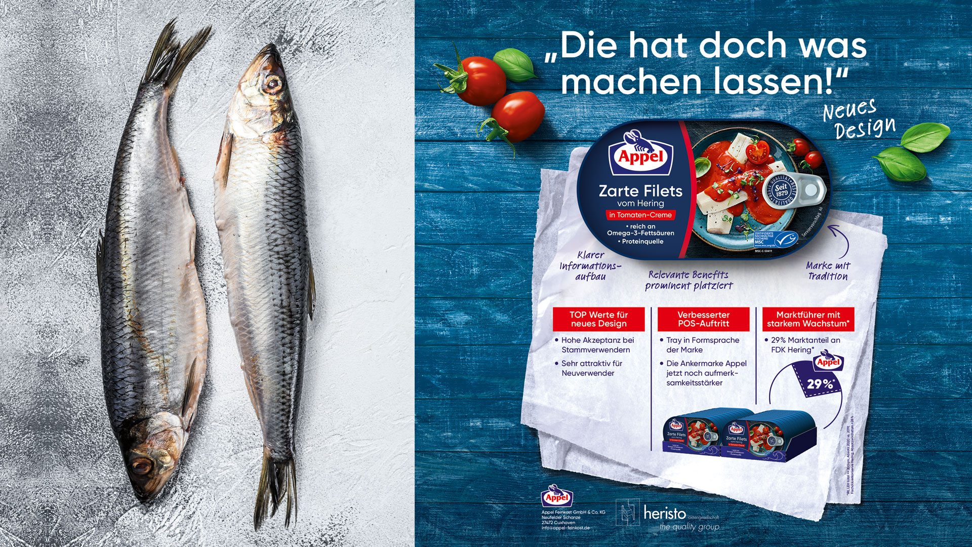
In addition to our design expertise, our copywriting skills came to the fore with this project as we developed an advertisement promoting the new packaging design.
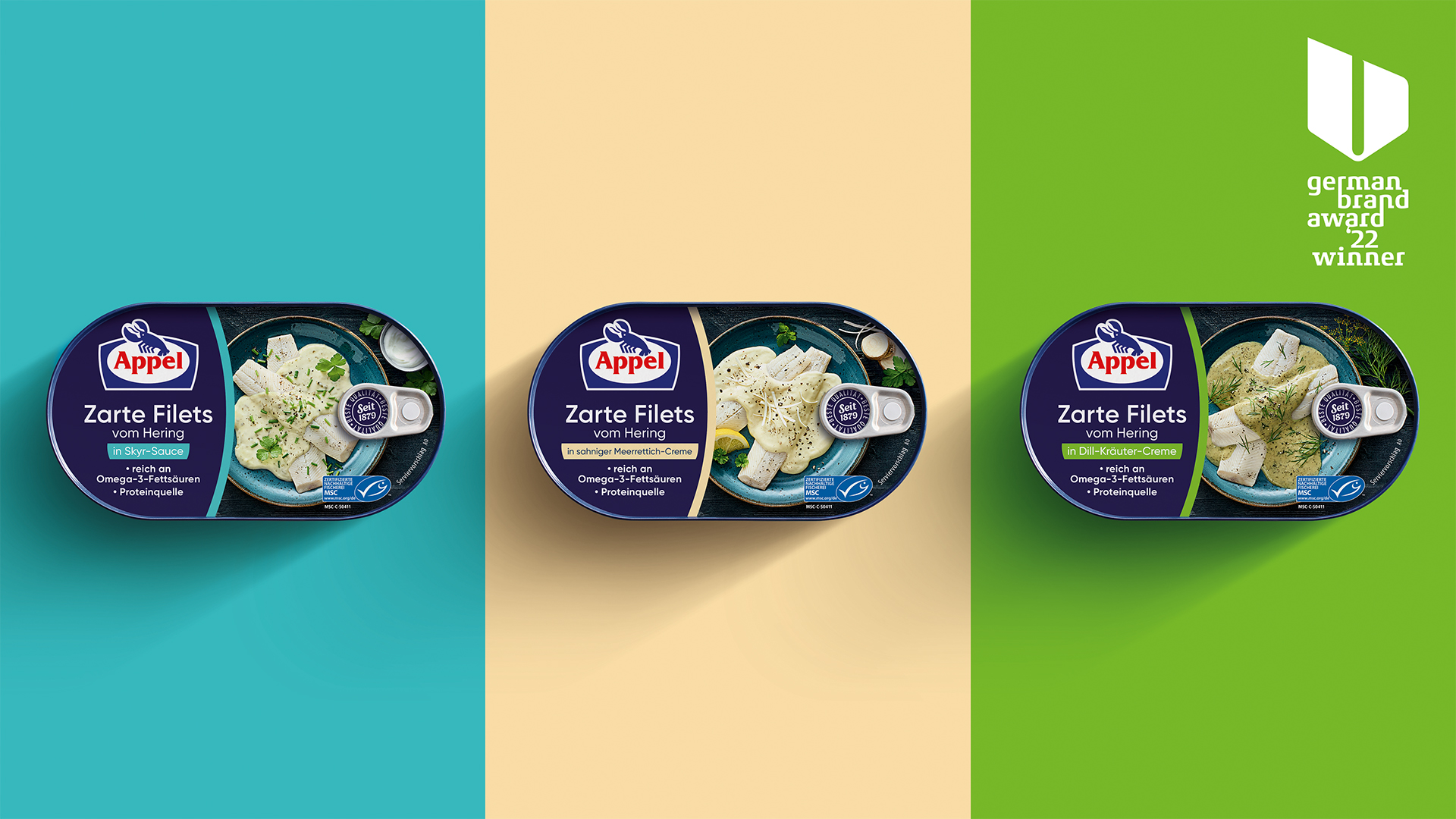
Tender inside, yummy outside
The famous Appel trademark, a lobster with big claws, was designed by the artist Änne Koken back in 1905. This timeless logo still works today. We decided to simply remove the reflections giving it clarity and a more modern look. The colour effect of the new packaging design is darker overall and underlines the quality of the products. The curved line ensures brand recognition and separates the on-pack information area from the serving suggestion. This contemporary top view has natural appetite appeal. The clear structure and modern typography help establish differentiation across the overall portfolio. Nordic, modern and eye-catching – Appel has a new look!
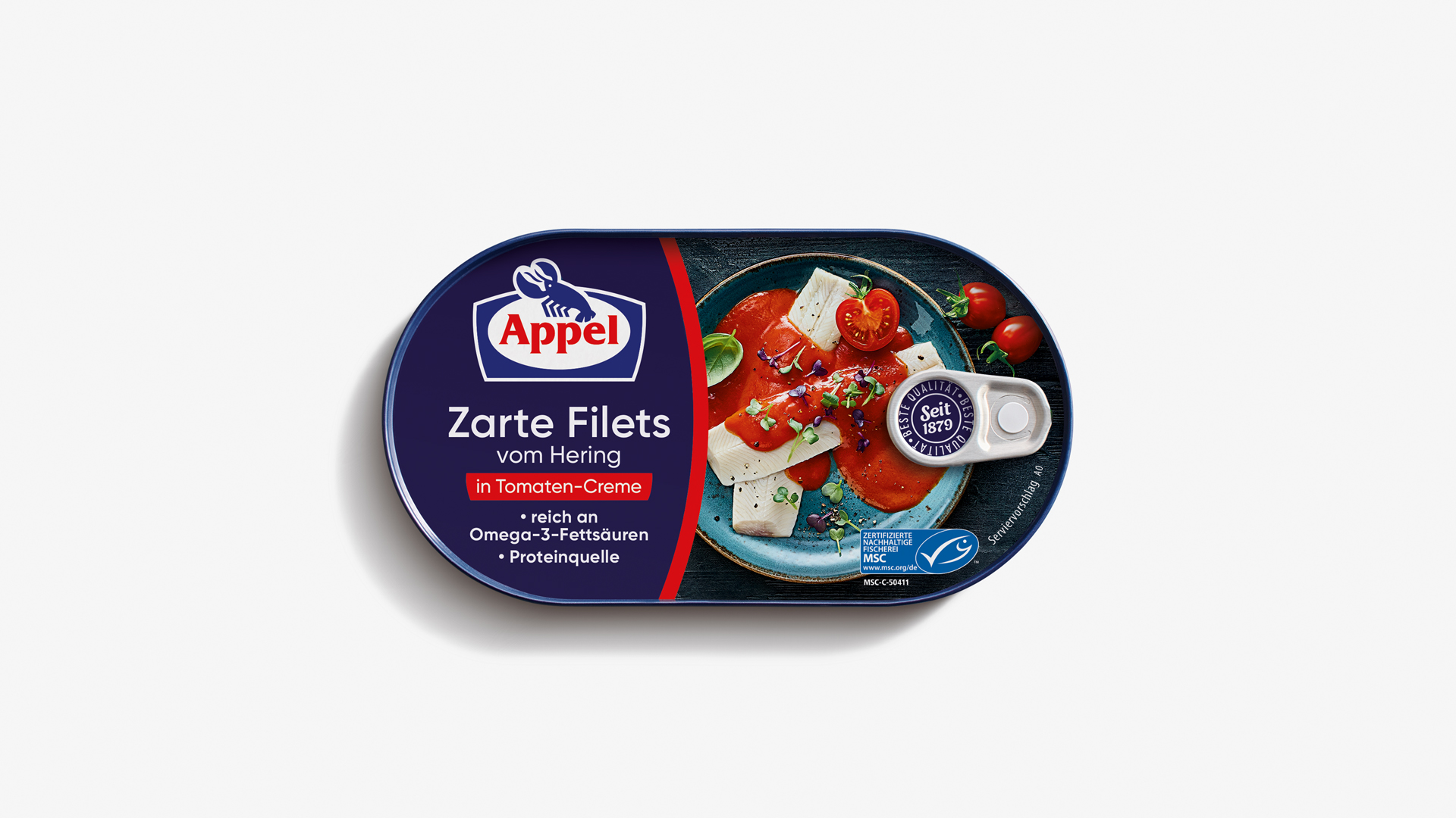
NEW
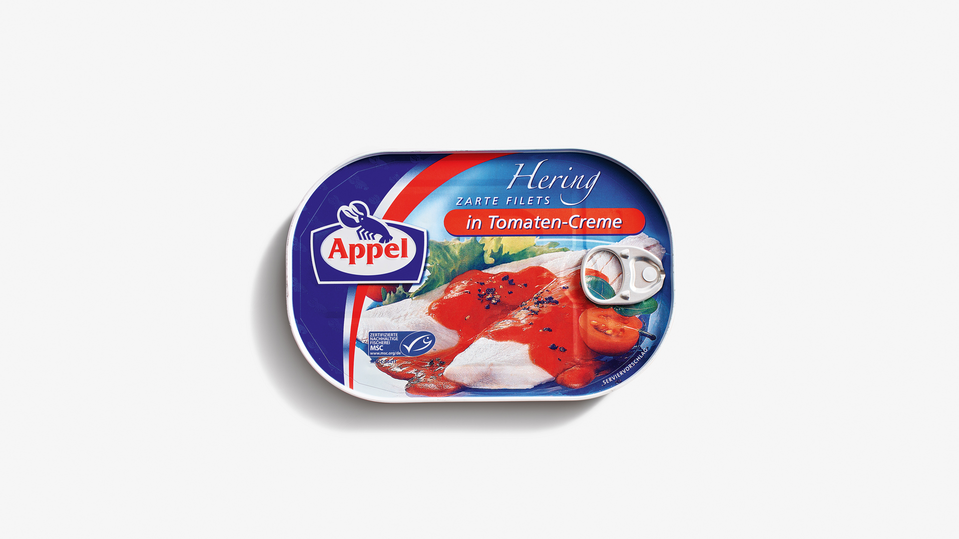
OLD
Would you like to know more about our work?
Get in touch!