Absolutely iconic
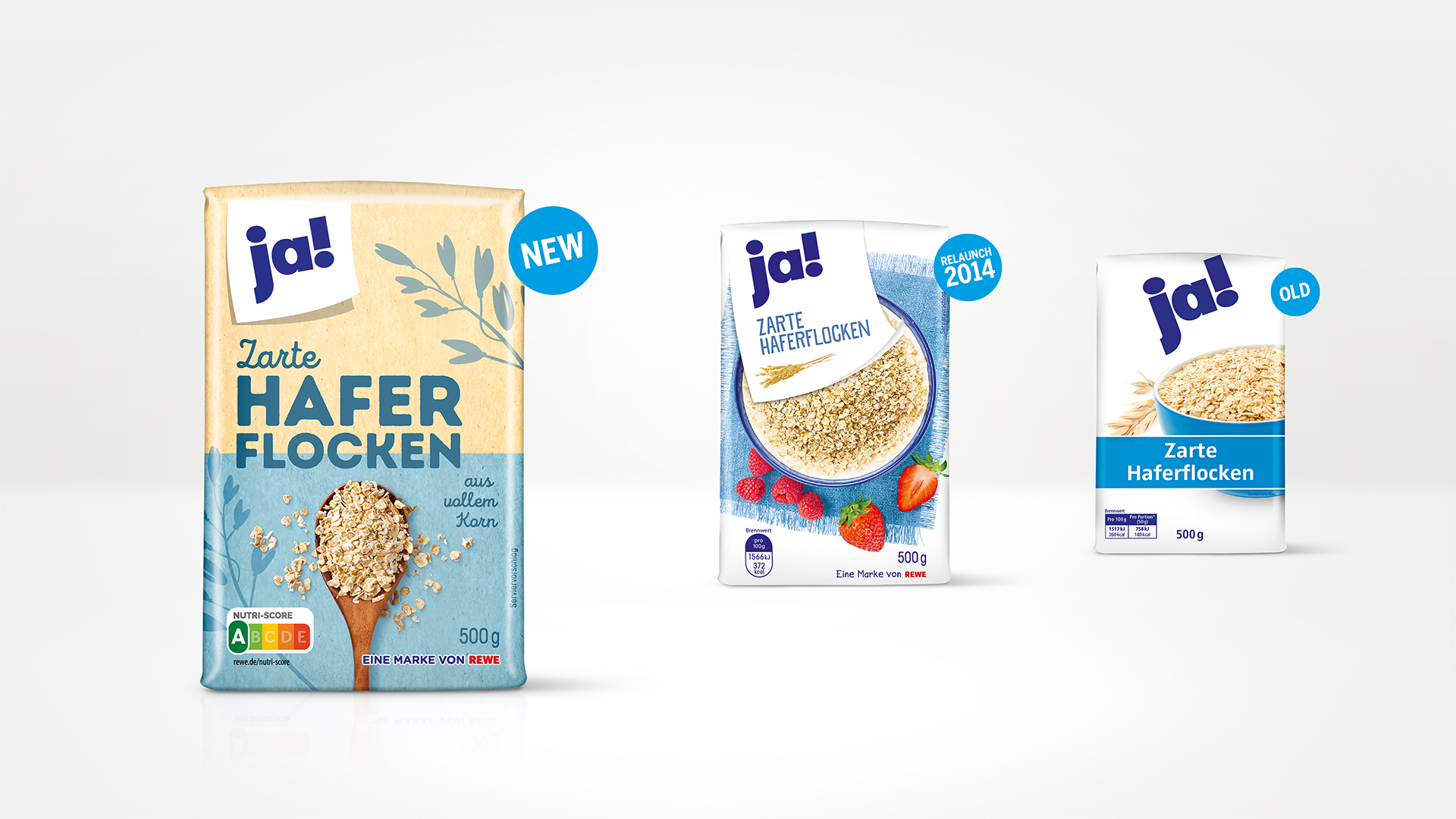
The club of iconic brands is made up of brands whose design language is unmistakable. When you think of ja! you immediately see the dark blue lettering and above all – a lot of white. In 1982 the Rewe private label became ja! It was launched with the aim of offering good quality at a reasonable price, attracting customers who shop as discounters. The aim of the packaging design was "reduce to the max", giving the entry-level segment a minimalist, uniform design code.
This strategy conquered the supermarket shelves and ja! established itself as the most successful and best-known private label in Germany. This iconic own brand has been carefully developed over the past few decades. But the everyday lives of the target group have changed dramatically and it was time to convey today’s consumer needs with the design.
Future-proof
ja! and HAJOK Design have enjoyed a successful partnership for several years. Since our first major relaunch in 2014, we have proven that a price-conscious approach and a positive shopping experience do not have to be a contradiction. During the first relaunch, the previous rational design was given more emotion – food shots and illustrations visually reflected the good quality of the products. The logo and the product names were placed on a white label, more colour came into play and ja! presented itself as a contemporary yet straightforward, everyday brand. In 2019, we were commissioned to redesign the ja! brand, embedding it into the era of brand experience.
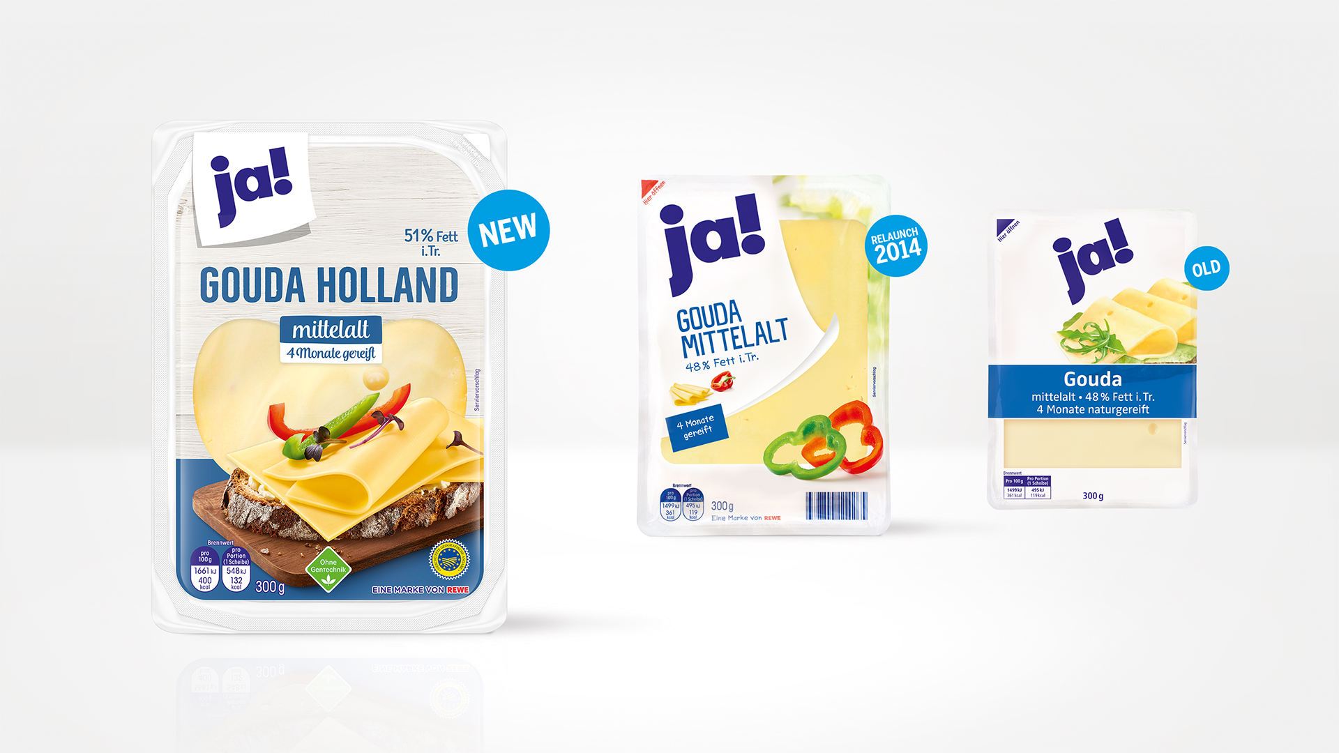
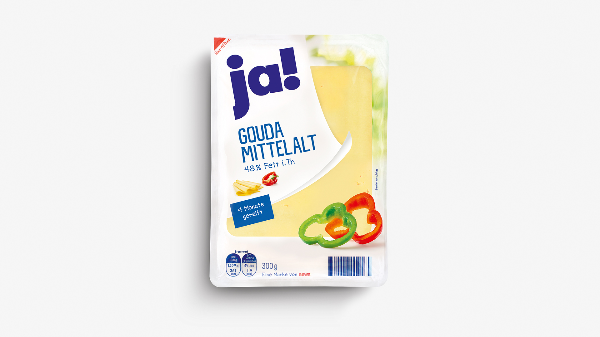
NEW
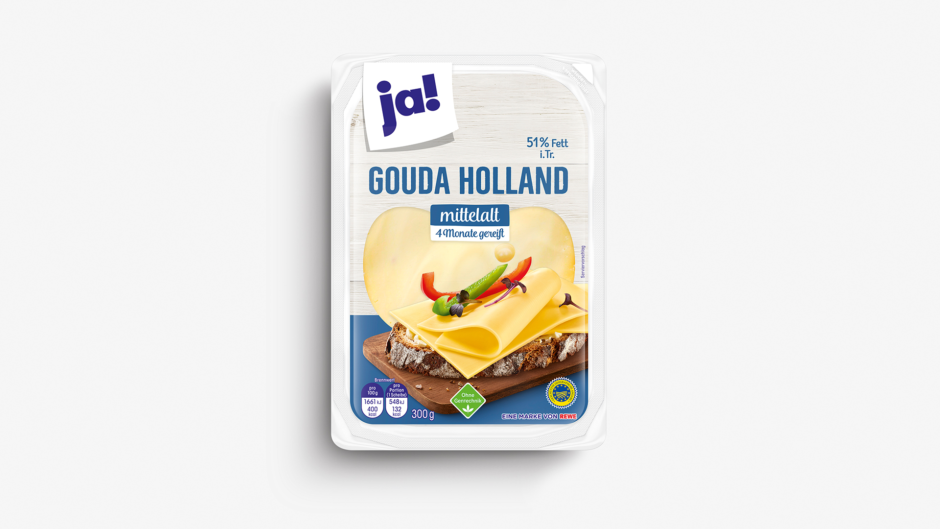
OLD
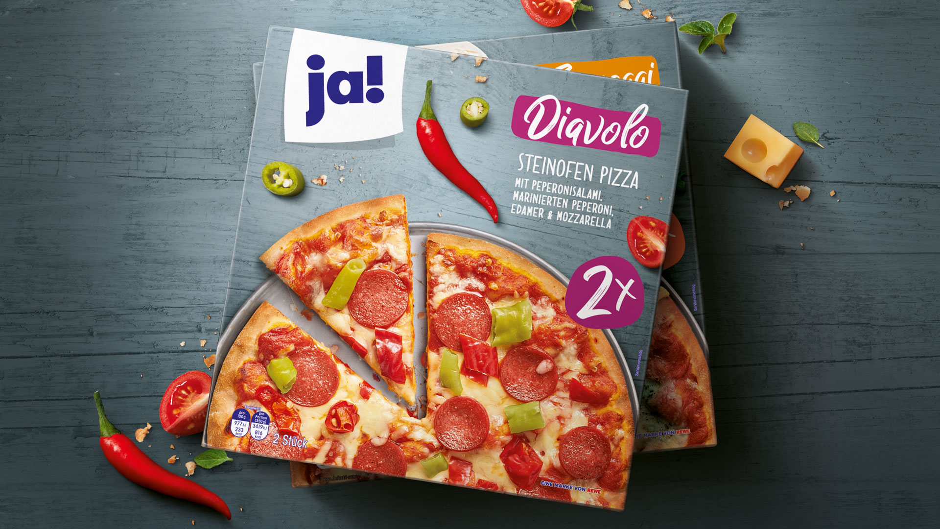
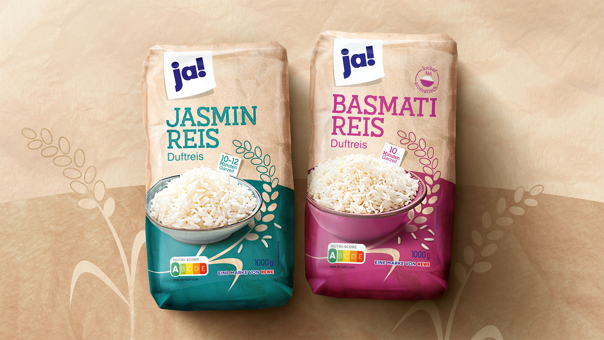
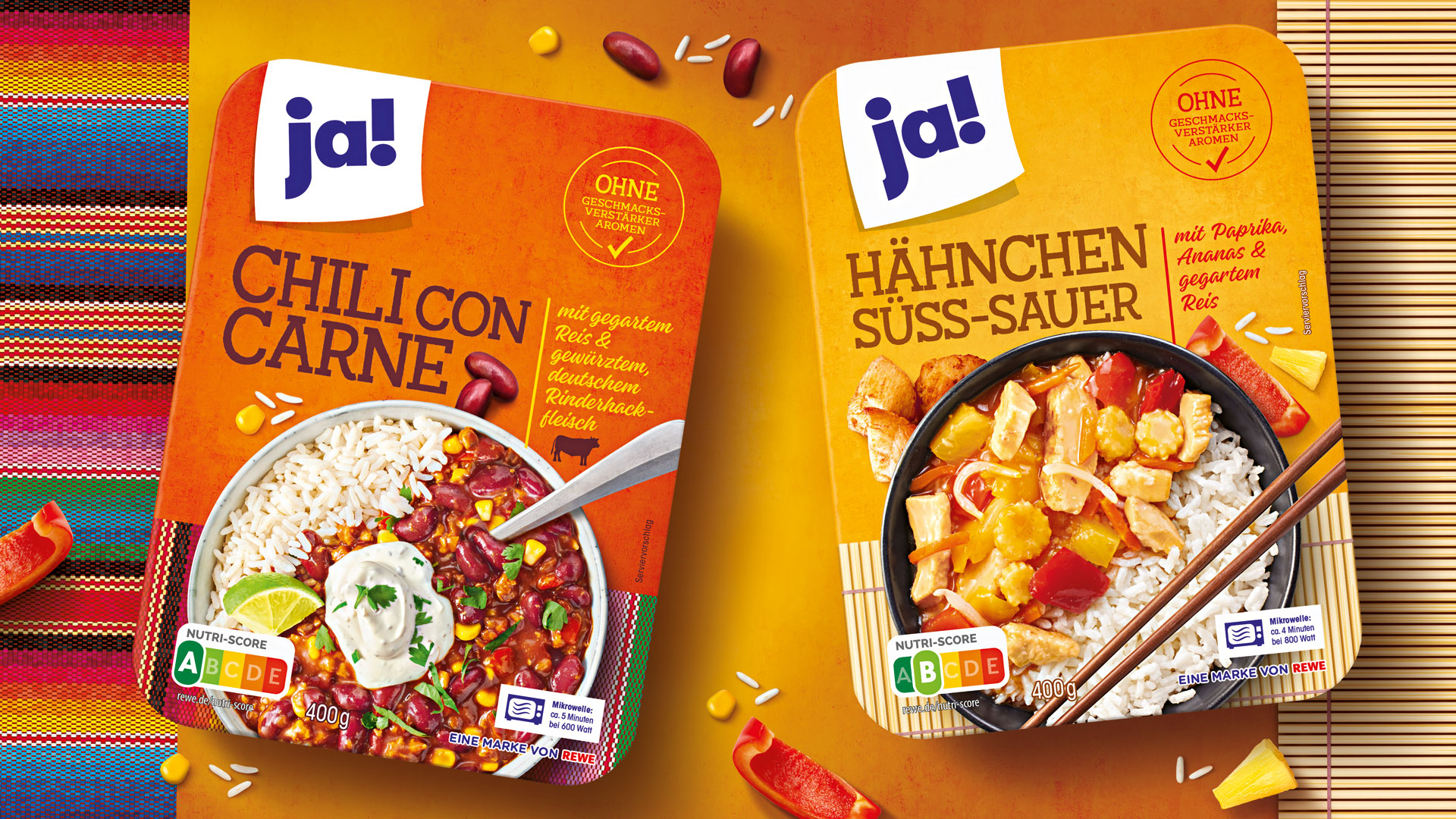
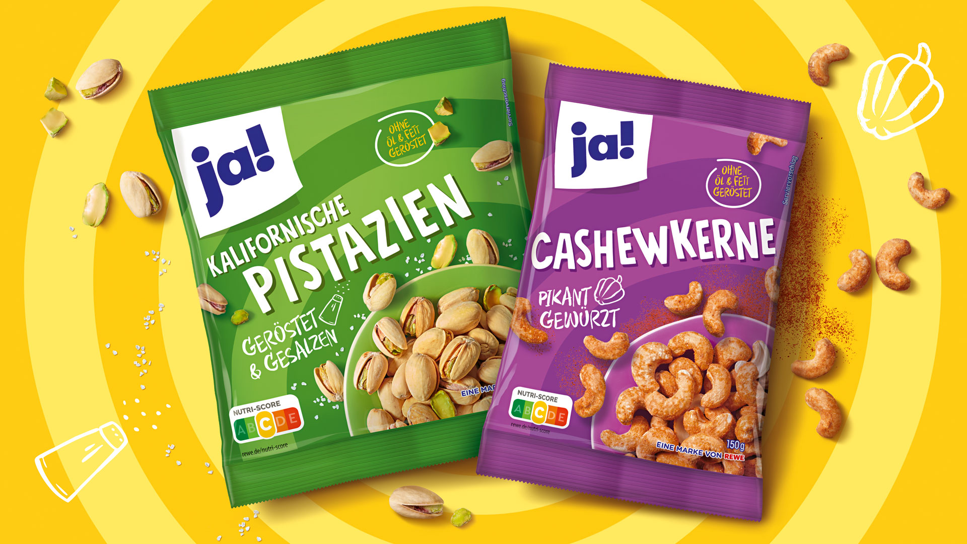
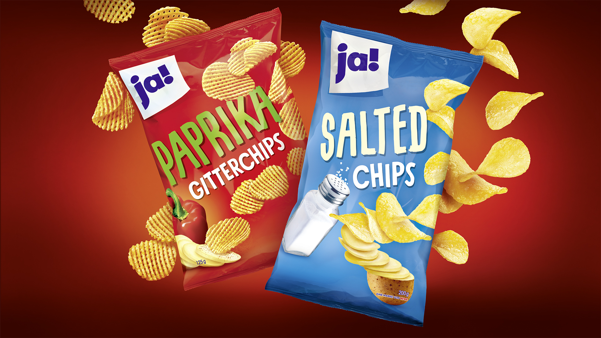
ADDING COLOUR
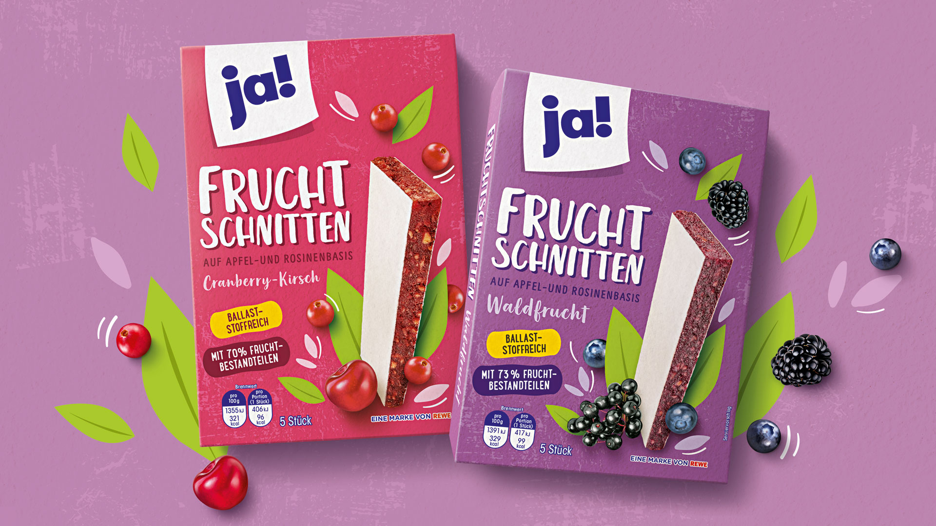
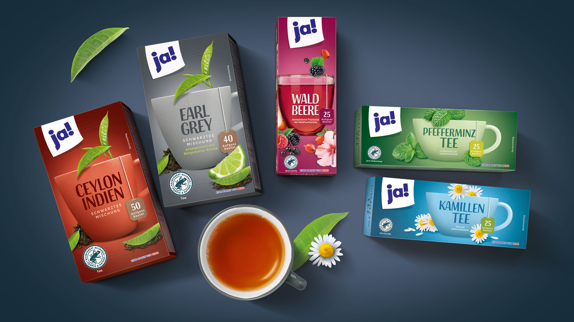
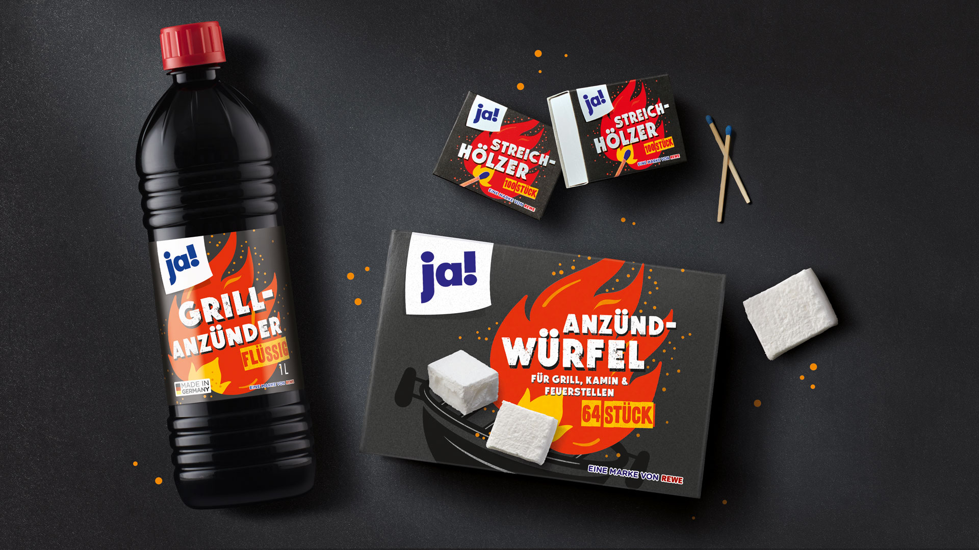
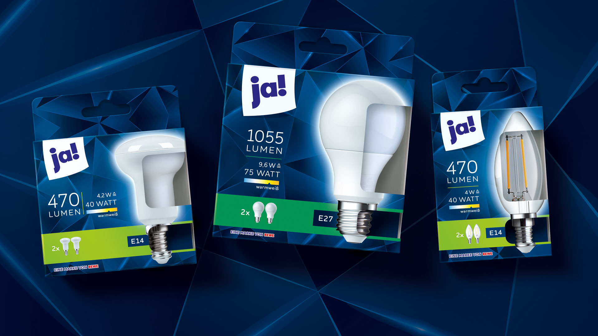
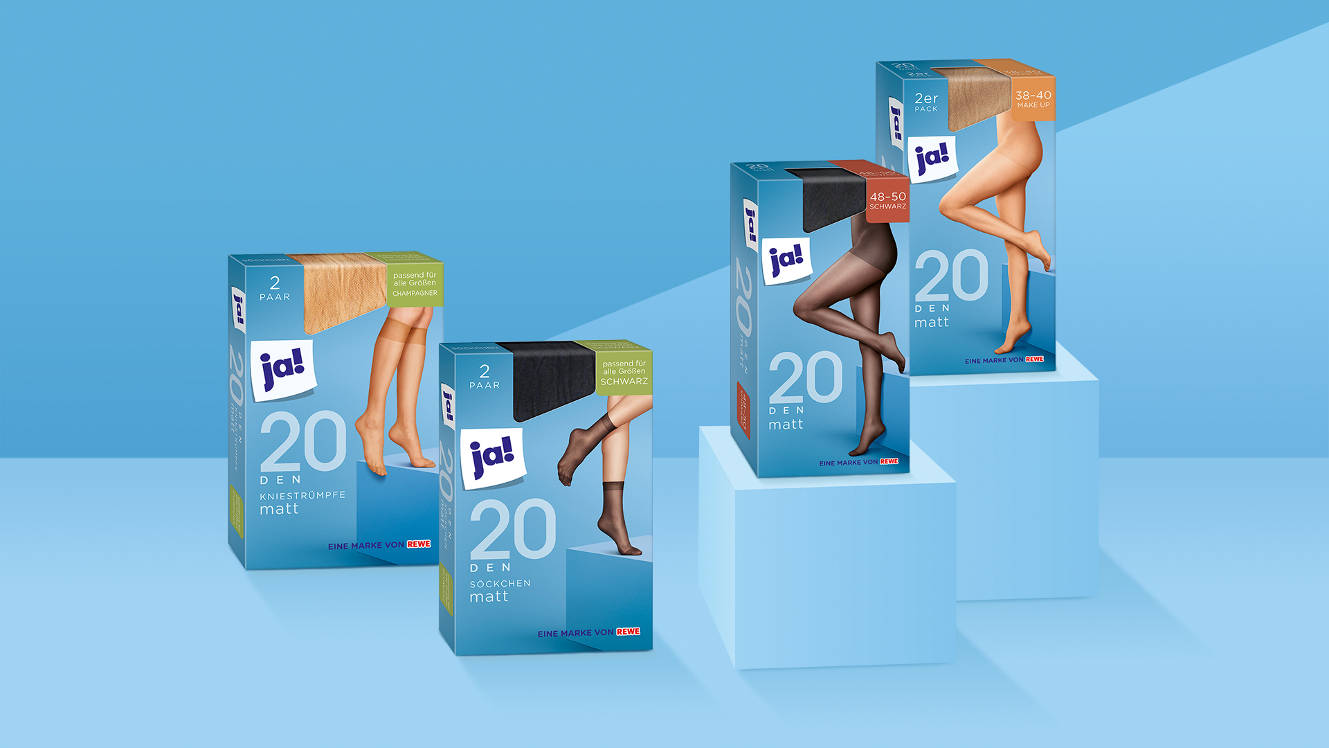
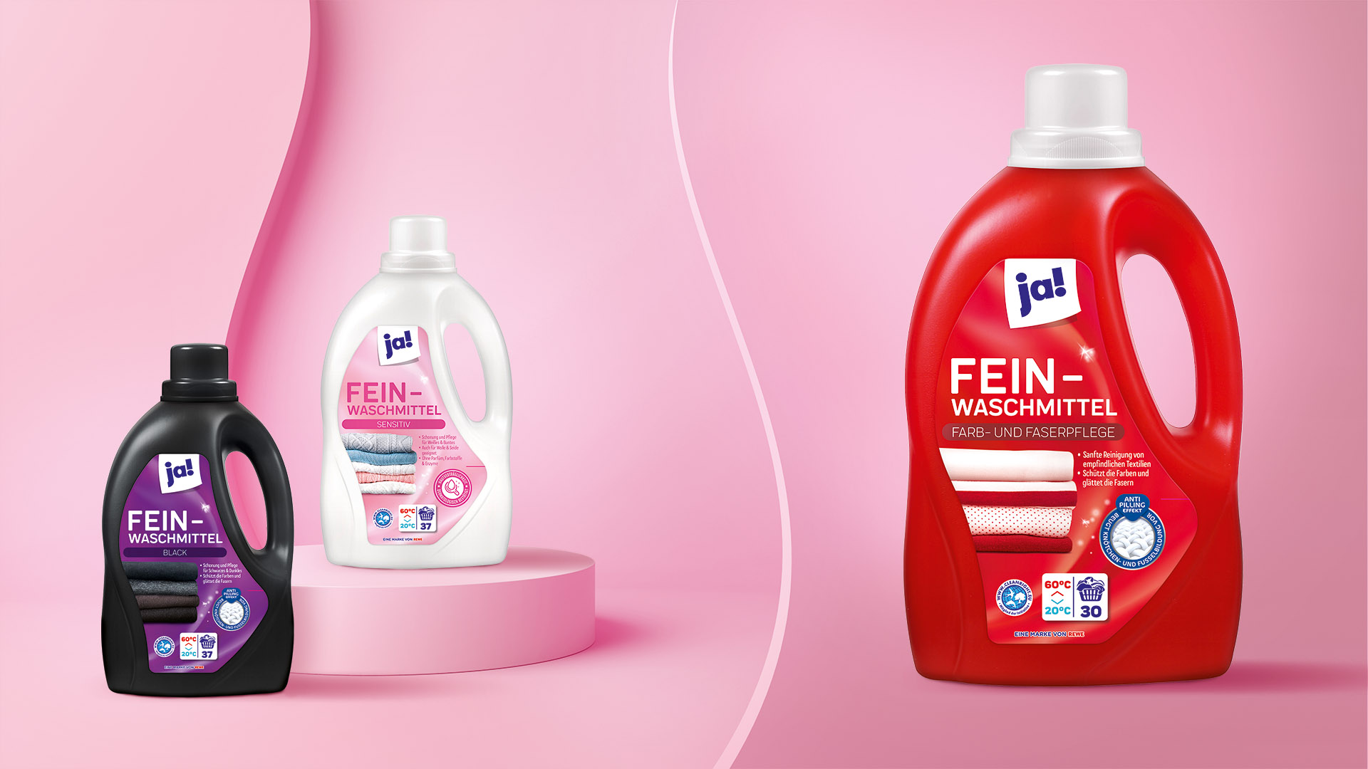
The German iconic own brand has truly undergone a design revolution! We reduced the typical and unmistakable entry-level on-pack white to just the logo. This freed up much more space, providing an emotional stage for unlimited variety and creativity. Individual designs open up worlds of experience in a colourful, life-affirming way. The clear design architecture helps consumers navigate product categories, proving that good quality and contemporary design need not break the bank!
Facts & Figures
-
Packaging design agency for the complete ja! relaunch
-
More than 1.200 products
-
Competition & design analysis
-
Strategy & concept development
-
Claim development
-
Packaging design
-
Display design
-
Illustrations
-
Photo shootings
-
Image editing / composing
-
Final artwork
Recognition
A white slip of paper serves as a space for branding – this is the only visual element that remains of the original all-white design. The new look is proof that entry-level pricing and quality are no barrier to an appealing packaging design.
We are experts in launches and relaunches.
Feel free to contact us!