Iconic brand rejuvenated
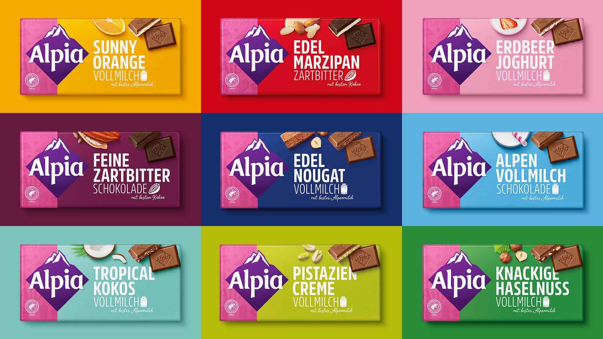
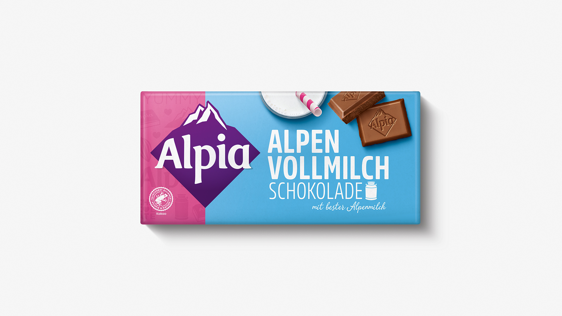
For almost 120 years, Alpia has stood for chocolate enjoyment in an unmistakable pink wrapper. A comprehensive brand and packaging relaunch was planned to rejuvenate and enhance this iconic brand. HAJOK Design has developed a very contemporary packaging design with a clear on-pack structure, strong typography and modern photographs.
Together with the corresponding colour of each variety, the iconic pink remains a feature of the Alpia packaging, now emotionally brought into focus thanks to the new brand pattern. The bold colour blocking not only gives the bars a cheerful look, it also helps consumers differentiate between the 12 different chocolate bars. This way the creative team at HAJOK Design has succeeded in creating a youthful, unconventional and fresh looking-relaunch.
NEW
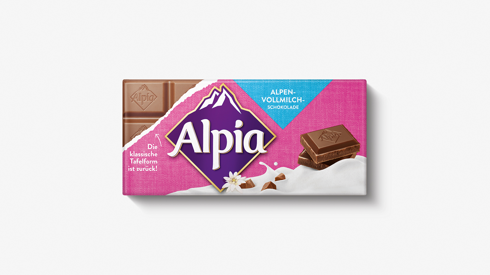
OLD
Confident appearance
The well-known Stollwerck brand appears much more up-to-date and self-confident after the relaunch. We wanted to focus more on the iconic alpine rhombus and on the exciting range of products with special varieties such as Sunny Orange. The packaging now has much more shelf impact. This way, Alpia can be rediscovered by German consumers as a strong and established brand.
Lead agency
In addition to Alpia, HAJOK Design is the lead agency responsible for the packaging design of Sarotti Tiamo, CHERRY N°, Eszet and Alpia Veggie Love. The Alpia relaunch with a total of 12 bars and 2 types of snacks has been the largest project to date.
Download press release
More articles
From Pick-Me-Up to Cult Drink
How to successfully appeal to the right target group with an expressive design.
Milestones
Interview about the development from a one-man show to an international packaging design agency.
Why We Buy
Interview with managing director Madeleine Lindner about packaging psychology.
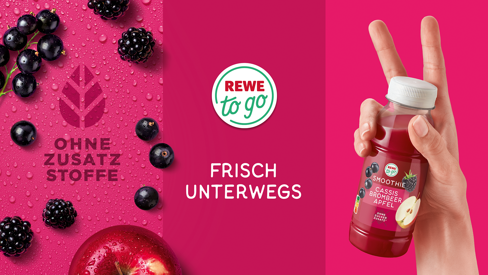
New look for REWE to go
HAJOK Design redefines the brand identity of REWE to go.