New look for REWE to go
22.10.2025
REWE to go presents a strong brand presence in the convenience segment.
Brand in Focus
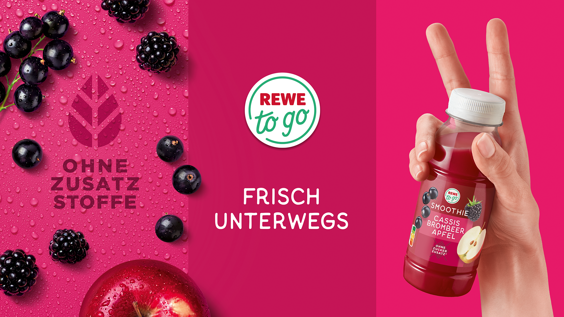
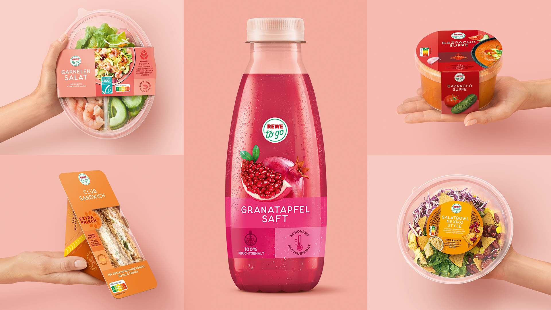
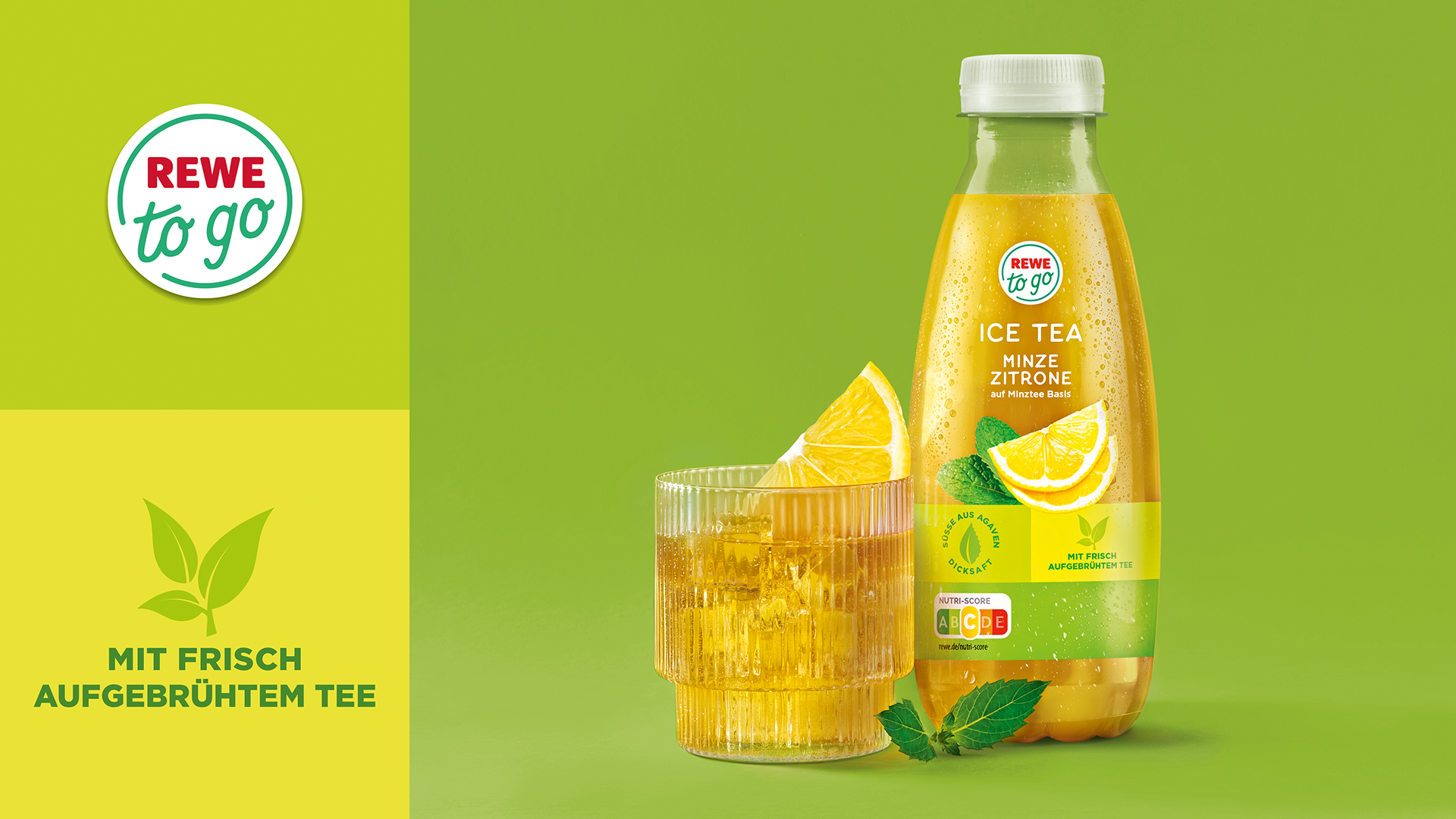
REWE to go is one of the best-known convenience brands in German food retail. With a focus on freshness, quality and trend awareness, REWE has been setting new standards since 2016. To further raise the brand's profile and strengthen its leading market position, the brand's visual identity has now been comprehensively redesigned. The Hamburg-based agency HAJOK Design, a long-standing creative partner for Rewe is responsible for the design.
Clear Identity
REWE to go products in the new design have been steadily replacing the old packaging since 2024. This communicates the brand values of REWE to go even more strongly. A clear structure, modern colour scheme and a modular packaging design system help the consumer navigate through the range while creating a unique on-shelf presence. The centrally placed logo serves as a guarantee of quality. Individual benefit icons and eye-catching on-pack food presentation underscore the brand's lifestyle character.
All in One
The REWE to go relaunch includes over 90 items, ranging from snacks, protein-rich meals and vegan ready-meals. As a full-service agency, HAJOK Design was responsible not only for developing the design but also for the individual product implementation and final artwork creation. Photoshoots, illustrations and image editing were carried out in-house and in close collaboration with the creative team.
Download press release
More articles
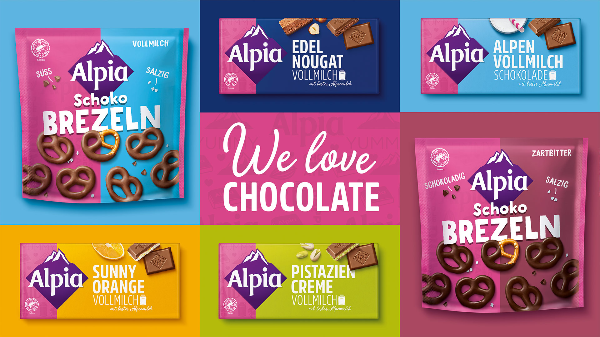
Alpia Gets a Colorful Relaunch
The Alpia brand by Stollwerck now presents itself in a colourful and modern packaging design.

Artificial Intelligence
Interview with Kim Schönert about the advantages and challenges of Midjourney and Co.

Twice the Creative Power
Klaus P. Hajok promotes Madeleine Lindner to Managing Director.
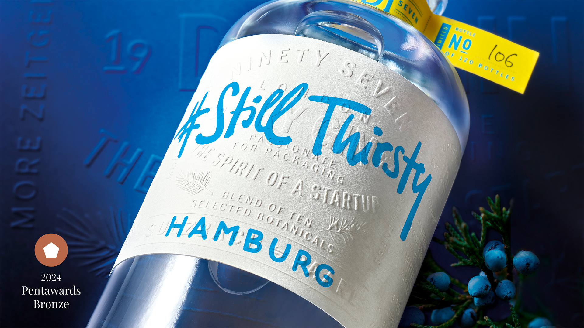
HAJOK Design Wins Bronze Award
The Pentawards jury honours a very special project that combines all our expertise: our own gin #Still Thirsty.