coffee hype
How does everyone – from beginners to coffee aficionados – find their favourite product in a highly competitive market? The packaging design in particular has the task here of creating clarity so that every target group can find their coffee.
There is hardly any other food or beverage that has become as indispensable as coffee. When you enter Germany's favourite drink into a search engine, coffee trumps beer, wine or tea by a large margin. Coffee has been an important part of our culture and society since the 16th century when coffee beans were first imported to Europe from the Middle East and North Africa. A real barista hype has developed in the last 20 years, especially in towns and cities.
Quick orientation
The number of roasting companies is constantly on the rise. The proliferation of latte art seminars and portafilter workshops means the gap between amateurs and the barista trade is narrowing. Interest in high-quality coffee and various methods of preparation is growing in Germany. The supermarket coffee shelf is above all very colourful and diverse. More and more brands, large and small, are trying to assert themselves against the competition with more or less successful designs.
The coffee buyer has to make decisions – which are completely independent of the packaging’s appearance – at the shelf because coffee offers many different flavours that depend on different factors. Packaging should above all create clarity and orientation to help consumers find their favourite coffee quickly.
Target group insights
If you want to make things easy for potential buyers, you should provide easy-to-understand information. Some older German consumers still want to be seduced by terms such as “Crowning Moment” or “Heavenly” for their own moment of personal indulgence. However, a generation has long since grown up that has significantly more differentiated standards of quality, ethics and sustainability. This no longer has anything to do with typical target groups, but with different approaches to coffee. Coffee is a special treat that expresses appreciation of oneself and others. Only those with a deep understanding of the needs, values and lifestyle of the target group are able to create relevant packaging design.
Design meets need
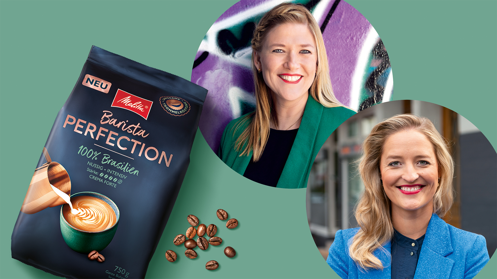
We have been successfully developing packaging design for Melitta® since 2021. For the Barista Classic, Barista Perfection and Melitta® Manufaktur Bremen sub-brands, we have worked intensively with the target group. The major task was to translate the different needs of consumers into the design for all three product ranges and to touch them emotionally.
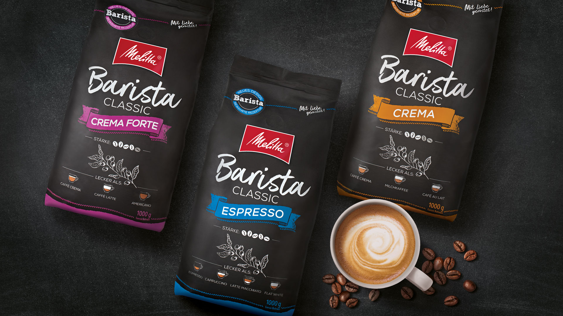
For Beginners
Melitta® Barista Classic is the right brand for those getting started with whole bean coffees. These consumers can try out coffee made in different ways and take their favourite coffee variety home with them. This is communicated in the design with the chalk look as a typical visual code of the barista world. The name Classic expresses the feeling of quality and of a good barista coffee that will definitely taste great. Information such as variety, strength and suggestions how to prepare the coffee are reduced to the essentials.
For demanding customers
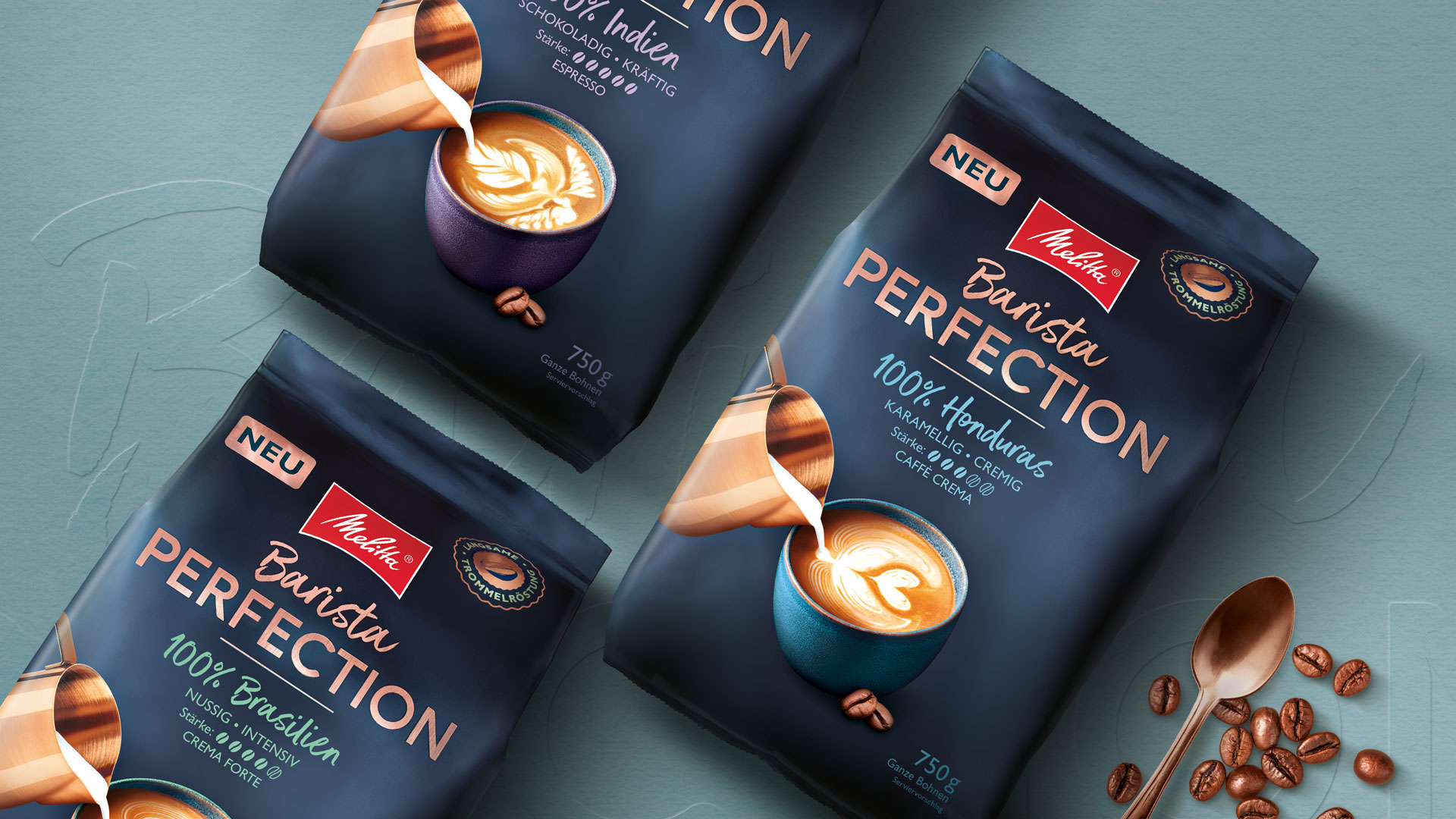
The Melitta Barista Perfection varieties appeal to more demanding coffee aficionados who are also interested in the origin and differences in flavour of the beans. The design with the country name and the gentle drum roasting quality seal convey more background information about the high-quality single-origin coffees. The stoneware mug, the creative crema effects and above all the copper jug colour and typography provide a visual anchor expressing craftsmanship.
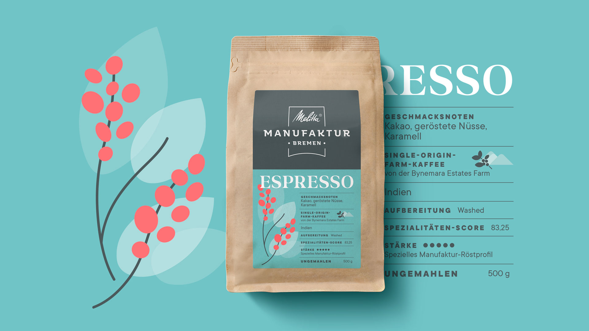
For coffee experts
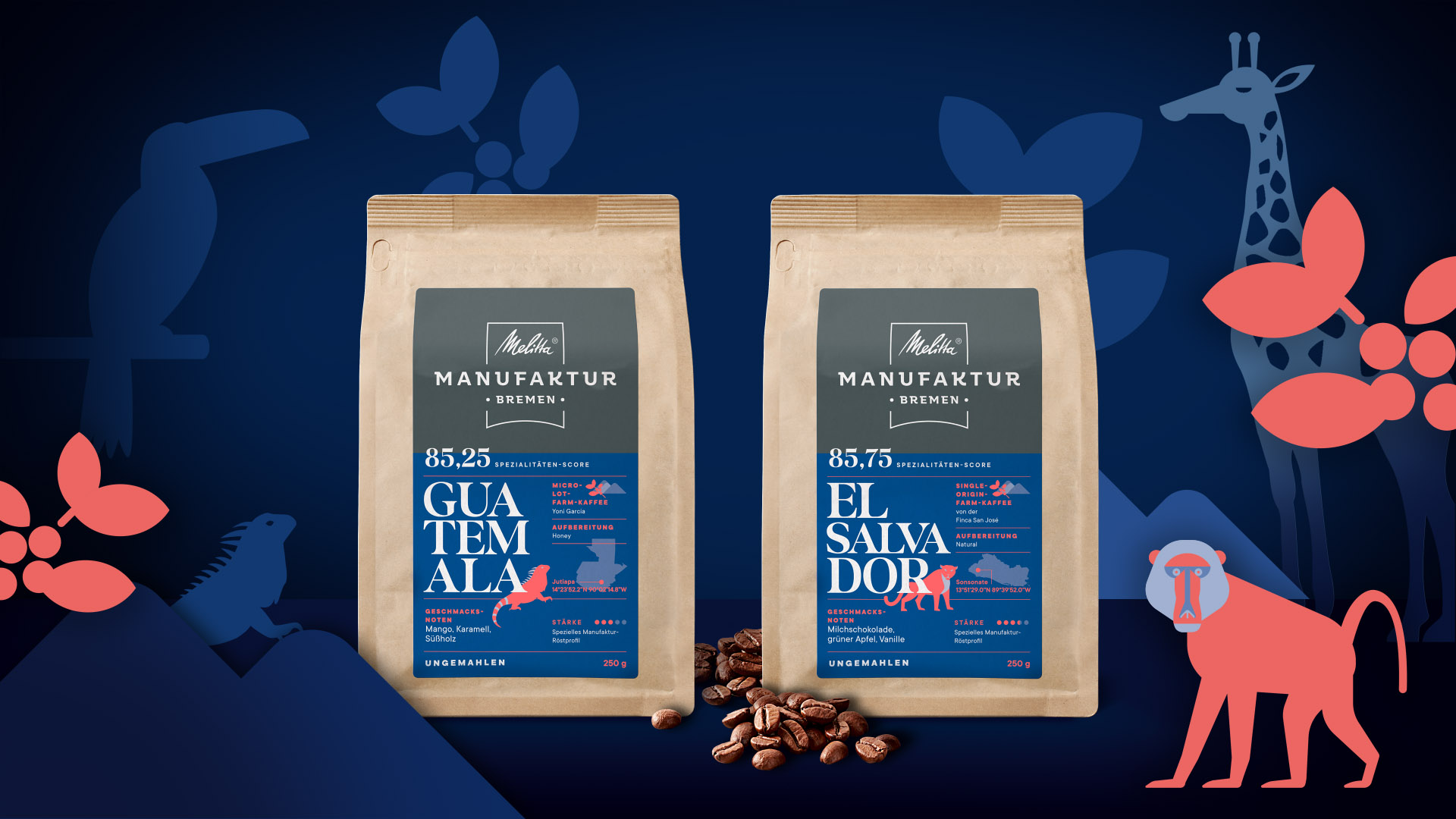
Melitta Manufaktur Bremen, founded in 2020, roasts special green coffees from small plantations and cooperatives. Traditional craftsmanship, high quality and a passion for select coffee varieties characterise the new Melitta brand. These properties appeal to coffee experts who, thanks to their experience, can recognize the fine nuances and special characteristics of the coffee. Such a connoisseur does not need a picture of a coffee cup on the packaging, but specific information about the origin, flavour, preparation and the SCA score.
Something for everyone
The topic of target groups was the focus of the Barista Classic, Barista Perfection and Manufaktur Bremen sub-brands. The task was to express the different consumer needs in the designs for all three product ranges and to convey these in an emotionally touching way. Good packaging design – unconnected with the usual target group classification – serves different information needs about the respective coffee variant and to emotionally engage consumers. Enjoyment and delight are firmly anchored in the traditional Melitta brand and we have succeeded in conveying this through the design of the three different sub-brands. This helps consumers choose the right product for them, making every coffee aficionado happy!
Published in the June 2023 issue of the magazine creativ verpacken.
Download article
More articles

Design 2024 – Opulent & Sensual
Madeleine Lindner on the ‘Frutiger Aero’ trend and the combination of analogue and digital.
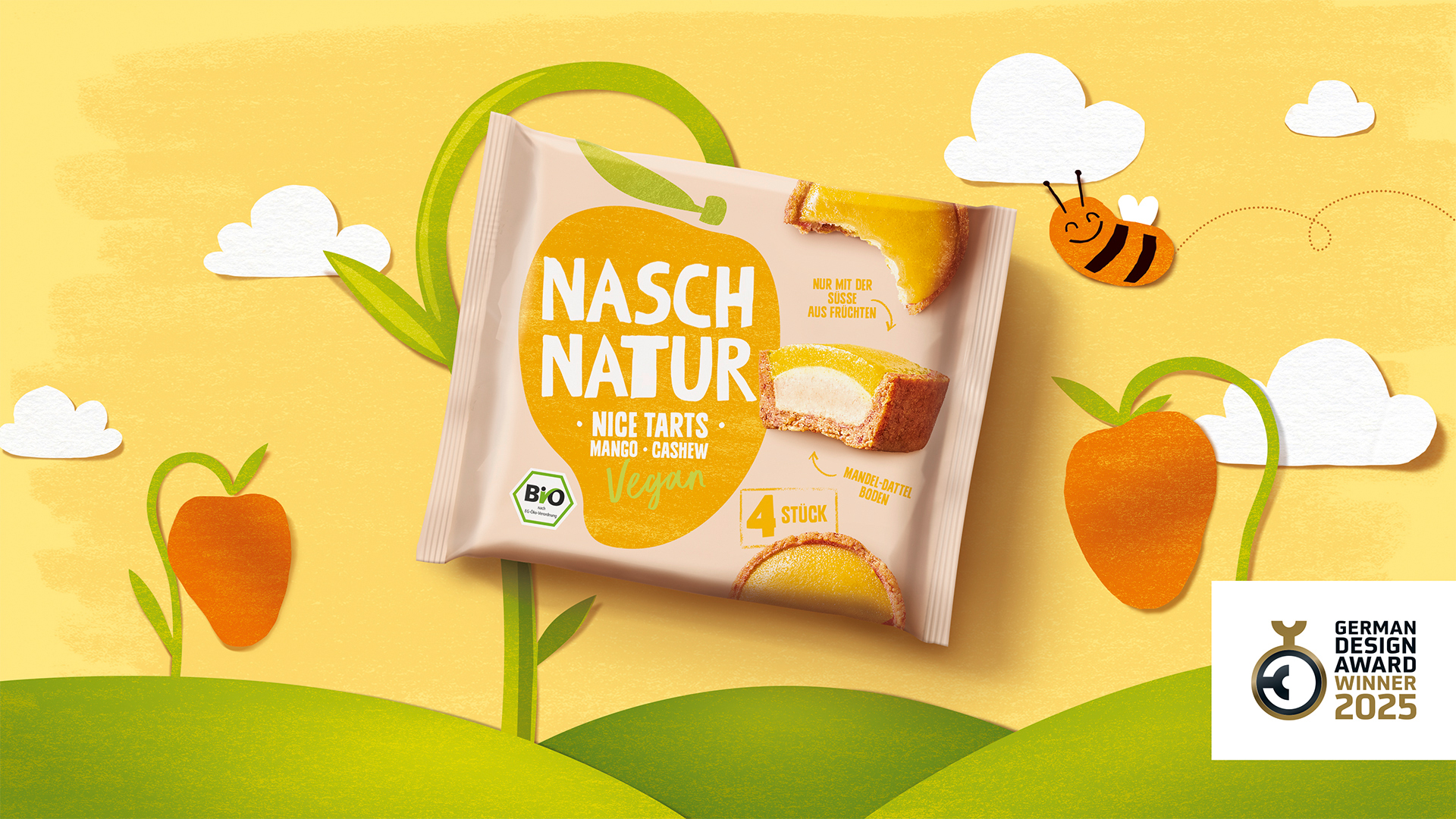
German Design Award for Naschnatur
The successful relaunch of Naschnatur's Nice Tarts is a clear win for the German Design Awards' jury.
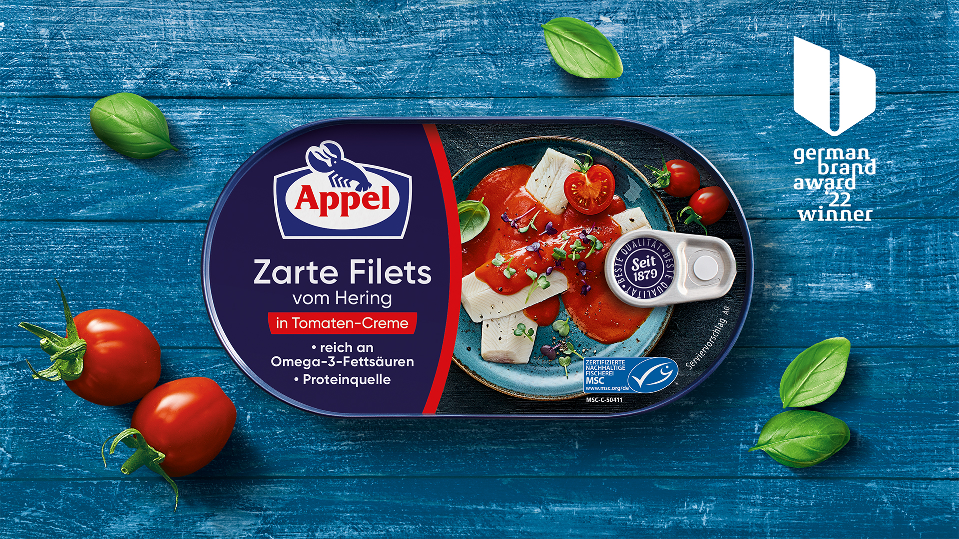
German Brand Award for Appel
HAJOK is honoured with the international award for brand strategy for the Appel brand relaunch.
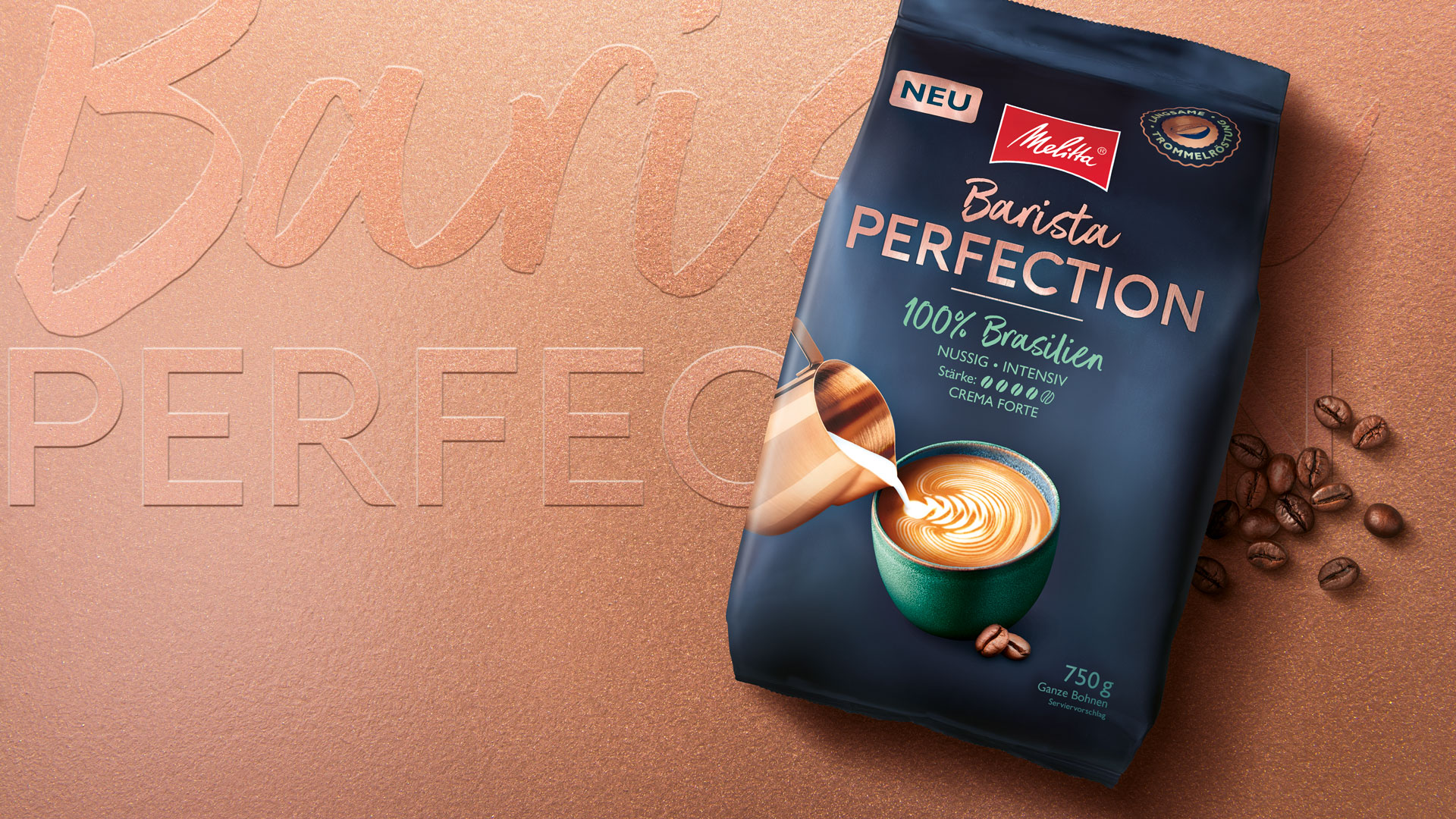
Successful Launch
HAJOK designs the premium brand identity for the launch of Melitta® Barista Perfection.