Mindful enjoyment
Langnese started selling ice cream on a stick in Germany 85 years ago. Part of the Unilever portfolio, Langnese is now one of the most successful ice cream brands in Europe. Ice cream has always been popular, but attitudes towards nutrition have changed over the past few decades. Natural ingredients instead of artificial additives are in demand and sustainability also plays an increasingly important role. By launching a new young popsicle brand onto the market, Langnese wishes to cater to the needs of health-conscious consumers.
100 % yummy
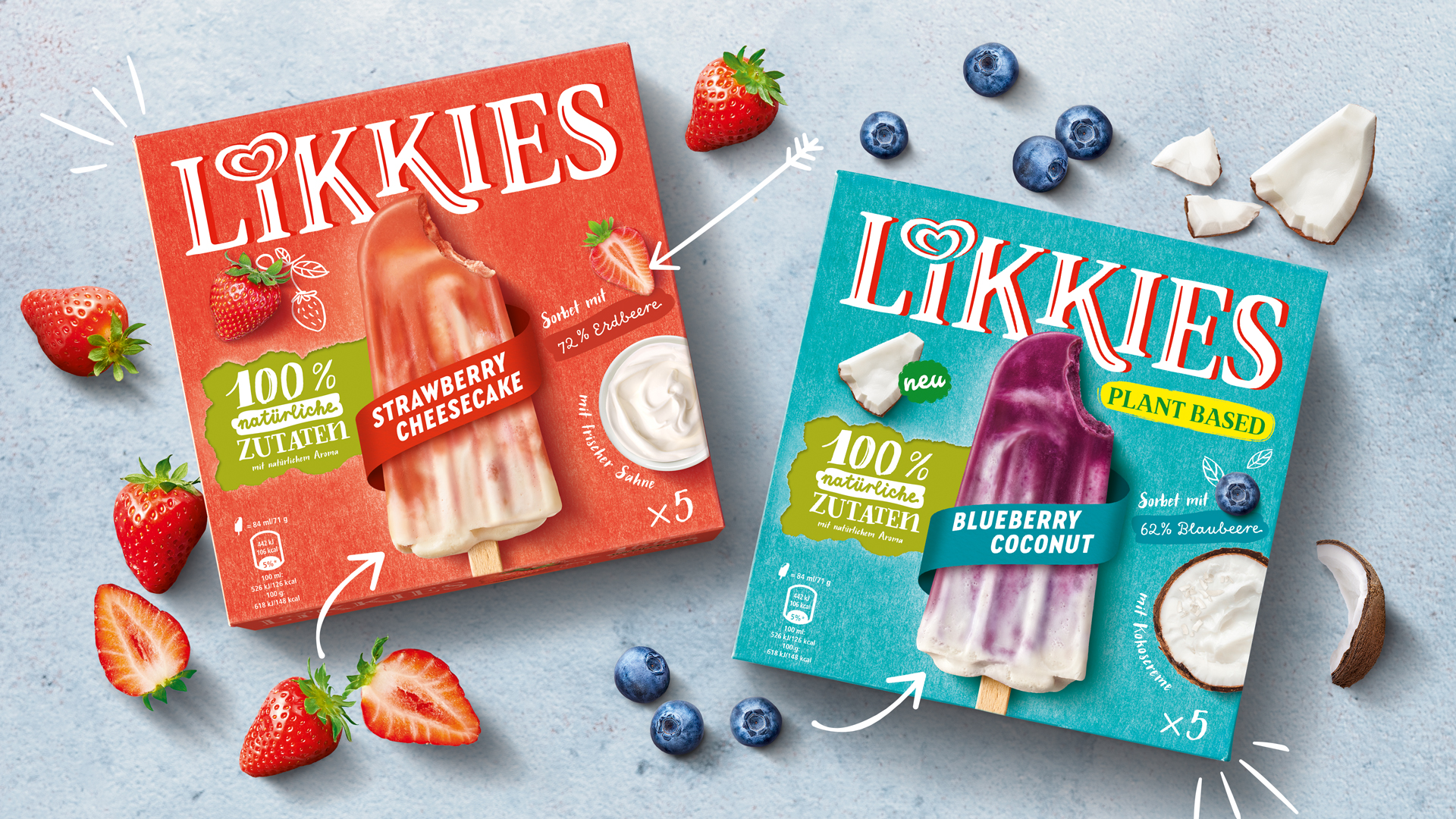
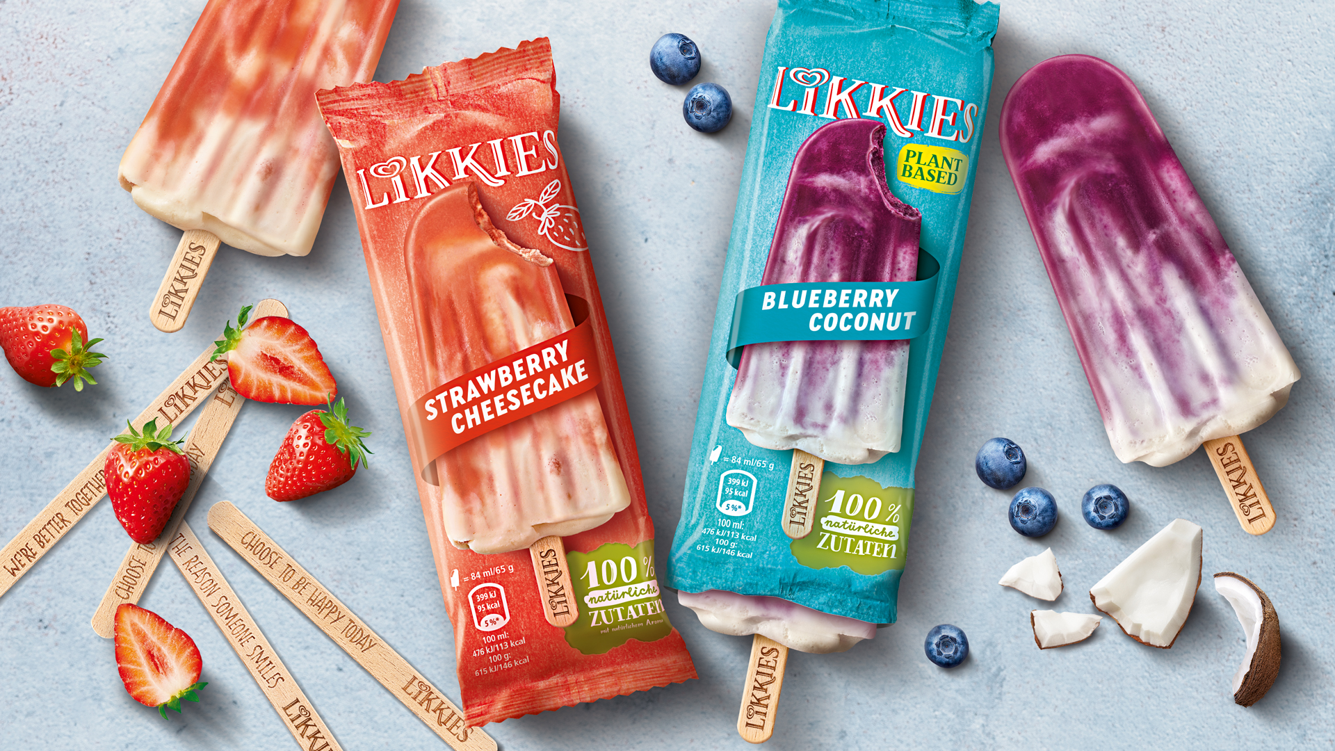
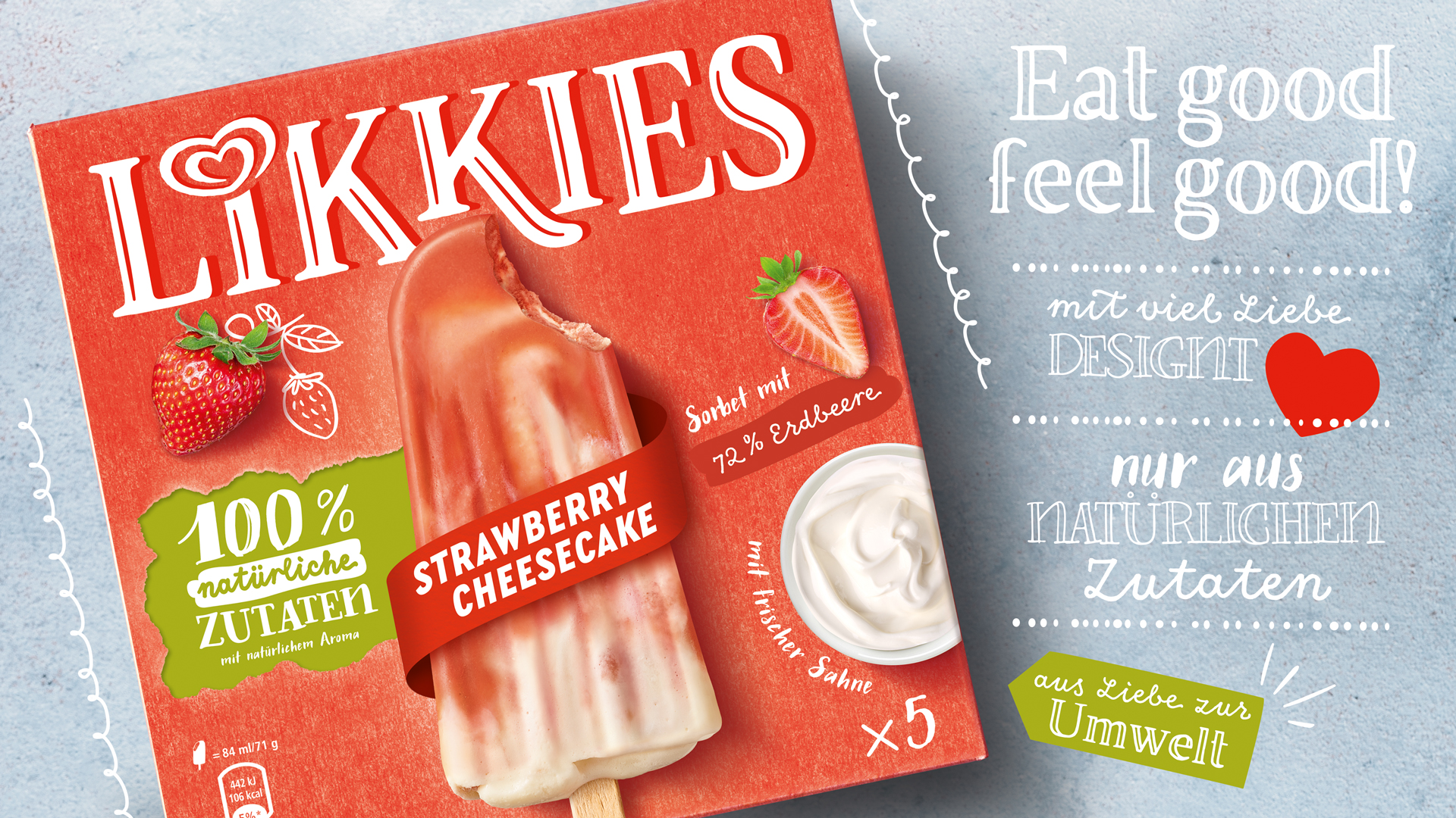
If you search for “popsicle recipes” on Google, you get almost 550,000 results. The hype about homemade popsicles isn't slowing down – on the contrary, it is going from strength to strength! The aim was for the packaging design to incorporate this homemade trend, present itself naturally and honestly while animating the desire for a delicious, fresh ice cream. In addition, we were also commissioned to develop a suitable brand name.
Great Naming
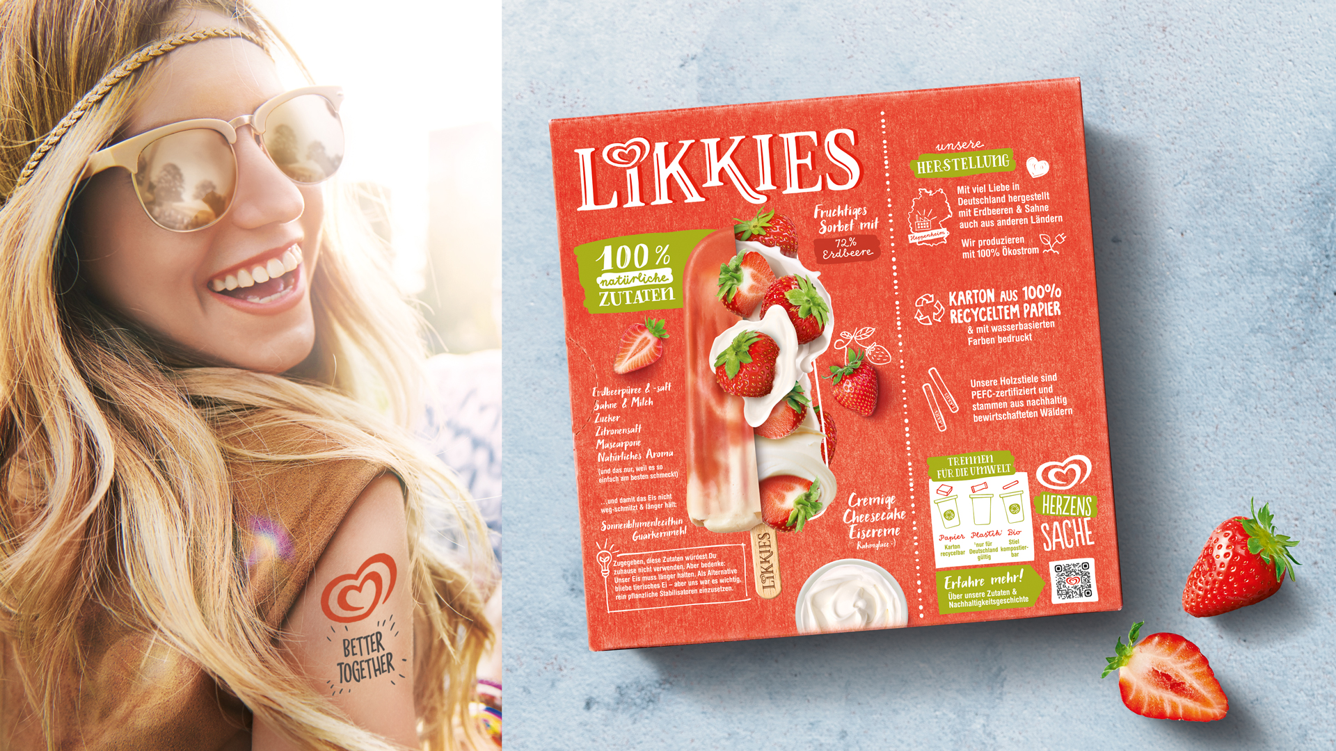
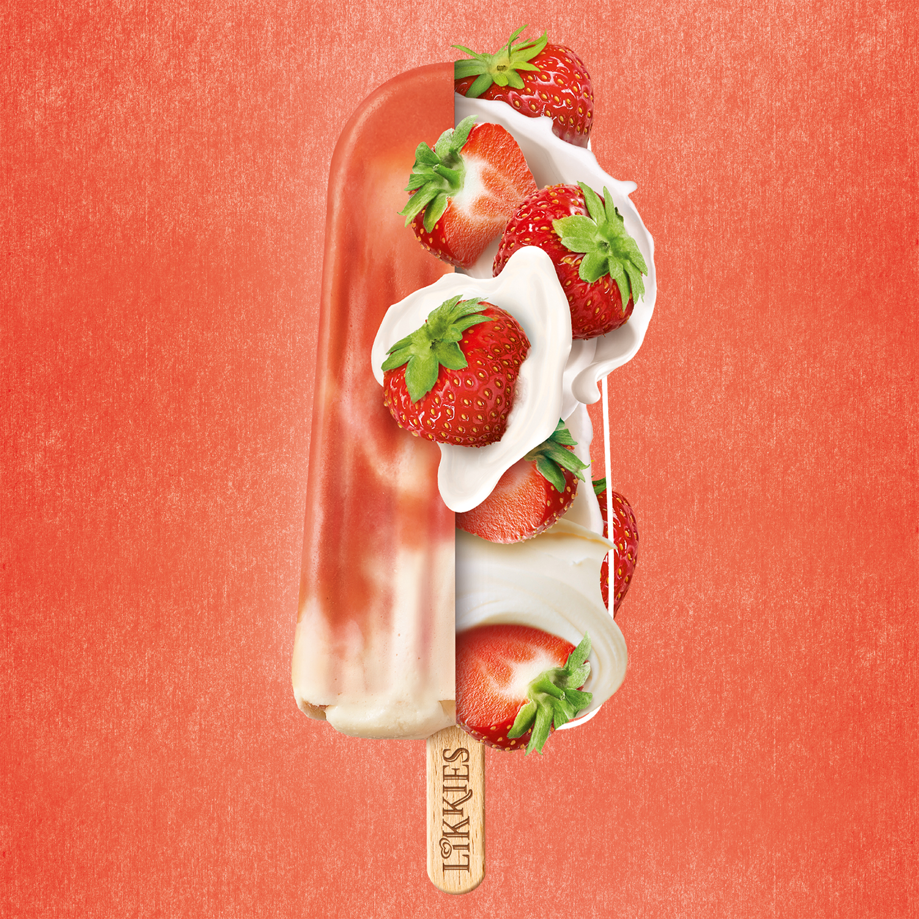
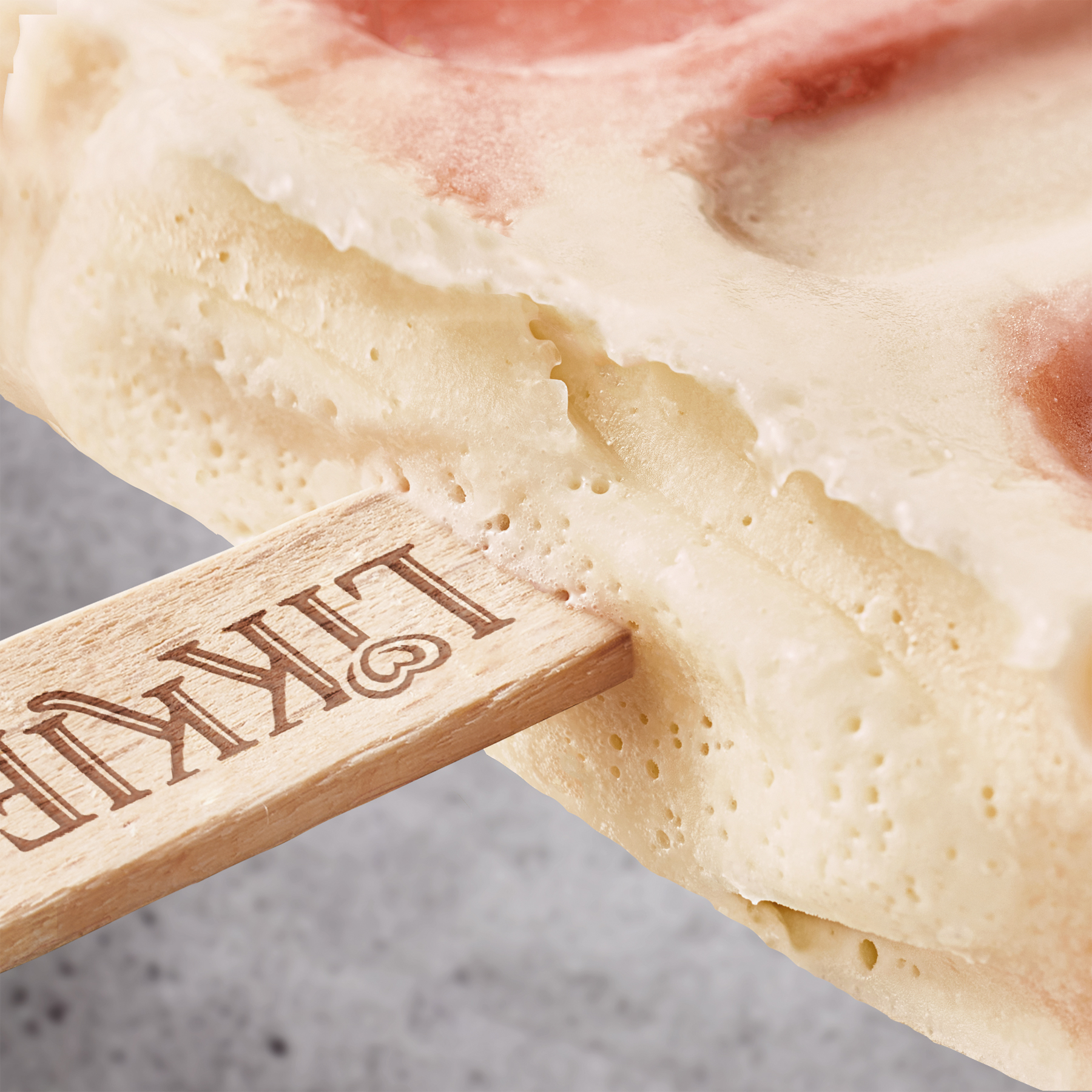
Staging the logo in white typography with a red shadow immediately evokes associations with Langnese. The packaging design reinforces the lively and relaxed homemade character of the ice cream brand with illustrations, decorative elements and handwritten fonts. The motto for the product illustration translates as "simply delicious". Especially the back-of-pack key visual of fresh strawberries dipped in cream makes your mouth water! The brand name also is a highlight. Playing with the idea of licking a popsicle, we created a name that exudes happiness and pure ice cream enjoyment!
Facts & Figures
-
Competitor analysis
-
Brand development
-
Naming
-
Logo development
-
Packaging texts
-
Illustration
-
Packaging design
-
Image processing
-
Final Artwork
Would you like to take your brand to the next level?
We’d love to work for you!