For truffle lovers
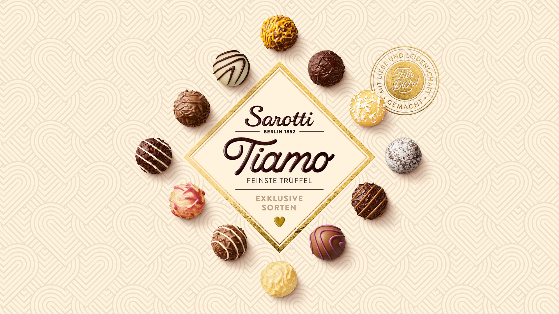
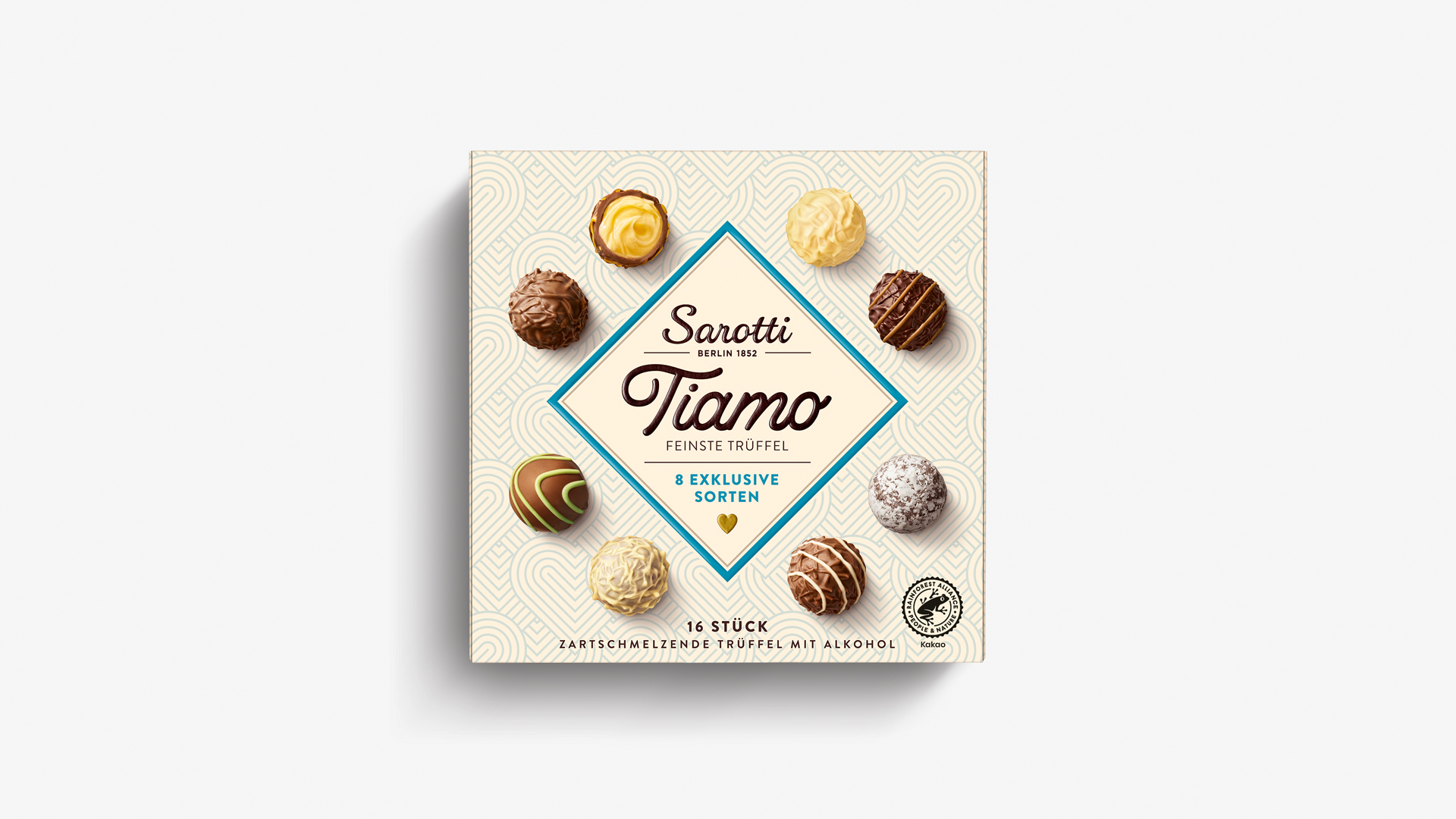
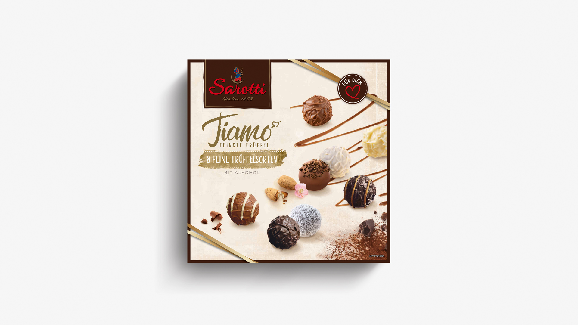
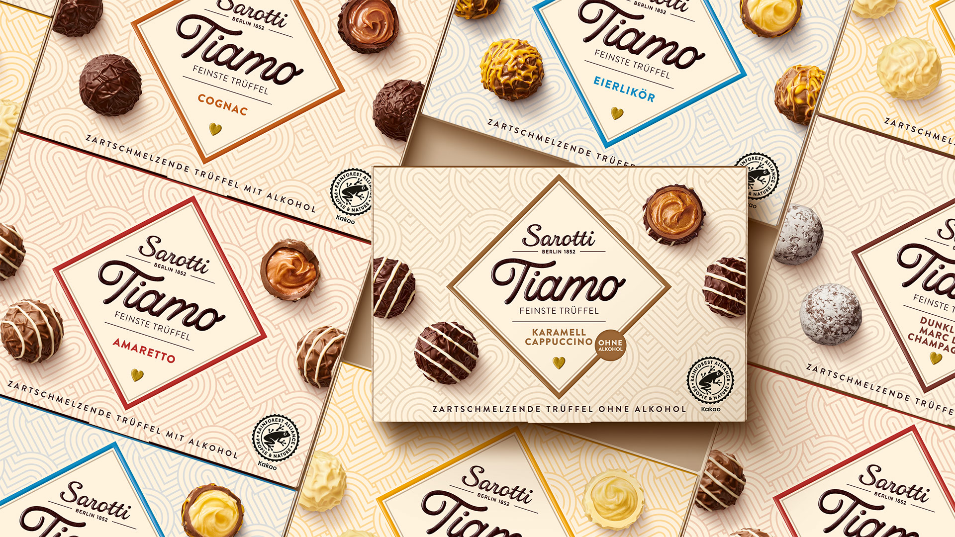
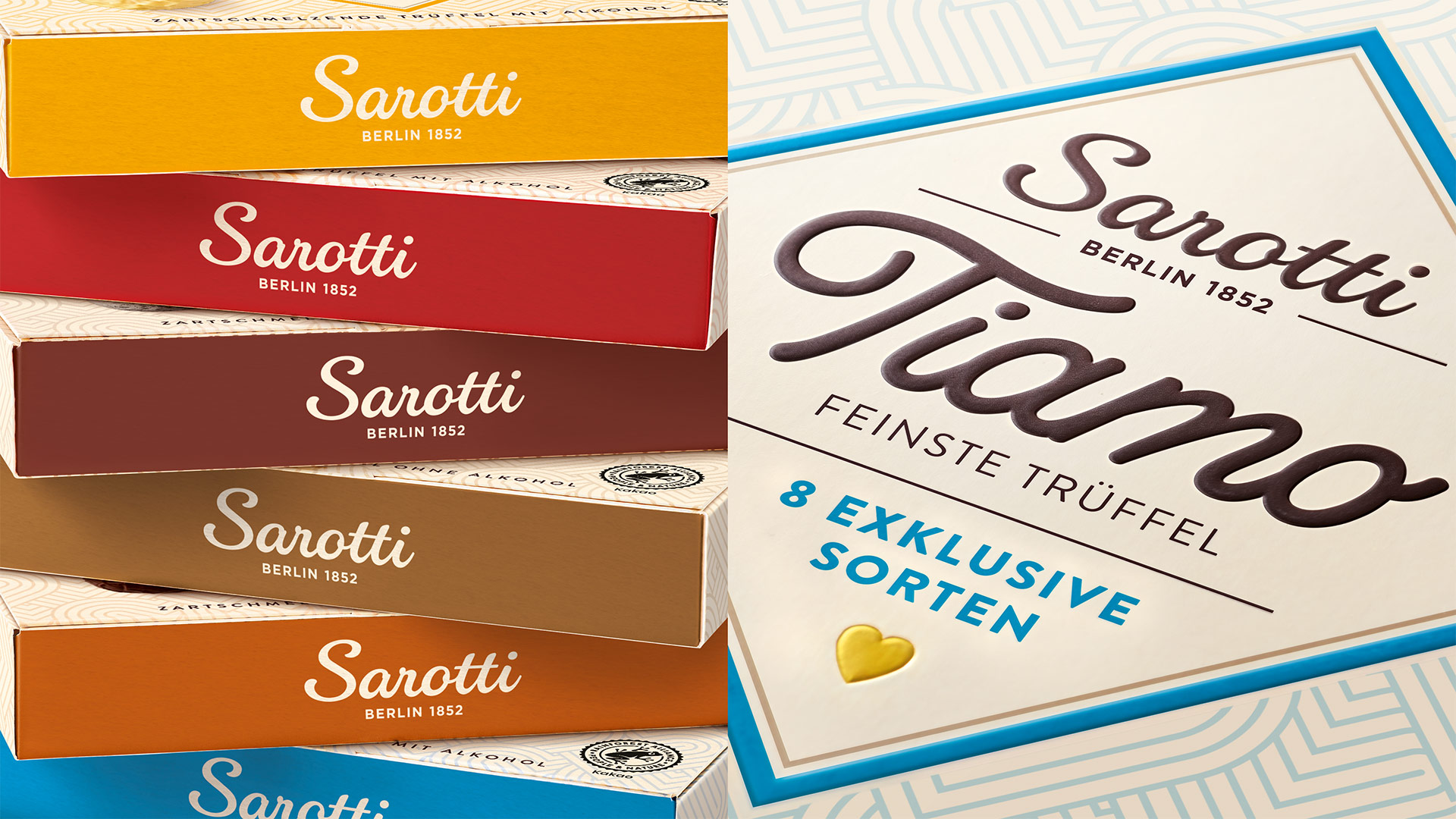
The traditional Sarotti brand is the market leader in Germany with its premium TIAMO truffle range. The new packaging design was to have a much more emotional, high-quality and contemporary look, arousing the desire for chocolates and encouraging people to buy them as presents.
Pieces of art
After the successful launch of CHERRY N°, the HAJOK design team further developed the modern brand world for Sarotti TIAMO. The premium truffles were elaborately photographed in our in-house studio and presented on-pack in a particularly aesthetic way.
Facts & Figures
-
Lead packaging design agency
-
Relaunch Sarotti TIAMO (8 SKUs)
-
Sub brand logo lettering
-
Packaging design sweets
-
Tray design
-
Photo shoot
-
Image editing
-
Final artwork
We are experts in launches and relaunches.
Contact us to find out more!
