MINDFUL, BOLD & BRIGHT
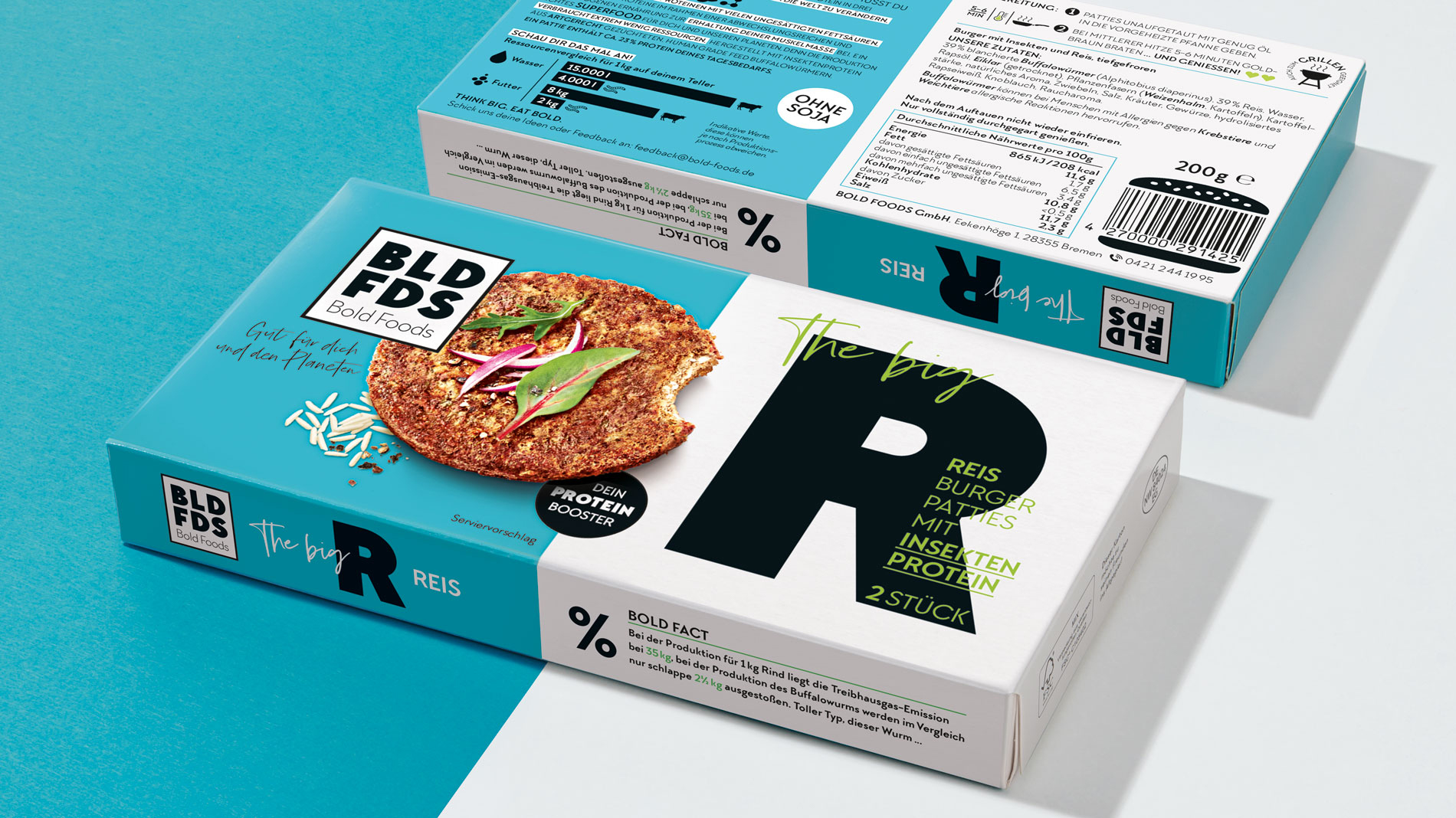
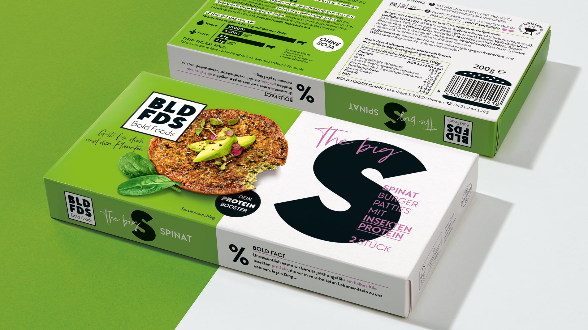
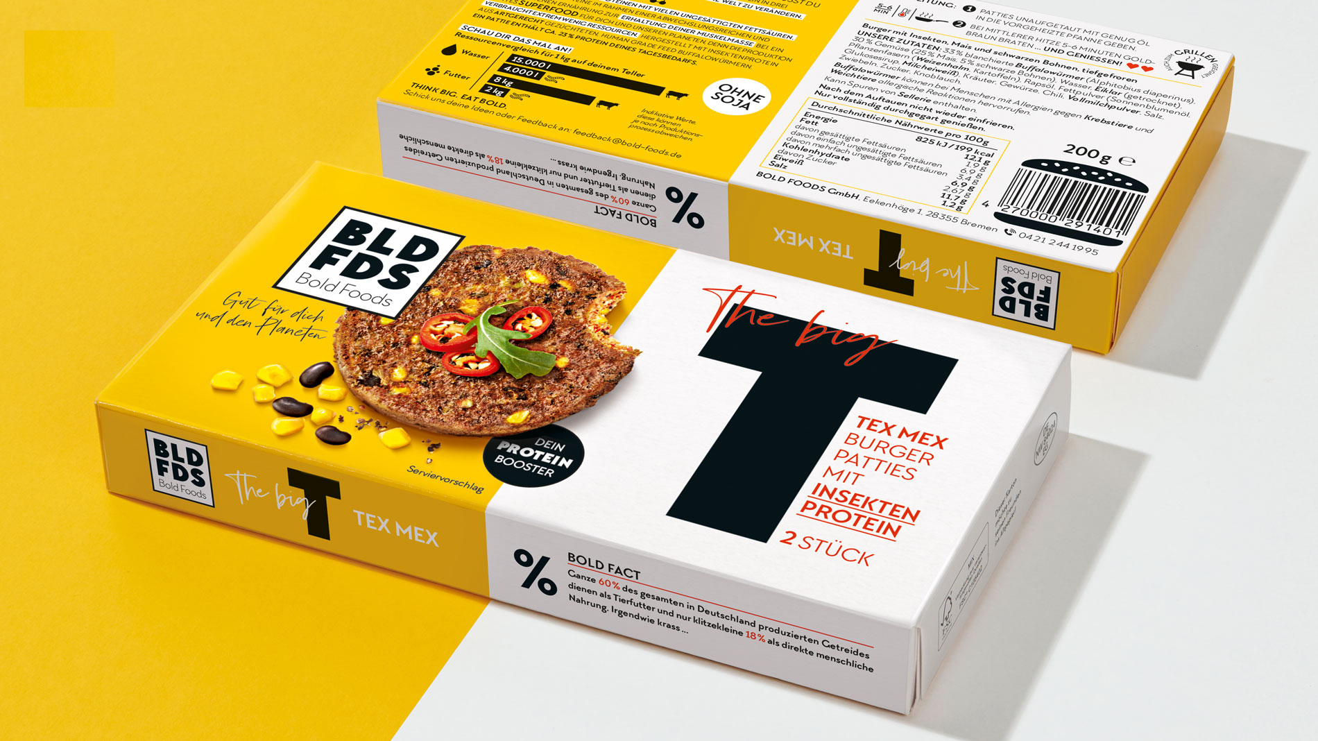
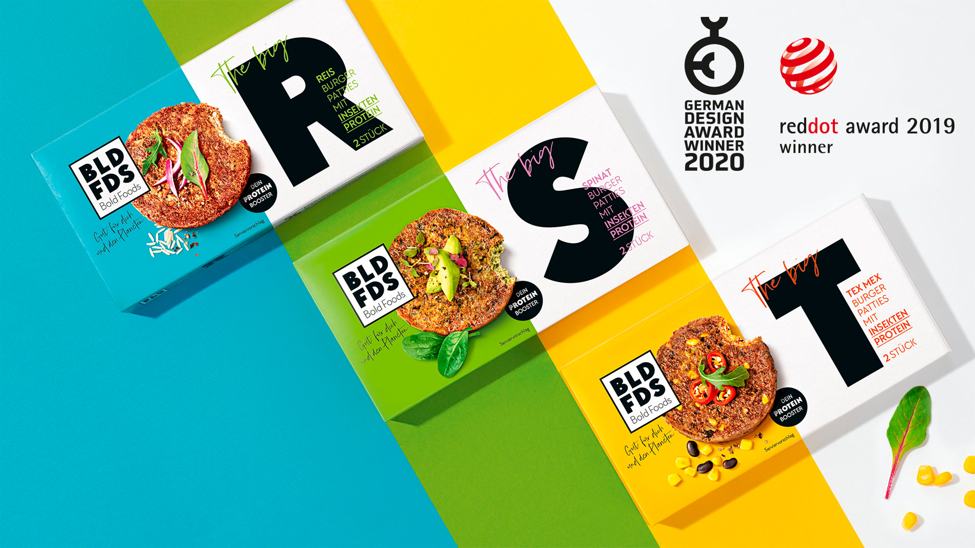
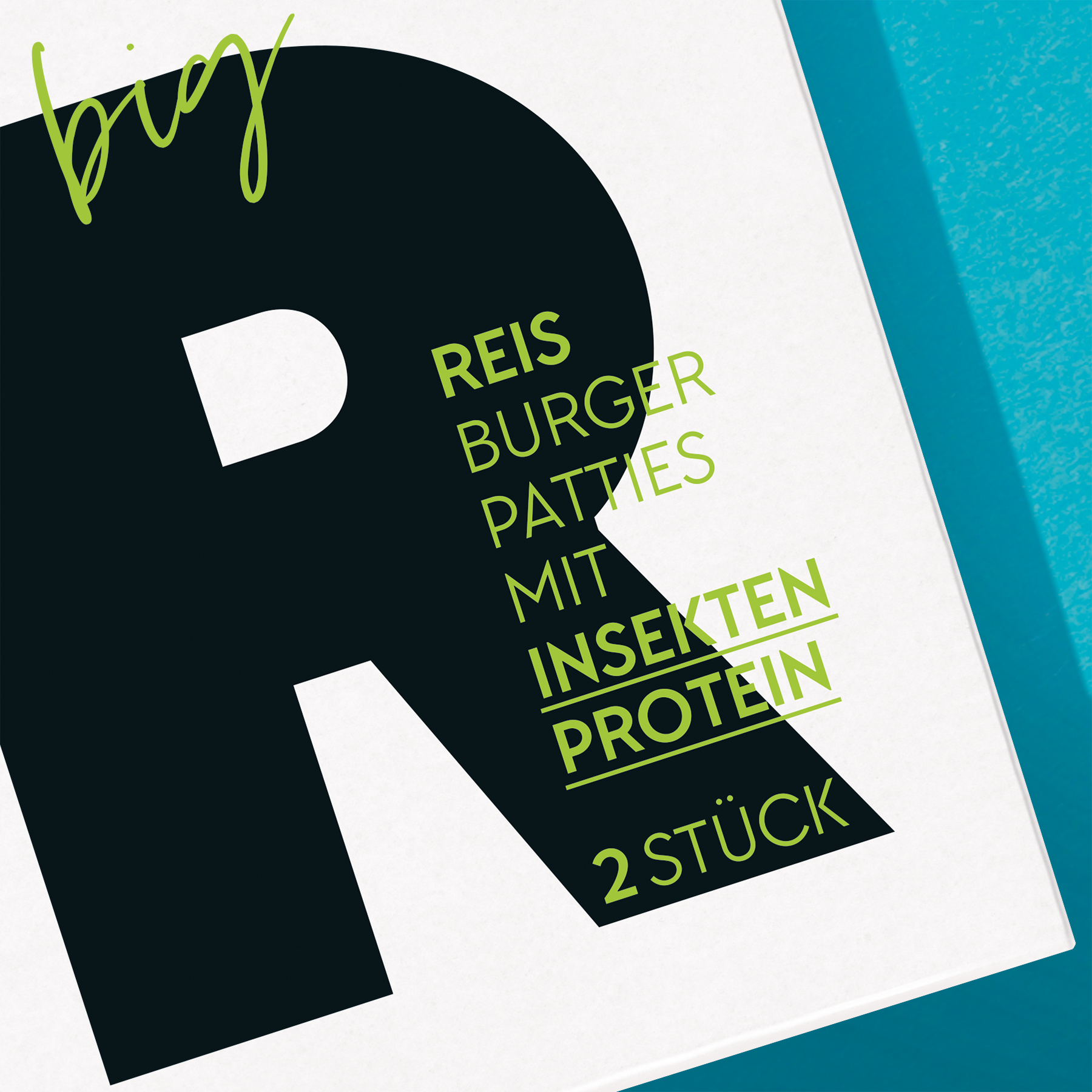
These core values of the new Bold Foods brand reflect the sustainable, innovative philosophy of the start-up. Our job was to give a voice and a memorable look to a strong idea. After values, positioning and tonality were created, it was our task to design the packaging for three burger patty variants that contain insect protein, giving the product the most appetizing and strong-selling appearance possible.
Functional Food
Are insect burgers really that delicious? We had to convince ourselves – and were delighted that they were so yummy! We were not only wowed by the taste of the burgers, but also the philosophy of the Bremen start-up, with its two founders who are bold pioneers with innovative ideas. It was a pleasure for us to offer Bold Foods a comprehensive strategic and creative service. The starting point was the overall brand development of the company and the aim of achieving a bold, eye-catching food packaging design.
Award-winning
We are delighted to receive the Red Dot Award for our outstanding packaging design!
Protein Power
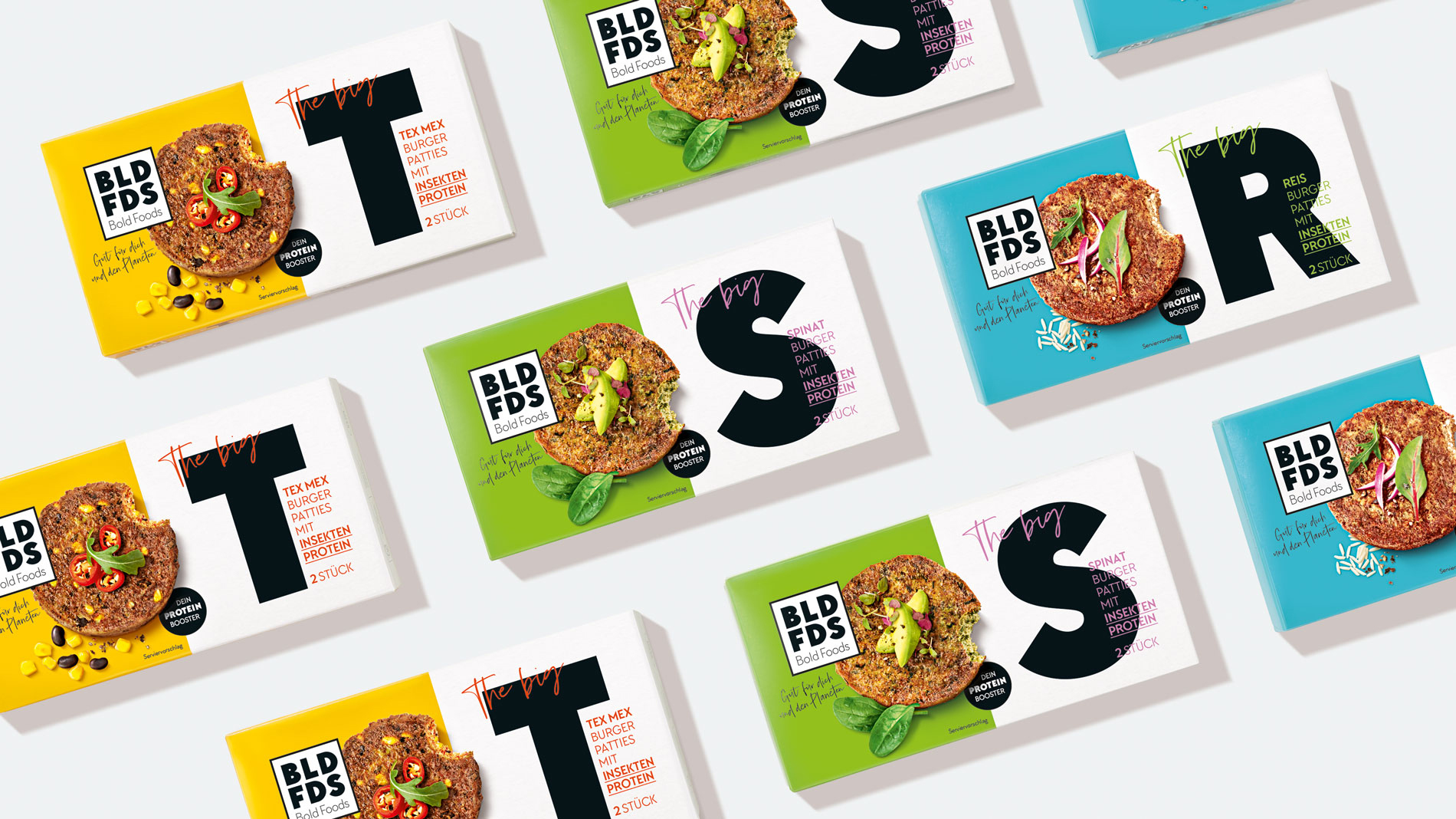
The key ingredient of ground Buffalo worms is not only rich in proteins, this so-called novel food is also sustainable and resource-friendly, because insects need much less space, animal feed and water than conventional livestock. These benefits also had to be reflected in the packaging design. The challenge was to make the design succeed in the burger category, even if the main ingredient sounds unusual at first. In addition, the positioning of Bold Foods had to be communicated by the packaging design – bold, different and reflecting more sustainable consumer needs.
Award-winning
Honoured with the renowned German Design Award.
From A to Z
We developed brand values, variant names, positioning and the logo. For the food packaging design, we staged the burger patties, designed packaging details and wrote on-pack copy. The design communicates an innovative product and a courageous brand that works for the environment and gives us a taste of the future today. We have created high shelf impact with strong colours, clarity and bold letters. Instead of an eco-image, a self-confident, functional and modern design ensures the so-called “stop-moment” in the supermarket.
Facts & Figures
-
Brand development
-
Brand values
-
Brand strategy
-
Brand positioning
-
Naming of variants
-
Logo development
-
On pack copy
-
Packaging design food
-
Inhouse photo shoot
-
Final artwork
Are you looking for an exceptional packaging design agency?
We’d love to hear from you!