Very personal
There is an emotional story behind every love brand. This is one that we found particularly inspiring: the idea for the Tom & Krissi’s family business all started with Kristoffer Schmidt’s fructose intolerance. His mother Vera developed recipes in her own kitchen that Krissi was able to enjoy despite his intolerance. Her cakes sweetened with dextrose were so delicious that even Krissi's best friend Tom loved them. The Tom & Krissi’s brand name was born and with it many more fructose-free and low-fructose delicacies.
Big changes
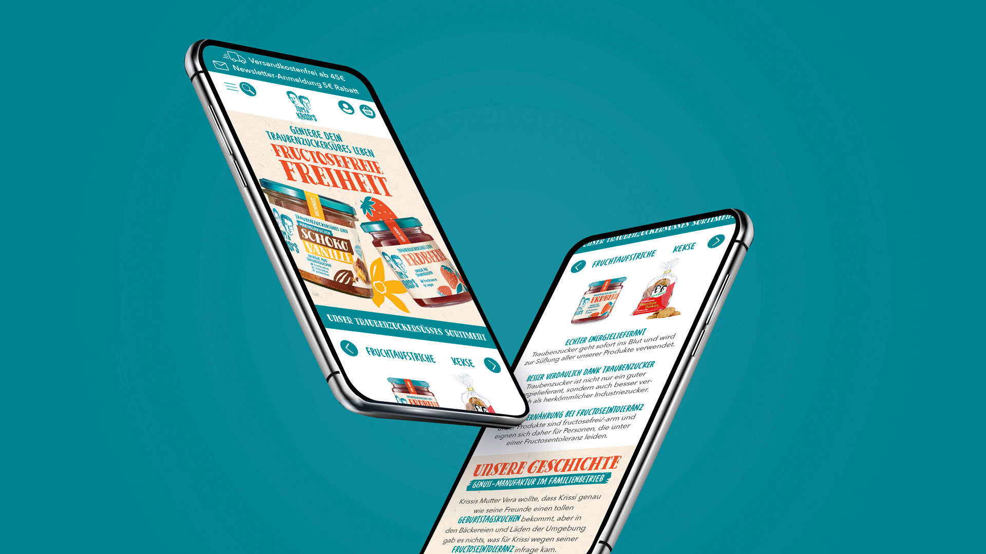
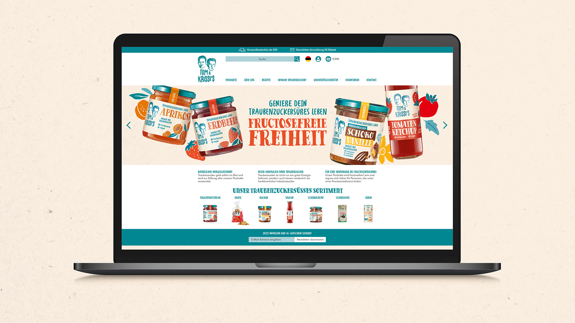
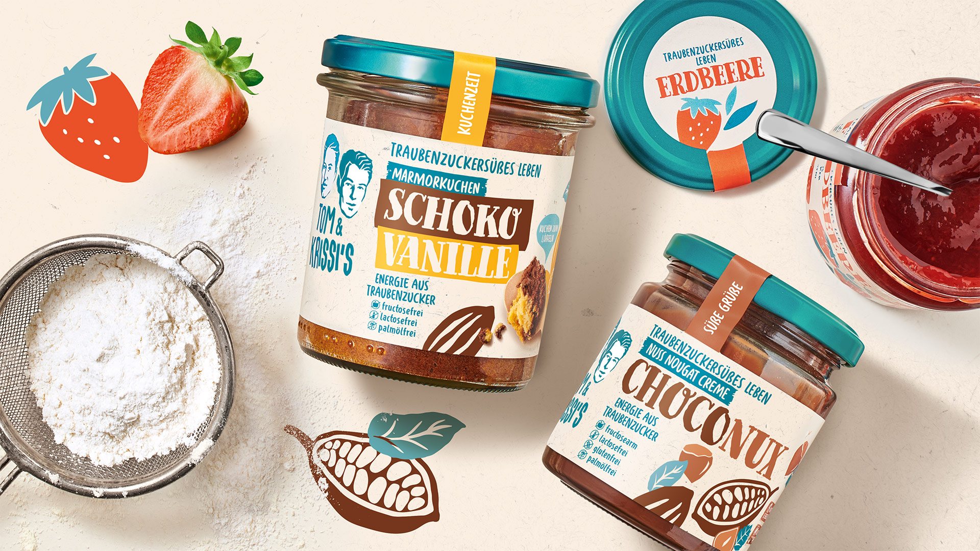
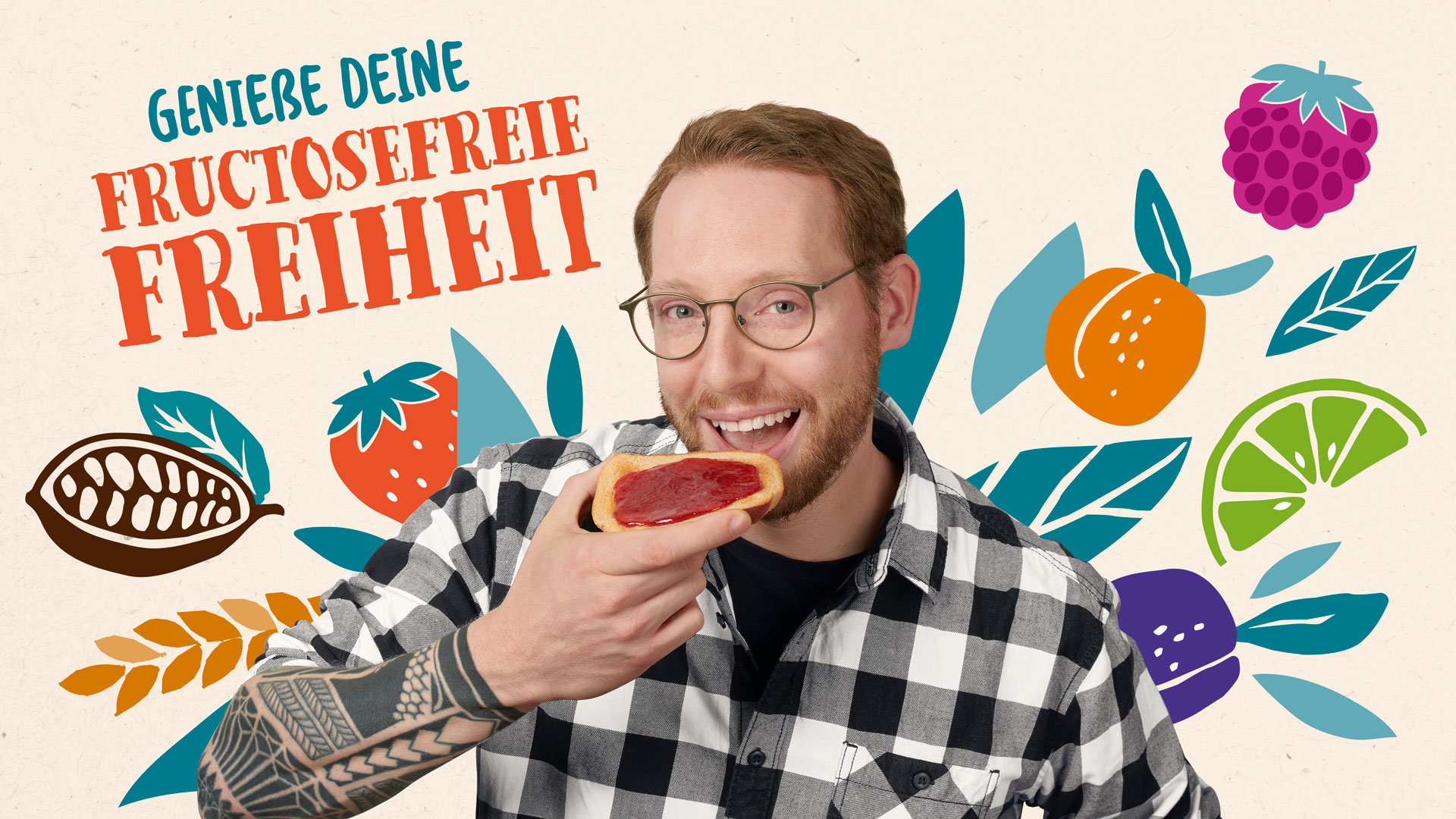
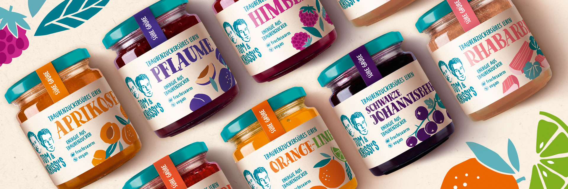
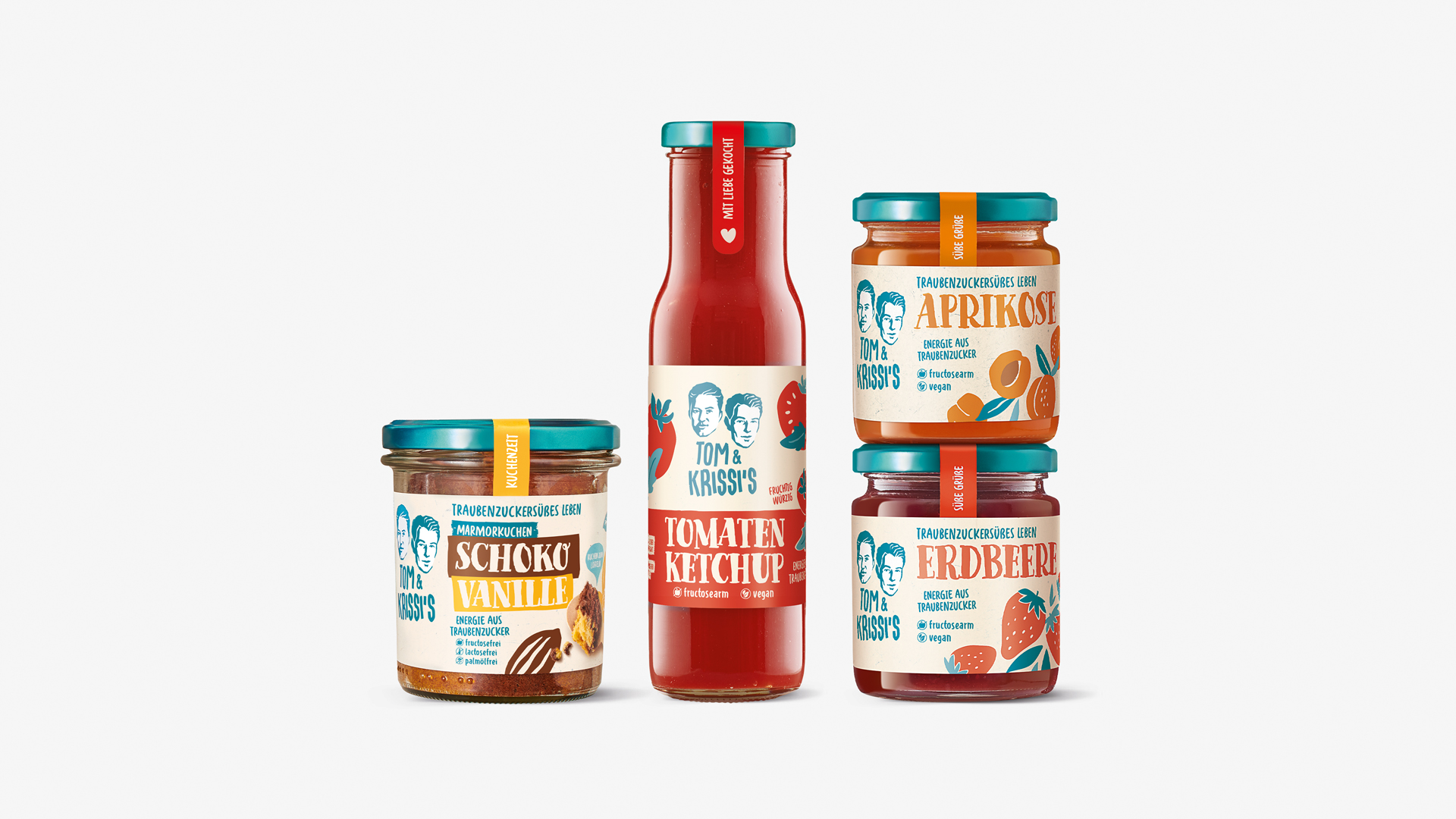
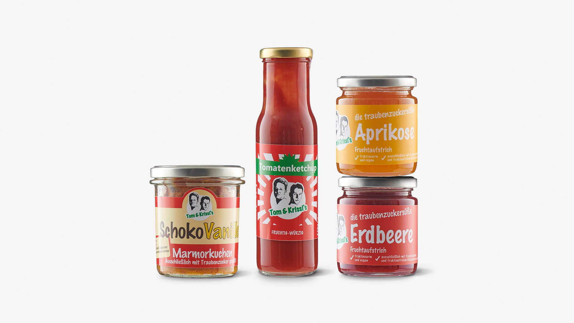
We were commissioned to reposition the Tom & Krissi’s brand, develop the packaging design and also revise the logo. We were also asked to design the look and feel of the website and Instagram channel. Inspired by the personal story of the founder and his mother, we really hit the mark with our first bold design drafts!
SUPER FOOD-APPEAL
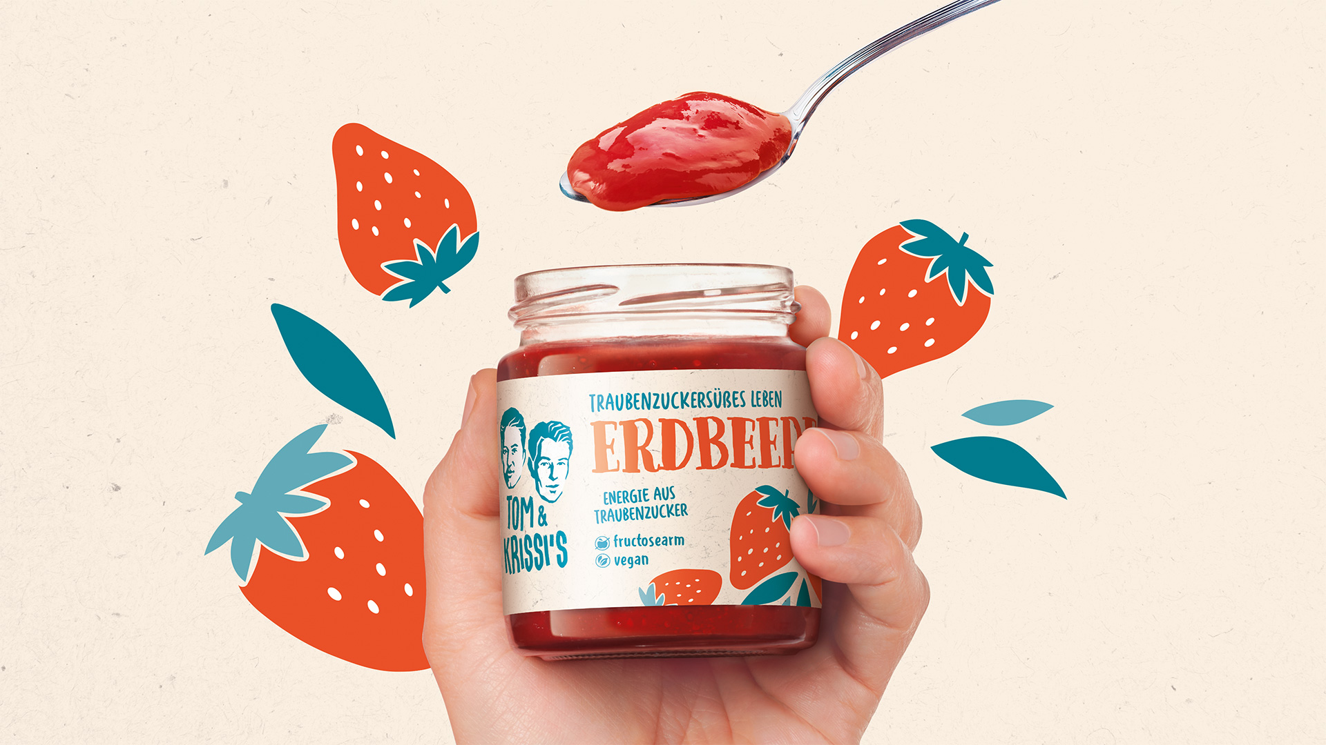
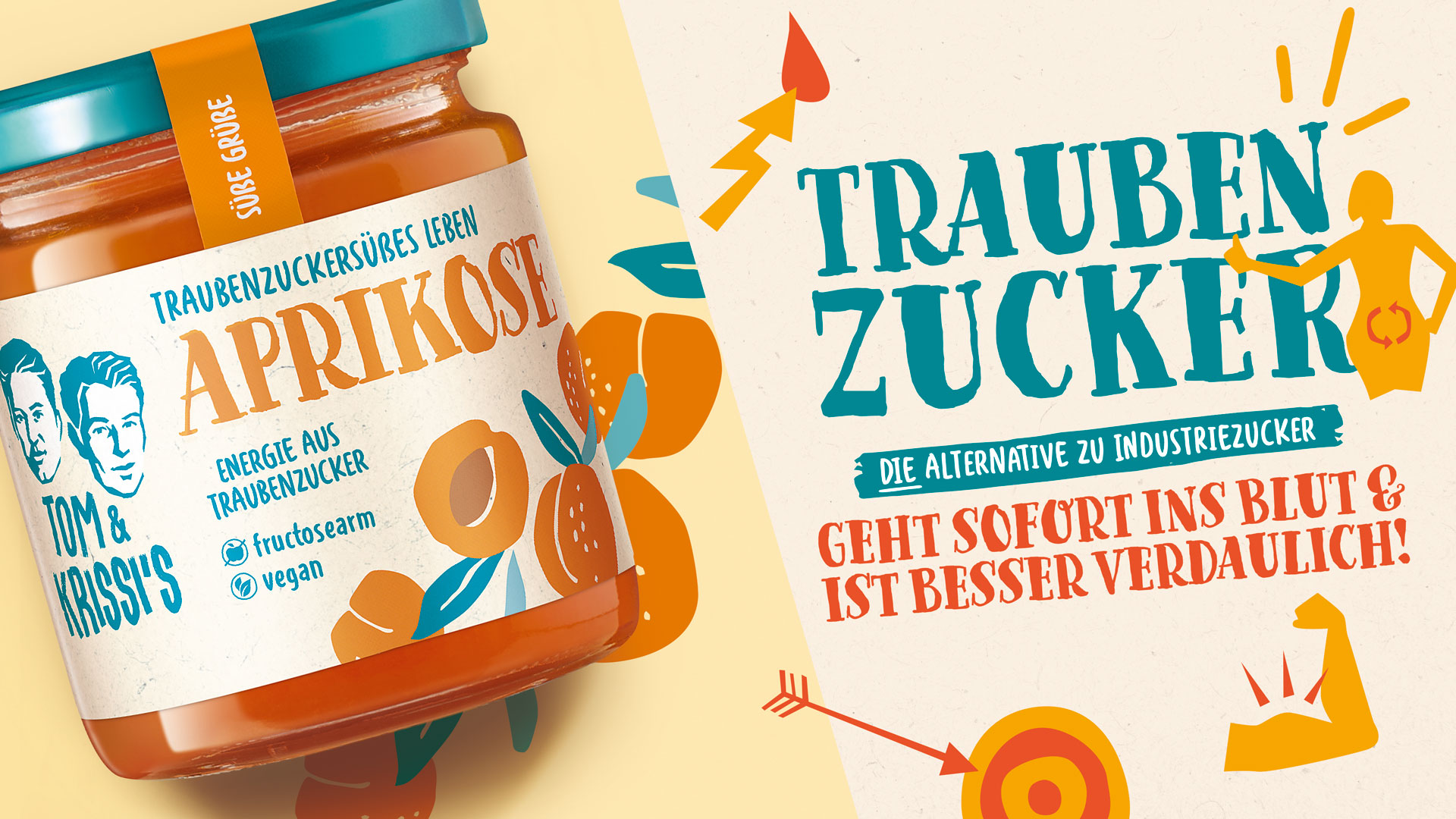
With the new packaging design, we wanted to show how delicious Tom & Krissi’s products are, while conveying that they are handmade with a lot of passion. We have created a look that inspires trust thanks to the emotional colour world and friendly illustrations. The overall clarity of the designs plus the likeable, eye-catching typography clearly communicate what is inside the products and presents a visually striking, unified design concept that is full of character.
Facts & Figures
-
Positioning & brand story
-
Relaunch of the portfolio
-
More Tina 40 SKUs
-
Slogan development
-
Illustrations & icon development
-
Logo revision
-
Final artwork
-
Website concept & design
-
Salesfolder
-
Look & Feel Instagram
Are you looking for an exceptional packaging design agency?
We’d love to hear from you!
