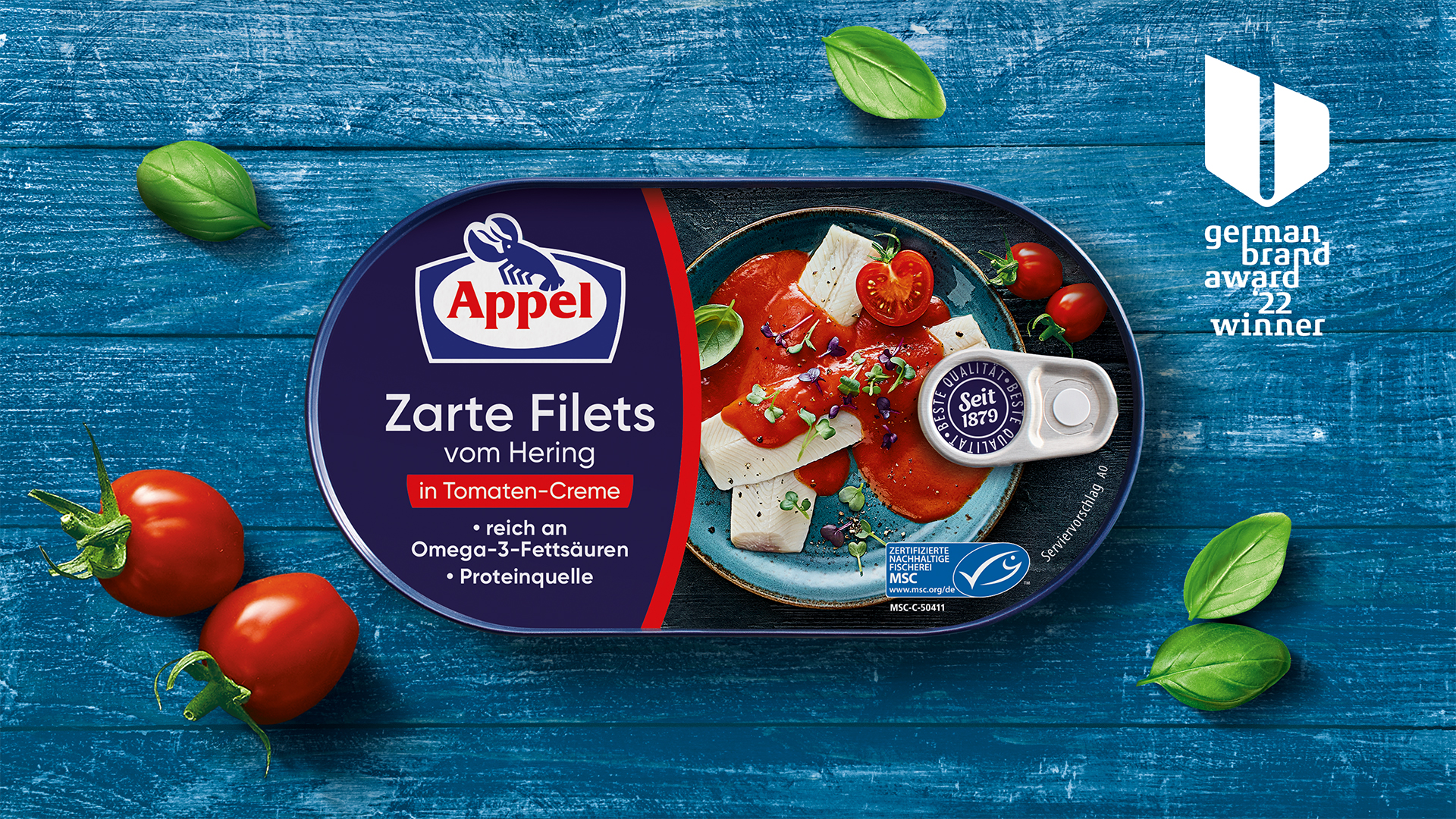
Future-proof brand design
The world is rapidly changing and brands must adapt to stay relevant. How do you stay ahead in such a dynamic environment? How can you outpace the competition?
Emotions are key to this: they drive consumer decisions and ensure that brands are visible and tangible. We develop lasting experiences for you that not only inspire consumers but also create an emotional bond between consumers and your brand.
Thanks to our size, we can work efficiently to achieve more in less time than many of our competitors. Our flexible infrastructure and tightly-knit team enable us to deliver to both global players and local champions – whether product ranges with two SKUs or international brand portfolios with over 2,000 items.
Are you ready to redesign the winning future of your brand?
Real charisma
We help both start-ups and established brands launch or relaunch their portfolios with our services. A fresh approach to creativity, proven design expertise and modern AI know-how assist us in creating exceptional designs that inspire and make brands shine.
CLEAR OBJECTIVES
No matter how extensive your portfolio or how challenging your brand goals, we can work with you to develop a vision that we never lose sight of. On-shelf, a product has just three seconds to inspire a consumer to buy the product.
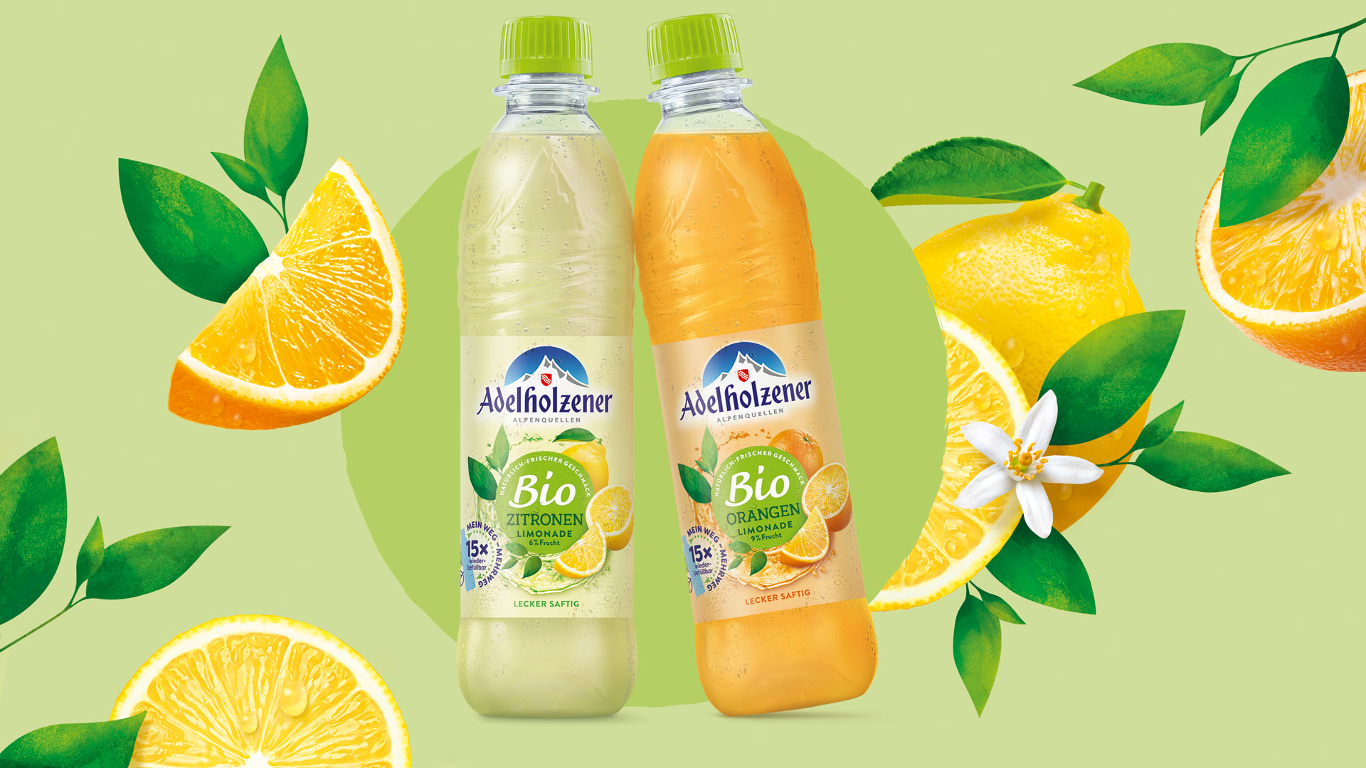
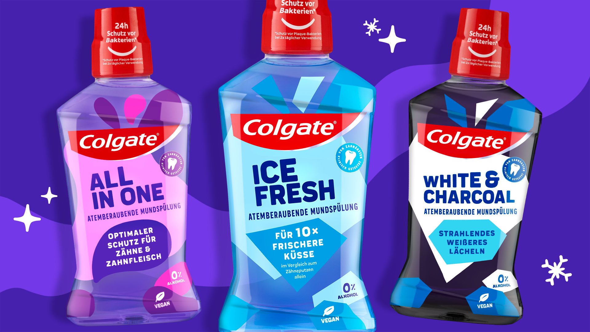
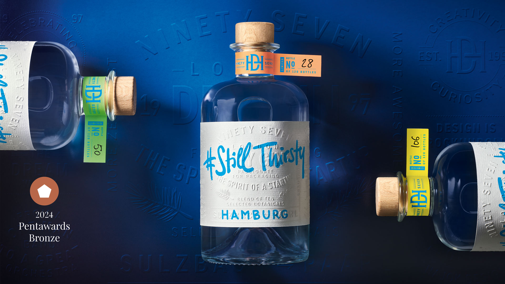
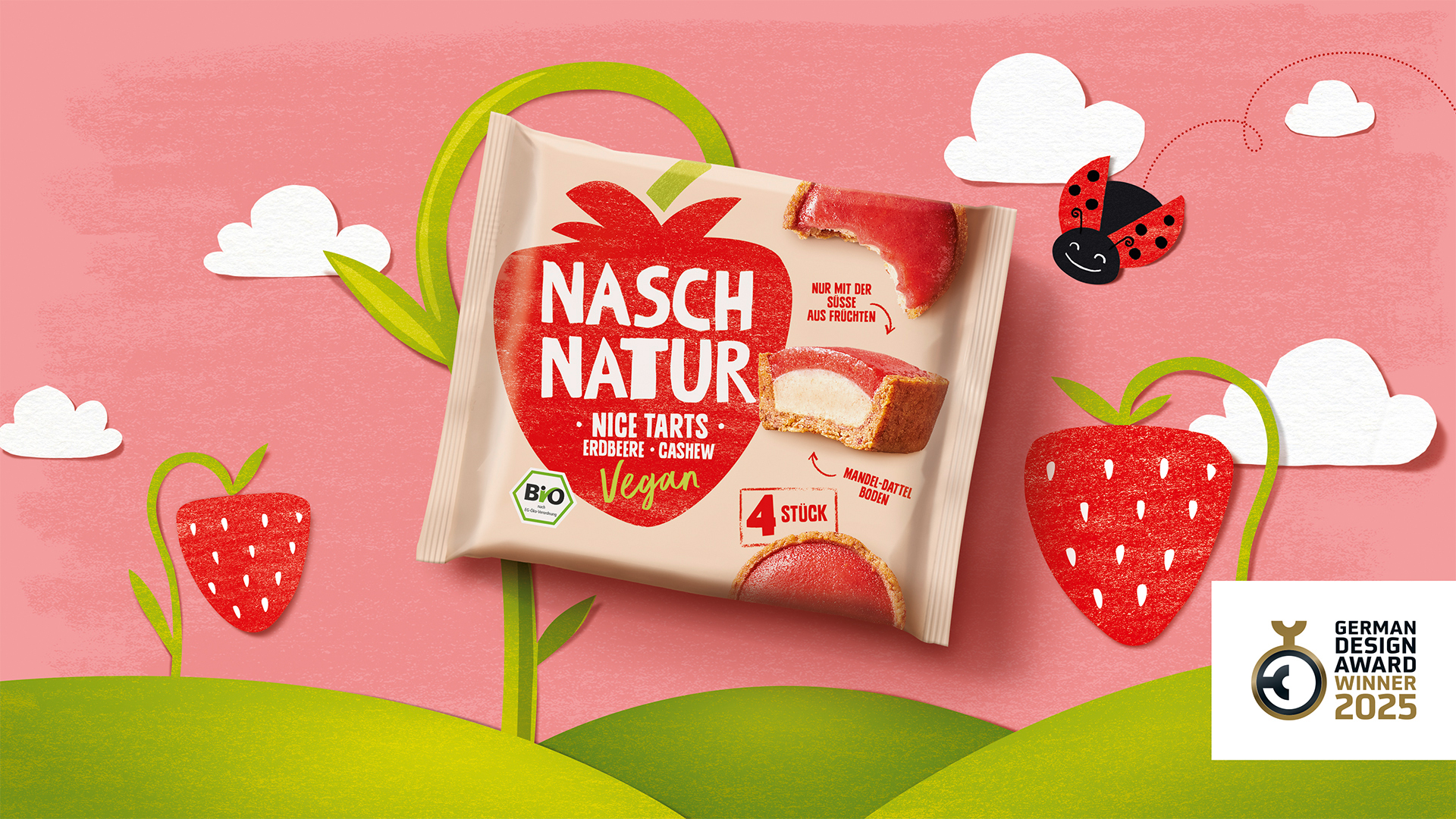
As a packaging design agency, we create solutions with in-depth brand understanding, targeted creativity and 100% passion that whet consumers’ appetite for the product long before they unscrew the lid.
Full service
We are passionate about improving everyday life and offer tailor-made solutions that precisely fit your needs – quickly, reliably and pragmatically. As a design agency and brand consultancy, we are experts in the German-speaking regions of Europe, we operate internationally and have worked with some of our clients for over 28 years. We ask the right questions and offer a variety of services to transform your vision into innovative design solutions. In doing so, we not only impress our clients but also regularly impress national and international design award juries.
We are experts in launches and relaunches.
Feel free to contact us!
Projects related to this service
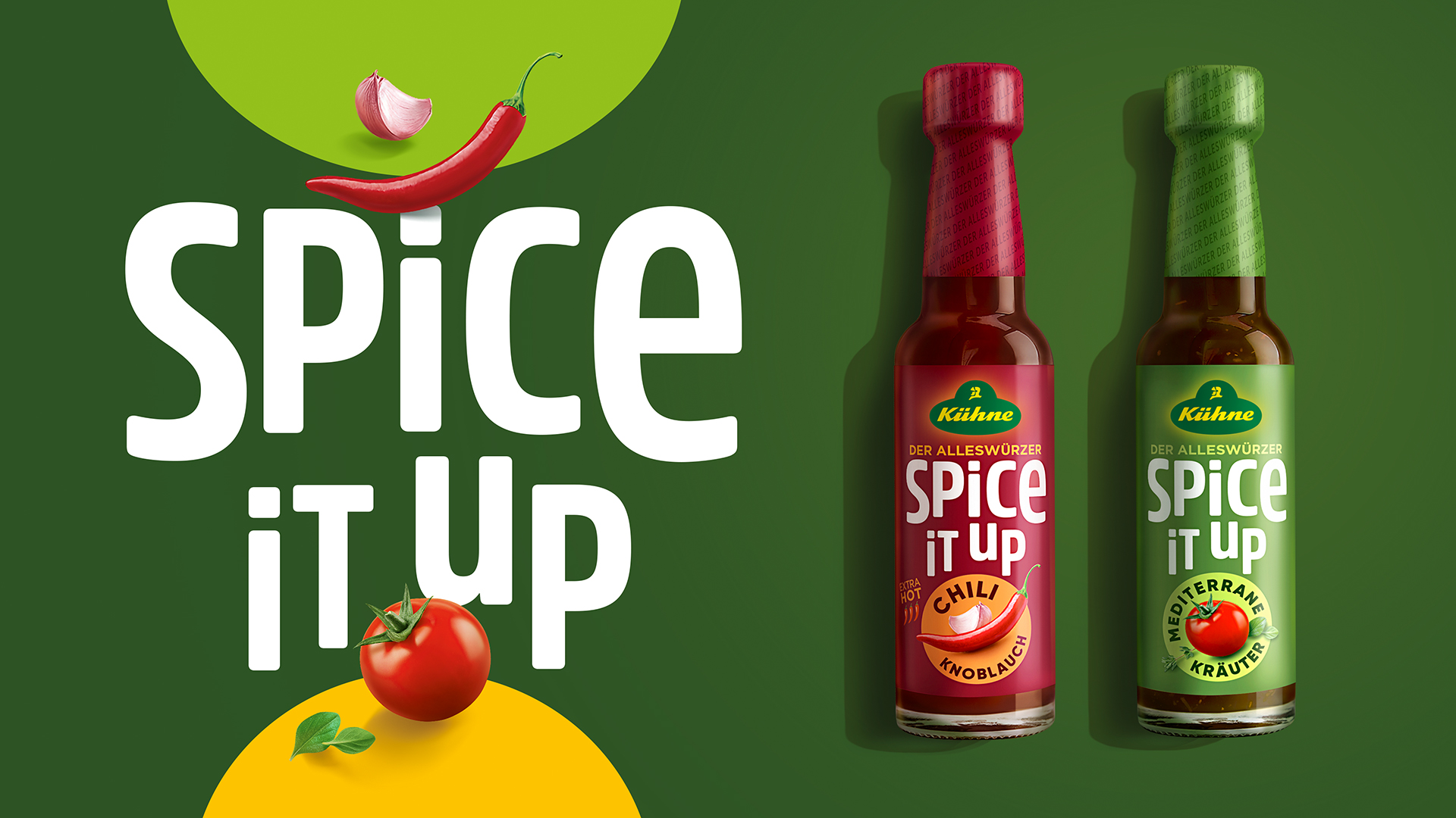
Bold & Spicy
Kühne All-Purpose Seasoning
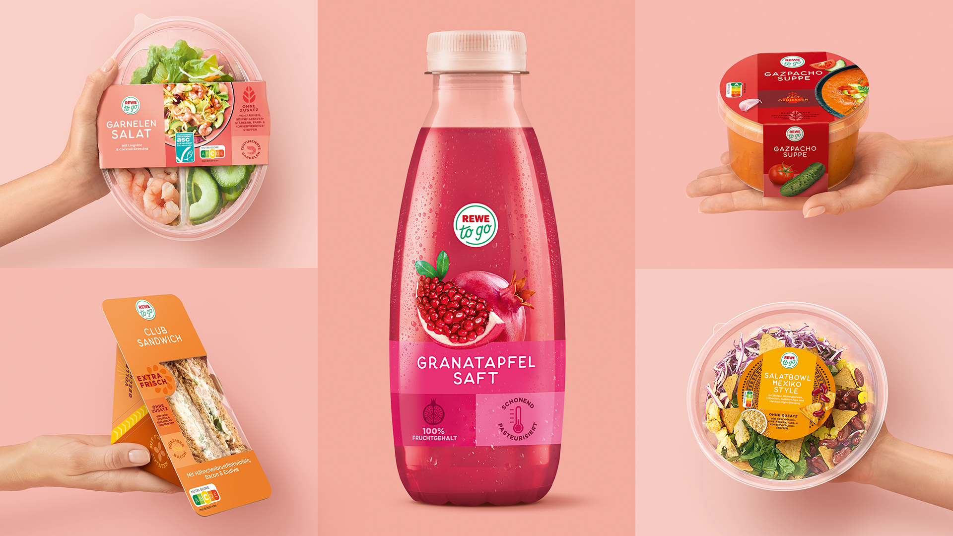
Ready to go
REWE to go
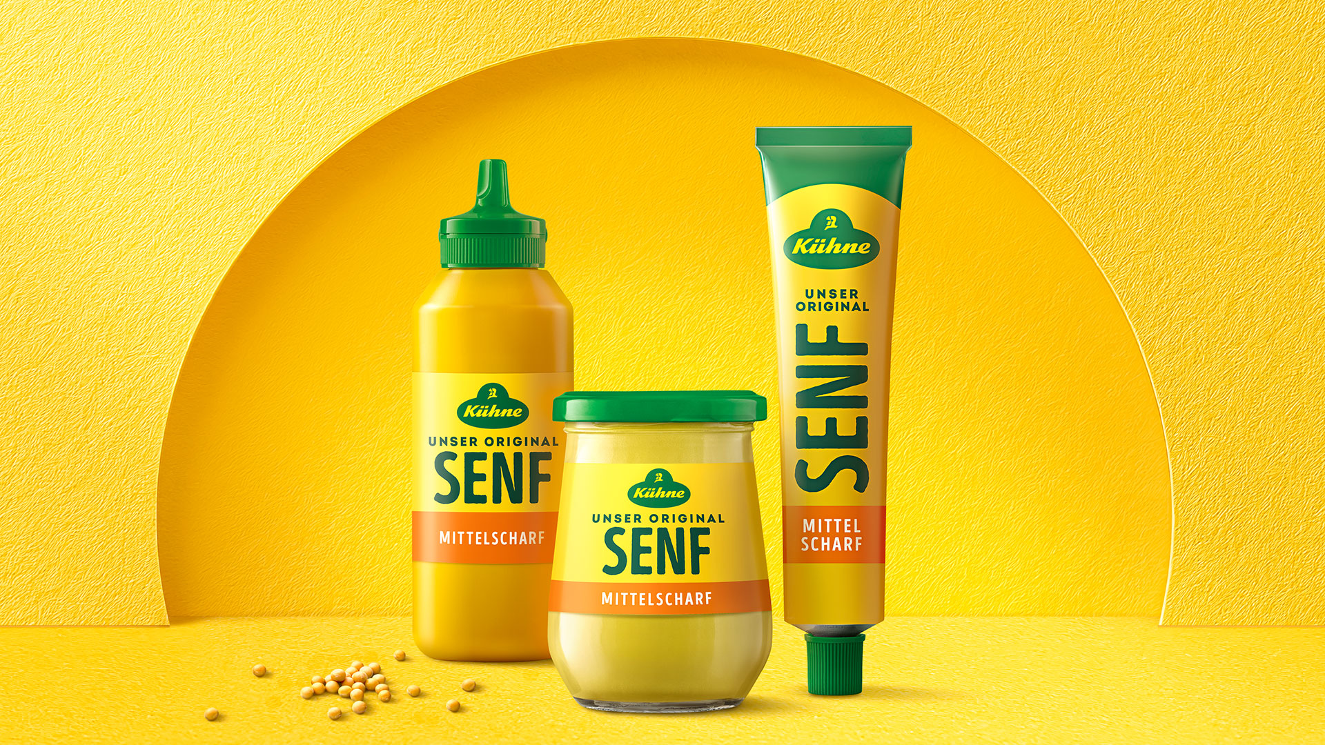
Yellow wins!
Kühne Mustard
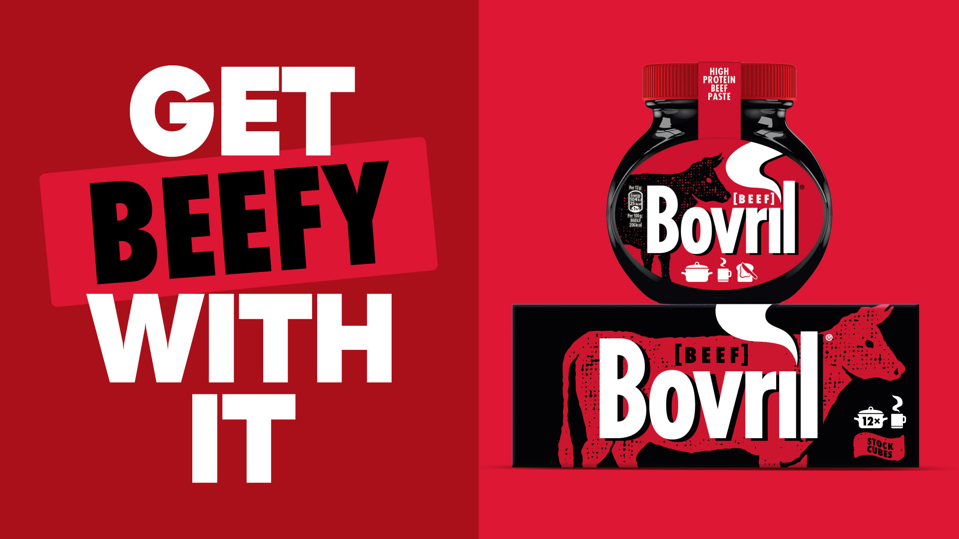
British Icon Relaunch
Bovril
